With the release of SAP GUI 7.30 comes the addition of many new, helpful features. They include the ability to define local tab order, to write system-specific comments on the logon pad, and to create client-specific color settings. Rehan Zaidi discusses these new features in detail and shows you how to get the most from them to make your job easier.
Key Concept
The Corbu Theme is a new theme (light gray and white) that uses brighter icons and larger fonts, providing improved readability. It is compatible with Web Dynpro for ABAP, SAP NetWeaver Business Client, and SAP GUI for Windows.
The new SAP GUI 7.30 provides a number of new features that are helpful to SAP ERP HCM users. I cover the options offered and show how they may be used to make the SAP ERP HCM user’s job easier. These may be related to, for example, changing the color of themes or defining personalized tab orders for standard SAP screens. (A local tab order is a user-specific or user-defined tab order that overrides the original tab order of any SAP screen.)
I start with a discussion of the comments feature on the SAP logon pad for various SAP systems. Then I dive into the SAP GUI settings available in the new GUI release. These new settings allow you to change the theme used in your SAP screens. They also enable you to change the session windows belonging to each client of a given system to display in a different color. I also explain how to customize the docking container position settings on a given SAP screen. (Floating docking containers are movable objects that can be dragged and placed in a new position in an SAP screen.) Finally, I show the detailed steps required to define a new local tab order for any of the SAP ERP HCM screens that you use.
Note
No administrator-relevant options of the SAP GUI 7.30 are covered in this article.
System-Specific Comments on the SAP Logon Pad
Once you have SAP GUI 7.30 installed, you can enter comments for each system listed on the SAP Logon pad. (The comment section [text box] is available on the SAP Logon pad if SAP GUI 7.30 is installed on your machine.) The comments area is at the bottom of the SAP Logon pad as shown in Figure 1. If the comments box is not shown, click the Display/Hide comment field icon  on the Logon pad to display it.

Figure 1
The SAP Logon pad
The area for comments is independent for each system listed in the SAP Logon. For example, this enables you to add separate comments for the production server and the quality assurance (QA) server. This is a useful feature for users as any activities related to the various systems such as QA or production that needs to be done on a future date or next working day can be recorded. In addition, the text written in the comment area remains there until it is deleted by the user. When the user accesses the Logon pad after logging in using his or her Windows password, the user can enter comments—and only this user can make changes to his or her comments. Changing the comments on one users’ PC does not affect other users on another PC. Also, if the user later accesses the Logon pad on a different computer, the comments entered using the other PC are not available.
To enter comments select the system name to which the comment text is to be added. This brings up the text box corresponding to the given system. Enter the text in the area shown. You do not need to click any button or icon to save your comments. In the example shown in Figure 2, I have entered comments for the QA system.

Figure 2
Comments in the QA system
You may find the need to leave different comments in the production and development servers. In that case, you can leave comments using the same method as above, but choose the relevant server. Once a certain length of text is exceeded, scroll bars are automatically inserted by the system to roll the text over into lines. When the Logon pad has been closed, or the system has been shut down and restarted, the comments entered by the user are still available. You may also enter comments for the Connections node, for example (this applies to all systems).
Note
Based on my experience, the system can handle comments of up to 5,000 characters, so keep this limitation in mind when entering your comments.
Additional SAP GUI 7.30-Specific Options
In addition to the option of adding system-specific comments, there are a number of other useful new GUI features. In this section I discuss them in detail. Before going further, however, you need to know how to access these new features. They are accessible from the SAP GUI options dialog box. You have two options for opening it.
1. After logging on to the SAP ERP HCM system, click the Customize Local Layout button from the standard toolbar (or press Alt + F12). This opens the main menu as shown in Figure 3. Then choose Options… .

Figure 3
Access the customizing local layout menu (option 1)
2. Alternately, from the SAP Logon pad, click the open-menu icon  in the top left corner. This opens the menu shown in Figure 4. Again, select Options… .

Figure 4
Access the customizing local layout menu (option 2)
Using either method, the SAP GUI Options – SAP Logon dialog box opens as shown in Figure 5.
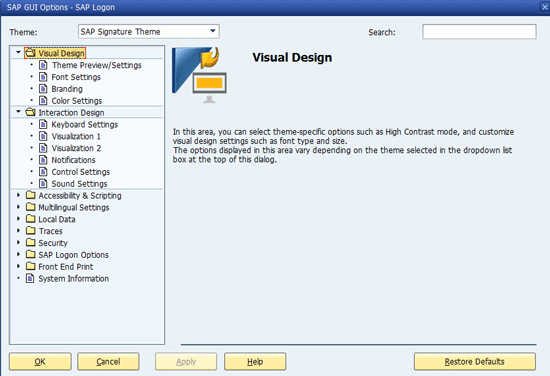
Figure 5
SAP GUI options dialog box
The SAP GUI Options – SAP Logon dialog window has a number of sections, such as Visual Design, Interaction Design, and Local Data, arranged in the form of a tree on the left. These allow you to access the various settings screens for your GUI. From GUI 7.20 on, you may search within the dialog box. For example, if you want to go to the docking container settings, simply type docking in the Search field at the top right of Figure 5 and press Enter. Once found, the relevant path node becomes italicized, as shown in Figure 6 (e.g., Control Settings under Interaction Design).
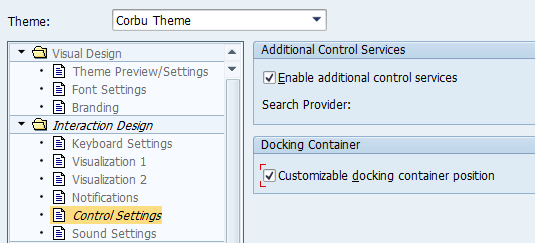
Figure 6
Search for a specific term in the GUI settings screens
Now that you understand how to access the new SAP GUI 7.30 options dialog, I discuss these three new available options in detail:
- Changing themes and colors
- Changing the position of docking containers
- Defining the local tab order in screens
1. Changing Themes and Colors
From SAP GUI 7.30 on, the new Corbu Theme is available. This theme has a different gray color and a different set of icons, as shown in the infotype 0002 screen in Figure 7.

Figure 7
Infotype 0002 record with the Corbu Theme
By default, the Signature Theme is applied for the SAP GUI. You may, however, change it to the Corbu Theme by following these easy steps. Display the SAP GUI Options (using the menu option shown earlier in the “Additional SAP GUI 7.30-Specific Options” section). On the top left corner of the dialog box, select the Corbu Theme from the drop-down list as shown in Figure 8.
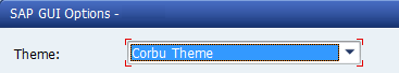
Figure 8
Change the GUI theme
Click the Apply button (not shown). The new setting takes effect after the SAP Logon pad is closed and restarted.
In addition to applying the Corbu Theme to your SAP GUI, it is also possible to use the Corbu-style icons in combination with the Signature Theme. In the screen in Figure 8 set the theme to Signature, and from the left pane choose the nodes Visual Design > Theme Preview/Settings (not shown). The screen on the right changes (a portion of which is shown in Figure 9). Select the Use Corbu style icons check box and click the Apply button (not shown) to save your settings.
Figure 9
Change screens to use Corbu Theme icons in the Signature Theme
Figure 10 shows an example of the result, with the Change Personal Data standard toolbar now using the Signature Theme, but displaying the new Corbu Theme icons.
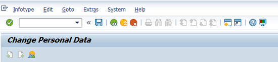
Figure 10
Display the new Corbu Theme icons in the Signature Theme
In addition to the new Corbu Theme and its icons, it is also possible to specify user-specific color settings for the Signature Theme. The benefit for this is that you can have SAP screens displayed in various colors in different systems or different clients within a system. For example, you may have client 200’s screens displayed in red and client 210’s displayed in gold. Here’s how to do this.
Note
Creating client-specific color settings are only possible from SAP ERP Central Component (ECC) 6 Enterprise Pack 6 and higher.
When the SAP GUI window is displayed in the Signature Theme, open the SAP GUI Options dialog (Figure 6). Choose the nodes Visual Design > Color Settings > Colors in System in the left pane. The right side of the screen then changes as shown in Figure 11.
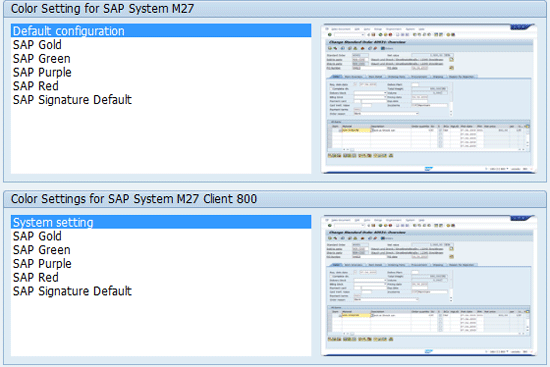
Figure 11
System and client-specific color settings
There are two color settings shown. On the top of the screen the color setting that applies to the entire system is shown. The second is the client-specific setting, shown in the lower part of the dialog box. (If you are not logged in the system, the client-specific setting is not displayed. Rather, an error message appears as shown in Figure 12.)
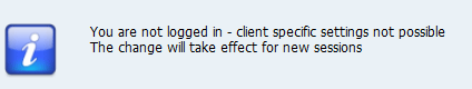
Figure 12
Warning message about not being logged in
Choose from the various color options to customize your SAP screens when you are in the given client. Then click the Apply button. The new color settings are applied when a new session is opened.
2. Docking Containers
If you are using SAP GUI 7.30 you can also change the positions of docking containers placed on your screen. A good example of this is the Object Manager in transaction codes PA20 and PA30. With the release of SAP GUI 7.30 you can now change the position of the Object Manager according to your requirements.
The original Object Manager is shown in Figure 13, placed on the left side of the transaction PA30 screen (note that the header is shown and all the icons are visible).
Figure 13
Original Object Manager (all icons are visible)
Before you can change the appearance of this screen, however, you need to change one setting in the SAP GUI Options dialog (Figure 6). Follow the nodes Interaction Design > Control Settings from the left pane. This opens the right side of the screen (Figure 14).

Figure 14
Docking container position setting
In the Docking Container section select the Customizable docking container position check box and click the Apply button (not shown). The new settings are applied.
After you apply this setting, execute transaction code PA30 (in my example, the screen with the docking container) to display the Object Manager. You can now drag the docking container to change its position. To do this, hover your cursor over the Object Manager header, and the header changes as shown in Figure 15.
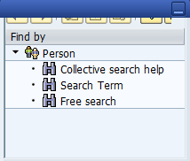
Figure 15
Changed header of Object Manager
Once the header looks like the one shown in Figure 15 (i.e., the blue bar appears, obscuring the icons and making them almost invisible), then the docking container may be dragged to a new position on the screen. Using your mouse, drag the Object Manager. While you are dragging, four icons appear at each side of the screen, as follows:  ,
,  ,
,  , and
, and  . Use these arrow icons to place the Object Manager in a new position (for example, to the right of the screen using the
  icon or to the top using the
  icon).
Execute transaction code PA30. The screen that appears (Figure 16) shows the Object Manager on the right of the PA30 transaction screen (moved from the default placement, on the left).
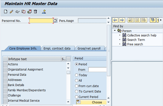
Figure 16
The new position of the object manager
To save your changes to the position of the Object Manager, follow menu path Options > Save Docking Container Layout. Now, when you open a new session and run the transaction, the Object Manager appears in the new position (Figure 16).
3. Define Local Tab Orders for Screens
One of the most useful features that the SAP GUI 7.30 provides is the option to create local tab orders for SAP screens. An important point to be noted, however, is that the definition of a local tab order is not system specific. Therefore, a local tab order for a particular screen for the development system is applicable for all the other systems (e.g., the QA and production systems) when accessed from a given machine.
Note
For an SAP screen, you get to the next field by using the Tab key. SAP GUI 7.30 for Windows lets users specify their own sequence of fields in the tab order. Note that the local tab order can only be defined for input fields, radio buttons, labels, and check boxes.
Every screen has a default tab sequence or order. You can override this by defining your own local tab order. Before taking a look at how to define a local tab order, I first discuss some of the important concepts applicable to both default and local tab orders.
Every screen tab order (whether local or default) has entry and exit points. The entry and exit points define the size of the tab order. These may either be an input field, a radio button, or button. For each screen you may have exactly one entry point and one exit point. In addition to entry and exit points, a tab order has a set of element pairs: from and to elements. This is the sequence of fields through which the cursor moves each time the tab key is pressed.
From SAP GUI for Windows 7.30, a visual option is available for displaying the default tab order (or a custom-defined local tab order). To display the default tab order for the screen in question, place the cursor on a field of the given screen and right-click while pressing Ctrl at the same time. Then choose the Visualize Local Tab Order menu option. Alternately, you can get to the same place using the shortcut Shift + Ctrl + A. This displays the tab order in graphical format. (For a list of applicable keyboard shortcuts for local tab orders, see Table 1.) For example, for transaction code PA30, infotype 0002, the default tab positions are shown in Figure 17. (For simplicity, only some of the available fields in infotype 0002 are shown.)
| Task |
Keyboard short cut |
| Local tab order dialog box |
Shift + Ctrl + L |
| Making the selected element the entry point |
Shift + Ctrl + N |
| Setting the current element as the exit point |
Shift + Ctrl + O |
| Setting the selected element as the From element of an element pair |
Shift + Ctrl + S |
| Making the selected element the To element of an element pair |
Shift + Ctrl + T |
Table 1
Table order configuration

Figure 17
The default infotype 0002 tab order
Each element in the tab order is denoted by a number. It is not necessary for the numbering to begin with 1. (A red number, if any, indicates the currently selected field). The From and To Element pairs are shown with arrows. As you can see in Figure 17, the entry point is element 5. For the portion shown, the exit point is element 42. An entry point does not have an incoming arrow, and an exit point does not have an outgoing arrow.
On the status bar (right-side corner), there is a double-arrow icon  for accessing the tab order configuration dialog box for each screen of the SAP system. A dim-and-disabled version of this icon (
 ) denotes that no local tab order has been defined for a given screen, as shown in Figure 18.

Figure 18
A dimmed double-arrow icon – no Local tab exists
Double-clicking this icon (Figure 18) displays the configuration table for the local tab order. If no entry and exit points are defined, the configuration table in the dialog box is blank (Figure 19).
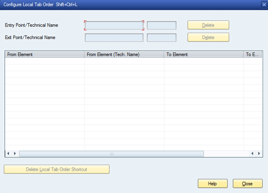
Figure 19
The local tab order configuration screen with no entry or exit points defined
Defining Exit and Entry Points for Local Tab Order
When defining a local tab order, you can define any field as the entry or exit point within the tab sequence. Using the entry and exit point definitions, you can also reduce the size of a tab order within a given screen. In addition, any unwanted fields can be removed from the traversal.
Place the cursor on the field that you want to define as the entry point in the local tab order. Then, while pressing Ctrl, right-click to display the enhanced context menu (Figure 20). From the context menu choose the Local Tab Order: Entry Point option.
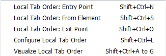
Figure 20
Partial context menu to change the entry point for local tab order
Next, you need to define another field as the exit point of the tab order. Place the cursor on the field that you want to designate as the exit point. Again, using the Ctrl key, right-click the mouse to access the context menu. From the menu that opens (Figure 20), choose the Local Tab Order: Exit Point option.
In this example, I define the Start Date and First Name fields as the Entry and Exit points, respectively, on infotype 0002 for the local tab order. As a result, the cursor initially jumps to the field Start Date field, and the tab order ends at the First Name field.
Once these changes have been made (or at least the entry point in the local tab order has been defined), the double-arrow icon is enabled. Any exit or entry points already specified are listed in the configuration dialog box. In addition to the configuration table, any local entry and exit points change the visual tab order.
Specifying From and To Element Pairs for Local Tab Order
Once the entry and exit points are done, you need to define the paired From and To fields elements to define the movement of the cursor after each tab is pressed by the user. You can specify a single pair using the following steps:
Place the cursor on the field that you would like to define as the first field of the Element Pair. Then press the Ctrl key and right-click the mouse to display the enhanced context menu (Figure 20). Select the Local Tab Order: From Element option.
Next, position the cursor on the field that you want to define as the To element. Press the Ctrl key and right-click to access the enhanced context menu. The local tab-order-specific options appear as shown in Figure 21.

Figure 21
Define the To Element
Then choose the Local Tab Order: To Element option. Note that once the From Element of a pair within your tab order has already been specified, the context menu option From Element is no longer available in the context menu a shown in Figure 21.
Note
When you are defining your first element pair, make sure to specify the Entry Point field as the From Element, and any field that you want the cursor to go to (upon tab press) as the To Element. Similarly, the last pair should specify the Exit Point as the To Element denoting the end of the tab order.
Now you can repeat these steps to define the next elements pair for the tab order, until the exit point is reached.
As already mentioned, the tab sequence specified by the From Element and To Element fields is stored as a pair. Both the From and To Elements must be defined if the pair is to be visible on the configuration dialog box. As you specify the elements in the tab order, the information entered starts appearing in the configuration table, and the status bar icon becomes enabled, denoting that the local tab order is defined for the given screen.
Using the steps shown, you can define a short local tab order for the infotype 0002 screen. Here there can only be four fields, with the Start Date field as the entry point and the First Name as the exit point, and two other fields (the Last name and End Date fields) as other elements in the tab order. The element pairs and the Exit and Entry points are shown in Figure 22. (Note also that the To element of one element pair becomes the From Element of the subsequent pair.)
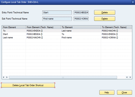
Figure 22
Configure the new local tab order
After you define the local tab order, selecting the Visualize Local Tab Order option shows the local tabs along with the original tab order as shown in Figure 23 (compare this screen with the Original tab order shown in Figure 16).

Figure 23
Visual of new tab order
The maroon number 14 is the local tab entry point, then the cursor moves to element 16 (shown in a different blue color), then to element 26, and at the end to element 30 (the exit point).
To delete the Entry and Exit points, click the Delete button next to the relevant field in the configuration dialog box, as shown in Figure 22. To delete a particular element pair, select the given pair and click the Delete Local Tab Shortcut button. Once you’ve made your deletions, click the Close button.
Rehan Zaidi
Rehan Zaidi is a consultant for several international SAP clients (both on-site and remotely) on a wide range of SAP technical and functional requirements, and also provides writing and documentation services for their SAP- and ABAP-related products. He started working with SAP in 1999 and writing about his experiences in 2001. Rehan has written several articles for both SAP Professional Journal and HR Expert, and also has a number of popular SAP- and ABAP-related books to his credit.
You may contact the author at erpdomain@gmail.com.
If you have comments about this article or publication, or would like to submit an article idea, please contact the editor.
 ) denotes that no local tab order has been defined for a given screen, as shown in Figure 18.