Predict the outcome of a promotional program or price change on sales figures using predictive analysis. Sunil Mehta and Biswajit Biswas provide step-by-step instructions that focus on the food and beverage industry.
Key Concept
Exponential smoothing is used to revisit, review, and revise forecast values based on comparison of historical data. This smoothing follows the concept of weighted averages. Older observations are given a lower weightage and more recent ones have a higher weightage. A selection of algorithms allows you to consider sales trends and seasonality in your forecasts.
A pizza chain wants to increase its sales volumes and its marketing team has come up with several ideas to promote sales. Because of budget constraints, the company doesn’t want to invest heavily. Therefore it would like to do some scientific analysis before it decides to invest in any of the promotional schemes.
The statistical analysis of the historical data would uncover hidden trends, allowing the company to evaluate the promotional schemes linked to such trends. It could then ascertain the probable impact on sales. The data is already available; the company just needs the right model to be created in the SAP BusinessObjects Predictive Analysis tool.
We first show how to see the impact of a promotion scheme in different markets across a region, with the emphasis on how to identify the impact of a price change and a scheme. For this purpose you need marketing data. We then focus on forecasting future sales, a method that requires historical sales data.
The available data is from outlets per region and the sales packages rolled out from those outlets.
For this case study, data input for SAP Predictive Analysis is from a Microsoft Excel file. Note that SAP Predictive Analysis can consume data from the following data sources:
- Comma-separated values (CSV)
- HANA
- Excel
- SAP BusinessObjects universe
Note
Predictive Analysis is all about studying historical data to forecast future trends. Similar interpretations can be reached with different predictive models. In this case, we have used one of the most widely preferred algorithms. Our intent is to elaborate on the technology aspect associated with the SAP BusinessObjects Predictive Analysis tool.
Prerequisites
To use this method you need the following:
- SAP BusinessObjects Predictive Analysis installed on the client machine.
- The user should have access to at least one SAP NetWeaver BW system.
- Prior knowledge of statistical algorithms is helpful in understanding the concept.
Section 1: Identify the Impact of a Price Change or Promotion
Step 1. Open a new document in Predictive Analysis. Once the new document is selected the tool asks for the data source (Figure 1). Select MS Excel from the new data source section.
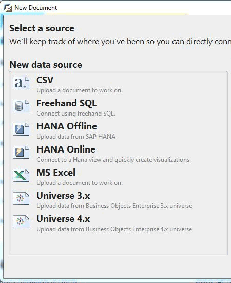
Figure 1
Choose the data source
Step 2. In the popup that appears (Figure 2), you select the file from which you are going to get the tabular marketing and historical data for analysis. Browse to the folder and select the file that has the data you want. The tool automatically detects the sheets that include data. You see an option to Select sheet in the Acquisition options section. For our case study, we have data for a promotion in the sheet named sales_promo. Select that sheet and click the Acquire button to get the data in the tool for further processing.
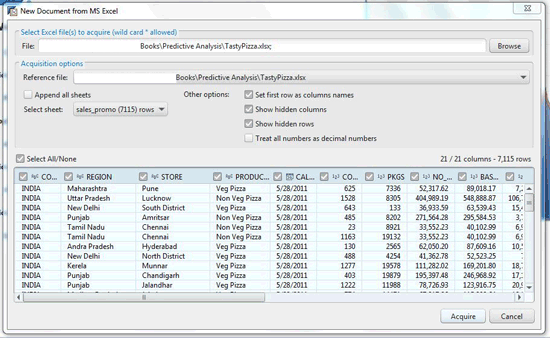
Figure 2
Select the appropriate file
Step 3. After you acquire the data, you see the screen shown in Figure 3 with the Prepare tab selected at the top of the screen. All the dimensions from the data source are on the left side and you can see the Excel data presented on the screen.
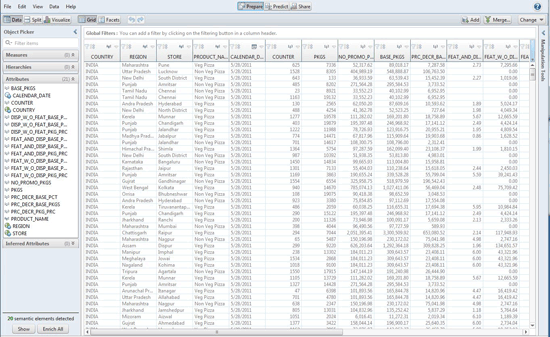
Figure 3
Acquired data in Predictive Analysis
Step 4. The Excel data in Figure 4 contains measures, time dimensions, and location. The tool suggests enriching them (converting them to measures-, time dimension-, and location-based hierarchy from the normal dimensions) by detecting the content of the cells. Click the Show button below the semantic elements detected message at the bottom left of the screen. The enrichment window appears. After deciding on the dimensions to be enriched and removing unwanted dimensions, click the Enrich button at the bottom to implement the conversion.

Figure 4
Convert the dimensions
Step 5. After enriching you see the data shown in Figure 5. The left panel has three main sections: Measures, Hierarchies, and Attributes. For this case study, the region is important as we are analyzing the impact of promotions on different regions. You need to create a geographical hierarchy manually as the tool did not detect the hierarchy during the enrichment process. Usually the tool suggests for Geographical hierarchy but does not convert, as there may be some named resolution errors and dimensions such as region, sub-region, and store may have different business meanings for different users. Right-click Country > Create geographic hierarchy > By Names, as shown in Figure 6.

Figure 5
Create a geographical hierarchy
You get a pop-up window to define the hierarchy (Figure 6). Select the dimension to define the hierarchy. For country select COUNTRY, for region select REGION. Leave the sub-region as it is because you do not have any dimension to represent sub-region. Fill the city with the STORE dimension. By doing that you create a hierarchy of Country > Region > Store. After making the selections click the OK button.

Figure 6
Geographical hierarchy selected
Step 6. Clicking the OK button takes you to the pop-up in Figure 7, where you complete the named resolution of the places mentioned in the data according to COUNTRY, REGION, and STORE. Named resolution is the matching of the names of the places that are already present in the tool with the places from the data set we have uploaded.
If the tool finds the exact match, you see a green dot before the matched names.You see orange dots and an approximate suggestion if the tool finds an approximate match. If there is no match, you see a red dot. After the names are matched, click the OK button. New columns are added on the screen according to the hierarchy.

Figure 7
Matching names
Step 7. After finishing the enrichment steps, click the Visualize button to create a different visualization from the data you just acquired. As seen in Figure 8, the graph panel allows selection of various graph styles. A bar graph is selected for the visualization by default.

Figure 8
Graphic display of data as a bar graph
Step 8. For the first visualization, shown in Figure 9, compare the promotion packages released per year. Select PKGS, representing the number of offer packages, from the Object Picker menu. Drag and drop PKGS to the Y Axis and from the hierarchies select the time dimension of year for the X Axis.
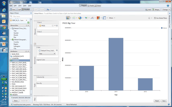
Figure 9
Number of offer packages by year
Step 9. For the second visualization, select line graphs from the graph panel (Figure 10). For the Y Axis, select PKGS and for the X Axis select Month as the time dimension to see the sales promotion rolled out by month.
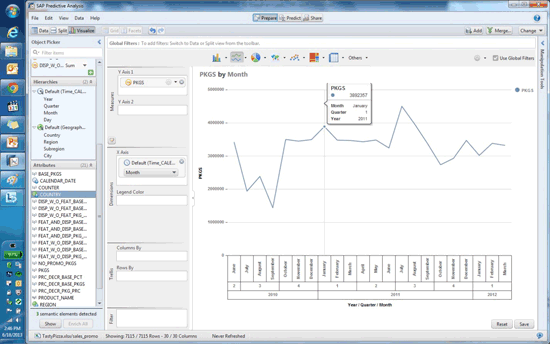
Figure 10
Line graph format
Step 10. For our example, there are two categories of pizza, vegetarian and non-vegetarian. Select PIE-Graph from the graph panel. The visualization shown in Figure 11 helps the business understand the number of promotions rolled out based on the category of product. This scenario also helps the customer understand the preference for products available in the market.
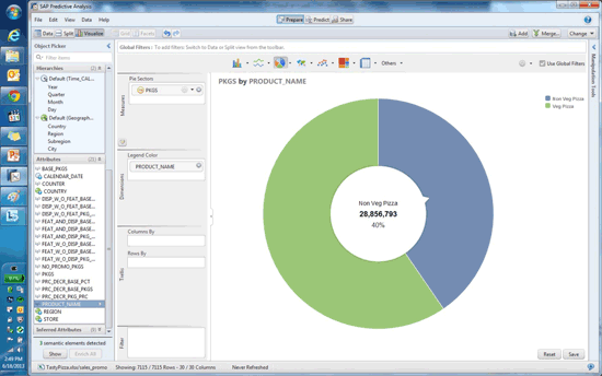
Figure 11
Pie graph showing customer preferences
Step 11. In Figures 12 and 13, the company can see where the promotion was rolled out and what the response was in that part of the country. In Figure 12 you select maps from the graph panel. Select Geography and then select the city from the drop-down menu. The map highlights the city from which the offers originated.
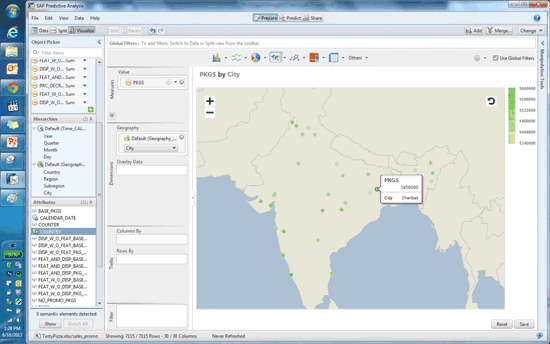
Figure 12
Select the city
In Figure 13, select Region under Geography and the map shows the regions of the country and the number of promotional offer packages rolled out in those regions.

Figure 13
Offer packages by region
Once you save by clicking the save button, the whole refined data set is saved. You can create different visualizations in addition to those explained here. You can save the visualizations after every step and view them later.
Section 2: Forecasting Sales Based on the Data
In this section of the case study, we forecast the sales based on the sales data from previous years. The data source here is Microsoft Excel to predict/forecast future sales.
Step 12. For this case study the data resides in different sheets. Therefore you repeat the actions in step 2 but select daily_sales in the Select sheet. Drop down to select the data for daily sales in the Predictive Analysis tool (Figure 14).
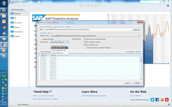
Figure 14
Select daily_sales
Step 13. Once the data is acquired you enrich it, shown in Figure 15. As explained earlier in Step 4, the tool has the capability to enrich the data according to the contents.

Figure 15
Enrichment option
Step 14. After the data enrichment you can easily see that the date dimension is further divided, with year, quarter, month, and day added as new columns to the data set (Figure 16).

Figure 16
New columns added
Step 15. You visualize the whole data set as you did in the earlier steps using a bar graph, taking the time dimension in the X Axis and the sales figures in the Y Axis. Figure 17 shows sales by month.
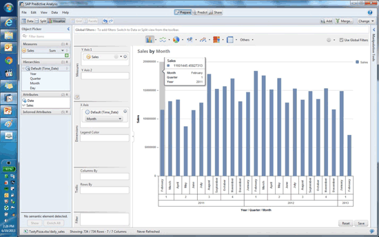
Figure 17
Sales by month
Step 16. Figure 18 is the graphical representation for sales by month in line graph format.
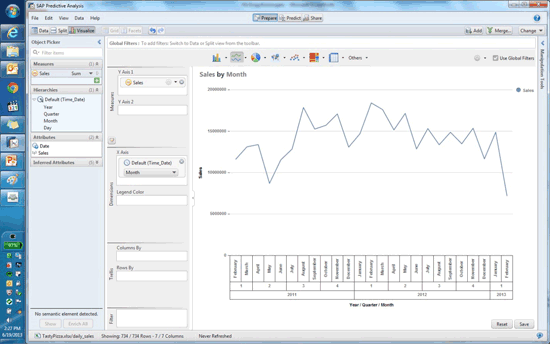
Figure 18
Line graph format
Step 17. Now you use some statistical algorithms to predict sales. To go to the Algorithm screen, click the Predict tab at the top of the screen shown in Figure 18. Then you see the system-provided algorithm you can use for analysis and prediction.
Once you select Predict you can see the data set already on the screen. Select the Triple Exponential Smoothing algorithm from the Time Series algorithms and double-click it. The algorithm appears on the canvas. Then you join the data set as shown in Figure 19. The screen shows the sequence of events of data processing for analysis.
Exponential Smoothing
Exponential smoothing is quite helpful in increasing the accuracy of predictions of promotional program or price change. Predictive Analysis comes with set of inbuilt algorithms, which are ready to use when choosing this method. For this case study, we are using Triple Exponential Smoothing, which is chosen typically when you sense some trends and seasonality in your historical data.
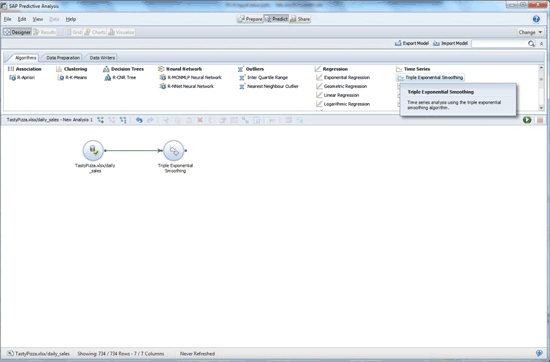
Figure 19
Algorithm for Triple Exponential Smoothing
Step 18. To use the algorithm you have to fill in some mandatory parameters that are used to calculate the result. To get to the parameters window, mouse over the algorithm to see the options. An icon appears when you mouse over the algorithm. Click Details and the parameter window appears (Figure 20). As you want to forecast sales, select Forecast for Output Mode. As you are predicting sales, the dependent column is Sales. If you have data for daily sales and want to predict the same for the next few years, select the period as Month and Periods to Predict as 12. Other parameters are automatically filled. There are three sections: Primary Properties, Enter Names for Newly Added Columns, and Advanced Properties. Visit these sections and change the values accordingly. After you fill in all the relevant fields, click the Save and Close button.

Figure 20
Select parameters for Triple Exponential Smoothing
Step 19. Now you need to run the algorithm on the present data set to get the prediction. With the Algorithms window open, hover your mouse over the desired algorithm. You get an option that says Run Till Here (Figure 21). Click it and the processing starts. After the activity is finished, you get a success message asking if you want to view the results. Select Yes to see the data set with new predicted values which are shown in Figure 22.
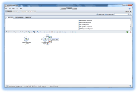
Figure 21
Click Run Till Here

Figure 22
Predicted values
Step 20. In Figure 23, the visualization of the data is changed from grid to charts and you see the visual distribution of the data. The line graph is the predicted data and the bar graph is the actual data.
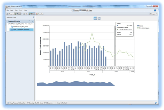
Figure 23
Data in chart format
With the sales trends now evident, the company gains a fair idea about where its sales will go in the next few years. Now it’s time to change the promotion strategy, change the product, or target different customer segments.
Sunil Mehta
Sunil Mehta is a solution architect at SAP. He received his master’s degree in Computer Management from Symbiosis in Pune, India. He is a certified SAP FI/CO/BOBJ consultant, working in analytics. During his career he has been associated with Accenture, IBM, Capgemini, and KPMG, and has worked in various roles, including as a consultant solution architect and a project manager.
You may contact the author at Sunil.Mehta@sap.com.
If you have comments about this article or publication, or would like to submit an article idea, please contact the editor.

Biswajit Biswas
Biswajit Biswas works at SAP GD and is a subject matter expert in SAP analytics. He has five years’ experience. He is proficient in the SAP BusinessObjects suite of reporting tools and SAP Data Services. He has been associated with development of Rapid Deployment Solutions for analytics on SAP HANA, focusing on the utilities industry.
You may contact the author at biswajit.biswas@sap.com.
If you have comments about this article or publication, or would like to submit an article idea, please contact the editor.