Learn how to measure the effectiveness of an SAP screen using the example of SAP’s time writing application user interface on the portal. Also learn about the improvements recently provided by SAP with the latest version of Cross-Application Time Sheet.
Key Concept
An application is deemed usable if it is user friendly — in other words, if it helps the user do his or her job. The usability of a software product is a critical success factor for its deployment. This factor increases in importance as the product is deployed to larger and more diverse groups of people. While an application program is precise and orderly, its usability is not always easy to define. Most people think this is a subjective attribute — something that developers and users have bickered about for ages.
What makes some software more usable than others? What can you do to make SAP system screens more usable so that users spend more time doing work than recording what they have done? After defining the concept of usability, the next step is figuring out how to measure it. I discuss this point in relation to the usability of SAP ERP HCM software, as well as how to improve it. By applying this concept to any SAP screen you are able to easily create a list of items that can fill any gaps that you have identified. Some of these improvements are easy to do through configuration, while others are more complex and require custom development. The key here is to know which one is which. Once that’s been determined, you can figure out how to get the most bang for your buck.
About SAP System Screens in General
The usability of an application varies depending on the application, its functionality, the user, and the device being used to drive the screen, as well as on the amount of time the project has to implement the SAP system. Here’s a simple example of this point. Entering time on a 800 x 600 resolution screen seems to be a very friendly application, but it does not seem very usable at all when you try to use it on your iPhone. For this reason, it is not only important to build usable applications, it is also equally important to prove that they are usable for the purposes for which they were designed.
Six Usability Tips for Software Applications
Various researchers have reviewed applications from a user’s viewpoint. There are many parameters that distinguish good applications from the not so good, but there is general agreement about the six main principles (Figure 1).
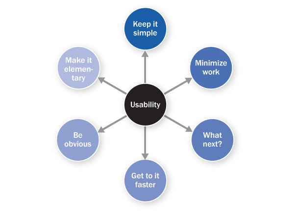
Figure 1
Six principles of usability
Here are the details of each of these principles. To illustrate my points, I am using the standard Cross-Application Time Sheet (CATS) regular screen from the SAP NetWeaver Portal (Figure 2).
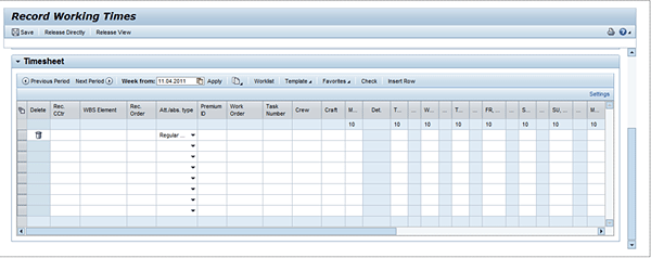
Figure 2
Standard CATS regular screen
Keep It Simple
Keeping it simple means ensuring that the application does not look too complicated. Use of different colors, fonts, page weights, page design, and layout all play a major role in keeping the application simple. Two things in the example (Figure 2) make the application more complicated than it should be:
- Too many columns that need to be entered (any more than three can prove to be cumbersome)
- Use of horizontal and vertical scroll bars (these should be avoided as much as possible)
Minimize Work
Minimal work means that you should configure the application so that it can be operated as efficiently as possible. Avoiding duplication of effort is the goal here. Looking at the standard CATS application you should minimize efforts by:
- Considering the fields on the screen. Which fields are mandatory and which are optional? Can the user determine this by looking at the fields? In this case, the answer is no. In CATS, at least one cost object must be populated to save time. The user only finds this out by entering a value and then clicking the save icon.
- Considering whether you need to copy a timesheet. Copying timesheets was not possible from the CATS regular portal prior to enhancement package 5. This is an important facility that is actually available from the GUI transaction to enter time in CATS classic (use transaction code CAT2). Users who work in a maintenance environment quite often have to split working hours over several projects or internal orders. Copying timesheets is a very useful feature that saves the user from having to repeatedly enter the same details (e.g., attendance type and cost center).
What Next?
An effective user interface does not need a manual — users can intuitively figure out how to navigate it and complete the desired business objective in the most efficient manner possible. In Figure 2, the need is to enter time, release time, and then submit time for approval. The problems are:
- This screen does not state where to go from here
- The screen does not provide any direction on how to correct time or deal with rejections (when an approver rejects the time entered)
A simple message that says “Once time is entered, your approver will be notified. If time is not approved for any reason your approver will get in touch with you via email,” would fix these problems.
Get to It Faster
A get-to-it quality of an application lets a user engage with it. For example, the application interacts with the user and confirms a time entry was saved or released when the user clicks the save icon. Two examples of this are:
- The message area on the screen helps the user by providing appropriate confirmations throughout the time entry process. This is available in the standard CATS regular application.
- If the user enters incorrect cost objects or attendance types, or if the number of hours for a work period exceeds 24, these errors are captured by standard CATS classic and regular. In most cases, however, this is not enough. Business logic typically requires further checks, such as checking to ensure that the cost center entered is of a certain type, or that the hours do not exceed budget. These have to be programmed through a user exit. SAP provides user exit CATS0003 to write code for these special validations. An added bonus is that these work in the same way from both the portal and the SAP GUI.
Be Obvious
A screen that is obvious does not require a complicated manual to explain how it works. This is the intuitive quality that good frontline applications have, and that helps users regardless of how often they use it. Two ways you can make choices more obvious are with labeling and scaling back choices. For example:
- One major aspect of an intuitive (obvious) application is the label. Too often you see applications that have fields named in techno-speak. In Figure 2, you see a field named Rec. CTR and another field named Rec. Order. For some it may be obvious that CTR is cost center, but for many end users (i.e., those who only use this screen to enter their time and have nothing to do with the configuration or maintenance of financial applications), it is not clear at all. An additional burden is the word Rec. itself. A reasonable guess is that it is an abbreviation of receiving, but what does it mean? This lack of clarity leaves users wondering: if there is a receiving order, where is the sending order? And how are they supposed to know if the order is a receiving one or a sending one?
- Another point worth noting in this screen is that every cell that records a day’s time has a duplicate. That is, the standard SAP portal in CATS regular provides Comment columns that can be used to record notes about the time entered. While having a place to capture notes is very useful, dedicating seven columns to capture this makes the screen look much more complicated than it is.
Make It Elementary
An elementary application simply means that it is a well-structured application — that there is a logical hierarchy in place that makes general sense. Two such examples are:
- Getting users back to where they came from. The portal application needs to have a link that takes the user back to the home page or the landing page from which the timesheet application was launched.
- Configuring logical pop-up applications. When configuring the portal, users can choose whether the window can be open simultaneously with other windows. Most implementations choose to open applications in independent windows, thus creating the possibility of multiple child pop-up windows being open at the same time. Users can find it very difficult to navigate through multiple pop-up windows and keep track of where they are and what they are doing. For example, a user launches the Working Time application from the landing page, which opens a new window but retains the landing page. After entering time in this new window, the user accidentally navigates back to the landing page. Having forgotten that he or she has already initiated the time application, the user clicks the link again and thus opens another time entry application. This causes error messages that say the record is locked. The easiest way to avoid these types of problems is to handle these while developing the application, and let the code specifically detect if the time entry application is already open — and, if it is already open, to not allow the opening of another child pop-up window, but instead take the user to the already open working time screen.
Using These Principles
Now that you know these six principles of usability, what do you do with this knowledge? You can use this information to evaluate an application to come to a qualitative assessment of how usable the application is. Each topic is analyzed to yield a user interface wish list — things that you can do to improve the usability of the application.
Here is an example of three opportunities for improvement derived out of the simple analysis I did above:
- Too many columns. The presence of many columns makes it difficult for users to focus on the time to be entered. Each type of user has different needs. Some users require a work breakdown structure to enter their time; other users enter their time only to internal orders. Each user needs to see only the column that pertains to his or her specific need.
- Mandatory versus optional entries. A great capability is the ability to see what is mandatory versus what is optional in the screen.
- Duplicative and unnecessary columns. Although entering comments is a requirement for many time users, the screen looks very crowded when each day is has a new column just for entering a comment.
I have prioritized this list, using three parameters:
- Impact (1 for low and 5 for high)
- Development effort (1 for very hard, 5 for very easy)
- Maintenance effort (1 for won’t survive upgrade, 5 for easily maintained through configuration)
A simple score is obtained by adding these parameters up for each task. Scores above 11 are quick wins, unless the effort is lower than 4. (This is just one example — you can determine your own criteria.) Here is a table to show my assessment of the three examples I listed above (Table 1).
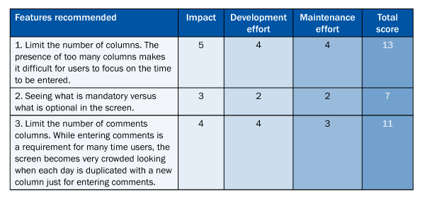
Table 1
Sample assessment criteria
Assessment numbers 1 and 3 clearly make it to the quick-wins list, while assessment 2 does not make the cut due to the huge effort it takes to develop. Assessment 1 is easily done through profile configuration using transaction code CAC2 (also available in older versions of CATS), while 3 requires some code to be written, using the Floorplan Manager for Web Dynpro ABAP in enhancement package 5. (This article does not discuss Floorplan Manager for Web Dynpro ABAP in detail. For more information about this, see the recommended reading at the end of this article.)
System Improvements with Enhancement Package 5
Now let’s look at how SAP has made usability improvements in the latest version of CATS (enhancement package 5). The screen in Figure 3 shows a typical enhancement package 5 screen for CATS. The numbered legends explain each point of improvement. (There is no number 1 in the screen because this step was eliminated with enhancement package 5.)
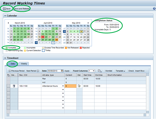
Figure 3
Enhancement package 5 screen improvements
- Improvement: Elimination of roadmaps. Earlier versions of the CATS portal had a roadmap that is fairly standard for SAP portal applications. It followed the strategy of entering data in one screen, confirming the data in another screen, and then displaying the confirmation that the record had been saved in a third screen. This roadmap makes sense for some infrequently used applications, such as a travel-booking tool, but for a time-writing application this meant using three additional clicks of the mouse. Removing roadmaps directly improves the process by both simplifying it and minimizing the effort required.
- Improvement: Combining the recording and releasing steps. This merging of two steps recognizes the typical workflow of a timesheet where a time-writer releases time as soon as it is saved. This makes it more user friendly as users typically don’t want to have to return later to release it. Again, this both simplifies the process and requires less work on the part of users.
- Improvement: Adding a complete calendar category. SAP added a new category in the calendar called complete, indicating that recorded hours are equal to target hours. Target hours are set by a person’s work schedule (infotype 0007) and are typically done in the backend. Having this simple feature makes it easy for time-writers to understand that his or her entry is complete for the day. This demonstrates the get-to-it and obvious categories of the application.
- Improvement: Including summary information in the context help area. This is already explained in the get-to-it category above. Specifically, SAP has provided default messages such as the pay period and the due date for the timesheet.
- Improvement: Providing copying timesheets capability. By giving users the ability to copy timesheets (as explained above), users can copy existing timesheets and quickly create new ones when the old and the new differ only slightly.
Recommended reading
- Nielsen, J. (1994b). Heuristic evaluation. Nielsen, J., and Mack, R.L. (Eds.), Usability Inspection Methods, John Wiley & Sons, New York, NY.
- Human Factors International (1996). 10 Usability Tips, www.humanfactors.com/downloads/10tips.asp
- SAP Library https://help.sap.com:
- SAP ERP > SAP ERP Central Component > Human Resources > Shared Services > Employee Self-Service > Employee Self-Service (WDA)
- SAP ERP > SAP ERP Central Component > SAP ERP Enhancement Packages > ERP Central Component Enhancement Package 5 > SAP ERP Cross-Application Functions > Roles > Business Packages (Portal Content) > Business Package for Employee Self-Service (WDA) 1.50; OR use this link: SAP Help
Deepankar Maitra
Deepankar Maitra has more than 25 years of consulting experience specializing in SAP-based solutions for human resources, supply chain, and reporting in multi-national companies around the world. He has successfully directed large implementation projects as solution architect, delivery manager, global lead, and country lead. His expertise lies in pragmatic harmonization of data and synthesis of processes using tools that improve process execution through quantum leaps in productivity.
You may contact the author at deepankar.maitra@accenture.com.
If you have comments about this article or publication, or would like to submit an article idea, please contact the editor.