Learn how to use the Self-Service Composition Environment (SSCE) in SAP Manufacturing Integration and Intelligence (SAP MII) 15.0 to quickly develop real-time analytics and monitoring dashboards by fetching data from multiple sources.
Key Concept
The Self-Service Composition Environment (SSCE) is a new feature in SAP Manufacturing Integration and Intelligence (SAP MII) 15.0 that enables you to develop real-time visualization dashboards using the visualization and data components developed in the SAP MII workbench without any coding.
I explain how to use the Self-Service Composition Environment (SSCE) in SAP Manufacturing Integration and Intelligence (SAP MII) 15.0 to quickly develop real-time analytics and monitoring dashboards by fetching data from multiple sources. To help you understand the workings of the SSCE, I walk you through the following sections:
- An overview of SSCE
- Initial steps to create a dashboard
- How to integrate with MII content
- Enhancing and customizing the SSCE
Note
Prerequisites for this article are knowledge of SAP MII catalog objects and the Plant Integration Catalog (PIC).
An Overview of the SSCE
SAP MII’s SSCE is a platform on which you can create real-time dashboards by dragging and dropping. The entire platform is built on SAP UI5; therefore, the resulting dashboard looks rich and beautiful. The SSCE caters to the needs of both technical and business users. Business users do not prefer to write cryptic code, but the technical users might want better control of their dashboards by coding. The SSCE can handle both.
Earlier businesses used to rely on their technical team to create dashboards and reports. These dashboards were normally HTML pages either designed by hand or with any of the front-end tools such as Microsoft’s Office FrontPage or Adobe’s Dreamweaver. JavaScript code was used to link all the HTML elements and get the data from SAP MII. Now, with the SSCE, you do not need any of those tools. You need neither the tools to create your HTML page nor any knowledge of JavaScript or any other UI scripting language. All you need is a desktop browser through which you would access the Self Service Composition Environment (SSCE).
The main advantage that the SSCE platform offers is the ability to create beautiful dashboards quickly in just a few clicks and dragging and dropping.
Note
The SSCE is only available in SAP MII 15.0 and above.
You can do a host of different things using the SSCE, including these tasks:
- Create dashboards using any SAP MII content (query templates, display templates, manufacturing data object (MDO) or key performance indicator [KPI] objects, and resource files), user interface (UI) elements, and tags from the PIC
- Configure the selected objects. The selected tags from the PIC can be positioned on images. For the selected tag, you can configure colors, graphics, and icons when the conditions match. A tag trend (line chart) is displayed when you move a tag to an empty cell on the SSCE.
- Display using different layouts of the SSCE
- Save the created dashboard for later use
- Customize the created dashboard by adding the saved content to the navigation tree
- Use the saved dashboards to share information
- Preview the created dashboard with either static or live images
- Secure your dashboards by assigning roles
I describe most of these features in detail later. First, I describe the tool itself.
The SSCE can be launched from SAP MII’s Admin menu under Content Development. You can also type in https://<server>:port/XMII/SSCE.jsp in your browser’s address bar. The link is set up by default. No additional steps are required to set up the link. Figure 1 shows the SSCE link under Content Development Category.
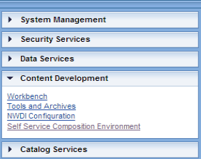
Figure 1
The SSCE navigation link
Clicking that link takes you to the screen in Figure 2.

Figure 2
The SSCE home screen
Note
Because the SSCE is built in UI5, it is compatible with Internet Explorer 9 and higher, Chrome, and Mozilla Firefox. SAP recommends that you use Internet Explorer 10 and higher as some of the functionalities do not work in Internet Explorer 9. See <https://help.sap.com/saphelp_nw74/helpdata/en/91/f072cf6f4d1014b6dd926db0e91070/content.htm>
When the SSCE is launched, the homepage of the SSCE is displayed (Figure 2). You begin the process of developing a dashboard in this screen.
The SSCE home screen includes two links: MY DASHBOARDS and DESIGN DASHBOARD.
The MY DASHBOARDS screen displays recently created or modified dashboards. You could also mark one or many of your dashboards as a favorite for ease of access. All dashboards created in the SSCE can also be added as navigation links that then display the link of the dashboard in SAP MII’s home screen.
DESIGN DASHBOARD is the main canvas or area in which you build your dashboard. It is very similar to the canvas of a painting on which you would paint. By default, the canvas is empty; you then add a layout, items, and images to make your dashboard.
The DESIGN DASHBOARD
The DESIGN DASHBOARD includes a number of buttons, tabs, and sections that help facilitate the creation of your dashboard (Figure 3).

Figure 3
DESIGN DASHBOARD layout
The DESIGN DASHBOARD contains four major parts:
- The left panel
- The right panel
- The layout tool bar
- The canvas area
The left panel of the DESIGN DASHBOARD contains all the file-handling actions in the form of icons (Figure 4). It is very similar to a File option in any application (e.g., Microsoft Word).

Figure 4
The file-handling icons in the DESIGN DASHBOARD’s left panel
The right panel of the DESIGN DASHBOARD contains all objects that can be dragged and dropped in the canvas. Four tabs in the right panel contain the following objects:
- MII – Content: Contains query templates, display templates, MDO or KPI objects, and resource files (the files that you would find under the WEB folder in SAP MII), such as images, web pages, scalable vector graphic (SVG) and ShockWave flash (SWF) files.
- PIC: Displays the PIC screen that you would have configured in SAP MII.
- UI Elements: This tab consists of basic UI elements that are provided out of the box by SAP MII. These elements help you create a basic form or drill-down menu if there is a requirement for one of these elements.
- Clipboard: This section finds its use when you come across the merge scenario. For now, keep in mind that as the name suggests, clipboard acts as a temporary storage to keep your objects and configurations.
The layout toolbar section contains the file name of the dashboard, a few buttons (e.g., Undo, Redo, and Merge Cells), and a Live Mode check box to toggle between the live and offline modes (Figure 5).
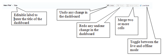
Figure 5
The layout toolbar
The canvas area is the main drawing area of the dashboard (Figure 6).

Figure 6
The DESIGN DASHBOARD canvas
In Figure 6, note that the main area is divided in the form of a grid. Each cell in the grid can hold one SAP MII object. You can combine two or more cells to form a bigger cell using the Merge Cells button.
The canvas’s layout can be created only when you are creating a new dashboard. Therefore, extra care should be taken to preempt the layout before creating the dashboard. Because you can only merge multiple cells and not divide them, you can start by having many cells and then merging them to form the layout you prefer.
Now I explain how to create a dashboard.
Initial Steps to Create a Dashboard
After you launch the SSCE, click the create dashboard  icon on the left panel. This action opens a pop-up screen in which you choose the type of layout you want to create (Figure 7).
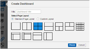
Figure 7
The Create Dashboard screen
Notice that after the title field, you have an option to select either a Standard Page Layout or a Custom Layout. The Standard Page Layout contains a predefined set of layouts that the SSCE provides. The Custom Layout, on the other hand, provides you with the option of entering a number of rows and columns that you need for the dashboard (Figure 8).
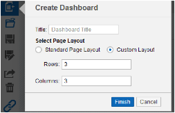
Figure 8
The Custom Layout option in the Create Dashboard screen
Choose any layout you prefer to work with and click the Finish button. If you had chosen a layout with three rows and three columns, your dashboard would look similar to the one shown in Figure 9.
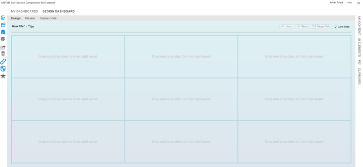
Figure 9
A layout created with three rows and three columns
You can further customize this layout by merging or unmerging the cells. To merge cells, select the cells you want to merge by pressing or holding down the Ctrl key on your keyboard and clicking the desired cells (Figure 10). Note that only interconnected cells can be merged.
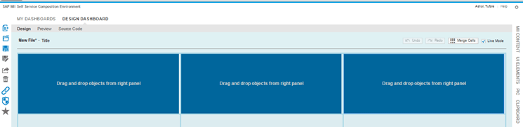
Figure 10
Cell selection
After you select the cells (for example, the top row in Figure 9), click the Merge Cells button in the layout tool bar (Figure 10). The merged cells appear in the next screen (Figure 11).

Figure 11
Merge cells
You can click the Unmerge button to unmerge the cells and return to the earlier layout.
Note
There is only one button for merge and unmerge. When a few cells are selected for merging, the button label reads Merge Cells. When a merged area is selected, the button label reads Unmerge.
Alternatively, you can also click the Undo and Redo buttons to edit your layouts according to your requirements.
After you create your layout, click the save icon in the left panel. This action opens the screen shown in Figure 12. Select the folder under which you intend to save the file. The path would be populated automatically when you select the folder. After you select a desired folder, click the Save button to save the dashboard.

Figure 12
Save the dashboard
Note
One feature exclusive to the SSCE is the ability to save your work in a MyContent project. This predefined project is available to every SSCE user. This project is not displayed in the workbench and the dashboards created are only visible to you.
Now that you know how to create a dashboard and save it, you are ready to learn how to add content to it. I now describe the various features of SAP MII’s SSCE and also explain how different objects can be integrated.
Figure 13 is an example of the final dashboard. The dashboard contains two charts (AssetHealth and AssetStatistics) coming from different sources and an image of a plant on which several tags have been placed that bring real-time values from the shop floor and the ERP system.

Figure 13
An example of a completed dashboard layout
How to Integrate the SSCE with SAP MII Content
A typical dashboard consists of a few charts and tables that receive data from either a shop floor, an ERP system, or SQL tables. In my example, assume that the required query templates and display templates have already been created in SAP MII’s workbench. I now explain how to integrate these templates in the SSCE and how to create a dashboard from these integrated templates.
Adding Query Templates to the SSCE
To add query templates to the SSCE, you need to complete the following steps:
- Click the MII Content tab in the right pane bar (Figure 14).
- After the pane is expanded, you notice three sections. Select the first section that reads Query Templates.
- Locate the project under which your templates are present and expand the project until you reach your query template.
- Click the query template and drag and drop it to any of the cells in your existing layout.
- Repeat the same process to add any number of query templates to your dashboard.
- To make it easier to search for templates, type in a few letters of the name in the search bar. The SSCE then suggests matching items to search for.
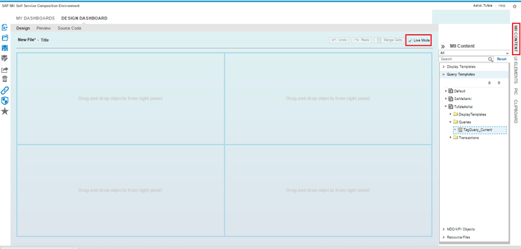
Figure 14
Add query templates
After you complete these steps, the query templates are added to the dashboard successfully.
Note in the Figure 14 that there is a check box called Live Mode. This check box enables you to render the objects either in live or offline mode. In live mode, the query templates can be visualized in the Design tab itself. However, if the Live Mode check box is not selected, then when you drag and drop an object, an image representing the corresponding object is displayed. You then need to go to the Preview tab to view the result. This feature is particularly useful when you have a slow network bandwidth and do not want to load the browser with live objects. For my example, check the Live Mode button so that the objects are visualized as they are dropped. Figure 15 shows the query templates visualized in live mode.

Figure 15
Query templates are visualized as tables by default
After the query templates are added, then you can configure them according to your business needs. For example, you may want to plot a chart for one of the tables. You can do that by completing a few steps. To make the table look like a chart, click the configure visualization icon (Figure 16).

Figure 16
Click the configure visualization icon
This action opens a pop-up screen (Figure 17). In the Select Type field, select Chart from the pull-down list of options. In the Select Chart field, select Line from the pull-down list of options. You can set the optional parameters for refreshing the chart automatically.
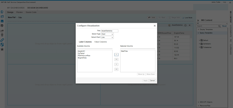
Figure 17
Configure visualization
Click the Label Columns tab (Figure 17) and select the DateTime column. Move it from the Available Column to the Selected Column by clicking the add icon in the middle of Figure 17. Because the line chart is a time series chart, DateTime is the x axis. Similarly, you can choose the Value Columns for which the chart would be plotted. The procedure is same as before. When you are finished, click the Apply button for the changes to take effect. Figure 18 is an example of the visualized line chart.

Figure 18
The visualized line chart
Notice that there is another icon (Figure 18) that is now visible in the cell in which you have a chart. This icon called configure display parameters is used to further configure the chart according to your needs. After you click this icon, a pop-up screen appears in which you can change the chart type, add refresh rates, and add control limit lines using this button. For example, you can change the chart type to a bar chart (Figure 19).
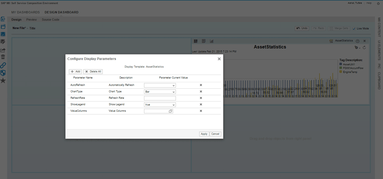
Figure 19
Configure display parameters
You can click the + Add button to add new parameters or click the X Delete All button to delete all the existing lists of parameters or use the cross (X) icon to delete selected parameters. Click the Apply button to apply the changes. The updated chart appears in the next screen (Figure 20).

Figure 20
Change the chart type
Adding an MDO to the SSCE
Your first step in creating the dashboard is complete. The next step is to add an MDO. MDOs store data that can come from either the shop floor or an ERP system or both. You can create any data source to the MDO and then later query the data like a table.
MDOs become really useful while creating dashboards because if you expect a huge amount of data, it is better to cache it in SAP MII to enable faster response times. I now explain how to add and configure an MDO in the SSCE. You may want to save the dashboard at this point. It is a good practice to save the dashboard after each logical step to prevent loss of data.
Adding an MDO to the dashboard is very similar to adding queries or charts. Choose the MDO file you would want to add to the dashboard by clicking the MII Content right pane bar and then expanding MDO/KPI Objects. Browse through the projects and select the MDO you want to work with (Figure 21).
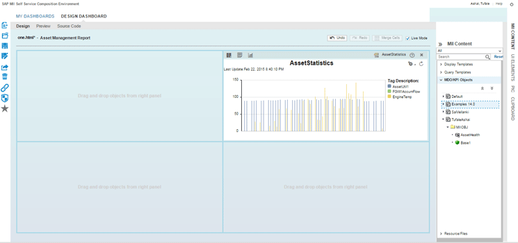
Figure 21
Add an MDO to the dashboard
Select the MDO you would want to work with and drag and drop the object in an empty cell. In this case, it would be the first cell in the dashboard. Once you have dragged and dropped the file and since the Live Mode is checked, you see a table that contains the MDO Data. As in a query, similar pop-ups appear to change the visualization to charts and to configure the query.
The MDO that is used in the example contains data in a single row as it is real-time data coming from the shop floor and ERP for an instant of time. Therefore, in Figure 22, you notice the table with a single row.

Figure 22
MDO rendering
Now I explain how to change the visualization of the MDO. This step is similar to the one for changing visualization for charts. First, click the configure visualization icon in the cell (refer back to Figure 16). In the Select Type field of the screen that opens (refer back to Figure 17), select Chart from the pull-down list of options. In the Select Chart field, select Bar from the pull-down list of options. Choose the label and value columns depending on the data you are receiving from the MDO. If you have data similar to the one in the example, then keep the Label Columns as DateTime and Value Columns as the other columns in the MDO. You may want to change the title of the chart too depending on the use case. When you are finished, click the Apply button (refer back to Figure 17). The dashboard now looks the one shown in Figure 23. Click the save icon to save your dashboard.

Figure 23
MDO data as a chart
Your completed layout represented in Figure 13 contains a large image on the right. This image represents a plant, and on this image, the tags from the PIC are dragged and dropped. However, your present dashboard does not have enough space to accommodate the image. Therefore, you need to reorganize the dashboard.
Every object in the cell can be moved from one cell to another by clicking the file name (e.g., AssetStatistics) in the right (Figure 24).

Figure 24
Move an object from one cell to another
Hovering over the file name changes the mouse pointer to a four-way move arrow. Click and drag and drop the object to a different cell. In my example, the drop target (the empty cell to where you would move the object) is the first cell in the second row (see Figure 23). After you finish clicking and dragging and dropping the object to a different cell, you have both the charts on the left and two empty cells on the right. You now merge these two empty cells and make space for your image. After you merge these cells, the dashboard looks similar to the chart shown in Figure 25.

Figure 25
Reorganize the dashboard
Adding Images to Dashboard
As you did with other objects, you can also drag and drop the image to the dashboard. To do this, click MII Content, click Resource Files, and select the image you want to drag and drop (Figure 26).
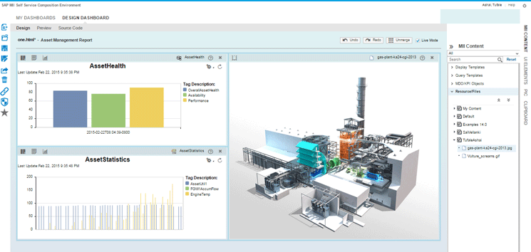
Figure 26
Drag and drop an image
The images can either be used as they are or you can create display areas on the images that can then later be used to change the color according to the incoming value. For example, you have a turbine generator in the image and you would want to monitor its output. You can create an area around the turbine and make it change color according to the incoming value. To do this, once the image is dragged and dropped, click the configure graphics icon. A pop-up screen opens with a magnified image (Figure 27). You can start creating areas now. You have to create a closed polygon. You do this by clicking various points in the image and creating an area. Click the OK button after each time you apply details to an area of the image. The area is complete when you close the shape by again clicking the starting point.

Figure 27
Create areas on an image
As soon as you close the area by clicking the starting point, a pop-up opens (Figure 27) in which you can enter a name and select the color and opacity for the newly created area. After you enter this data, click the Apply button. The updated image looks like the one shown in Figure 28.

Figure 28
The updated image
Consider saving the dashboard now. You would see the colored area created on the images when you go back to the normal view. As of now, these areas do not do anything. The next section of the article explains how to use these areas and also many other features of the SSCE when you integrate your dashboard with the PIC.
Integrating PIC Objects for Real-Time Monitoring
The Plant Information Catalog (PIC) was one of the most important features in SAP MII 14.0. It enables users to integrate tags from various historians or data sources and build a single unified catalog representing a plant. Then, a couple of months later, SAP released SAP MII 14.0 Support Package 04. In SAP MII 14.0 Support Package 04, one of the features was the ability to integrate the PIC with ERP hierarchies. This made the PIC all the more powerful as the PIC can now integrate both top-floor (ERP) and shop-floor (plant systems). This feature enables users to build a catalog similar to SAP Production Planning and Plant Maintenance (PP/PM) hierarchy in just a few clicks and then map the measurement points to actual tags in the shop floor.
In SAP MII 15.0, the PIC can also be integrated with SSCE. This integration enables users to represent the tag information in more than one way. When you drag and drop a tag from the PIC to SSCE’s cell, you can do one or more of the following tasks:
- View trends in the form of line charts. You can add multiple tags to form multiple lines in the same chart.
- Render real-time values on an image. You can also change the way the value appears by using various graphical icons and customized images.
- Give rules to your tags to raise alerts or change colors when the values cross the control limit.
- Assign an area to your PIC tag. This feature enables you to change the color of the area according to the tag value and hence make a normal image look dynamic.
The PIC hierarchy is present in the PIC tab of the right pane bar. Adding a tag to the dashboard is very similar to adding any other object in SSCE. Open the PIC pane, expand the Root group, and browse through the hierarchy to find the tags you want to work with. After you select the tags, drag and drop the tab in the cell. When you drag and drop the tag into a cell in SSCE, two things happen:
- If you drag and drop a tag into an empty cell, by default the tag is rendered in trend mode. This means that the tag is visualized in the form of a chart.
- When you drag and drop a tag into a cell in which there is an image, then by default, the tag is rendered in current mode. This means that the tag displays value or dynamic graphics according to the current value of the tag. The SSCE uses SAP Plant Connectivity 15.0’s WebSocket functionality along with SAP UI5’s out-of-the box support for WebSockets to render real-time data on the dashboard.
You can toggle between these two modes using the trend mode icon. However, before you start adding the tags to the dashboard, you need to first set up the communication between the SSCE and PIC. Because all PIC tags are connected to SAP Plant Connectivity, you need to establish a seamless connection between the SSCE and SAP Plant Connectivity. This can be achieved using WebSockets. In the next section I show you how to configure WebSockets in SAP Plant Connectivity and in SAP MII. For more information regarding WebSockets, you can refer to SAP Plant Connectivity’s documentation.
Configuring WebSocket in SAP Plant Connectivity and MII
The WebSocket network protocol, in accordance with specification RFC6455, allows a high-performance, network-resource-efficient communication between a WebSocket server and a web application configured as a WebSocket client.
SAP Plant Connectivity 15.0 supports WebSocket technology to enable the transfer of data between SAP Plant Connectivity and SAP MII. This is a bidirectional communication between the client and server. In SSCE, when you drag and drop a tag in current mode, the browser becomes the client and subscribes to the server that is the SAP Plant Connectivity instance. Because each tag in the PIC is connected to an SAP Plant Connectivity Connector, the SAP Plant Connectivity connector in SAP MII has a special field that tells the browser which port to connect to enable WebSocket communication.
To enable WebSocket communication, you first need to have SAP SAP Plant Connectivity 15.0 installed. Next, you configure the agent in the SAP Plant Connectivity to act as a WebSocket server.
These are the steps you need to follow while creating a WebSocket listening SAP Plant Connectivity agent:
- Create an SAP Plant Connectivity agent instance and set the port type as SAP MII. You could create an agent instance of any type depending on your source of data. The data source could be from OSISoft PI server or any other OPC Data Access or Historical data access system. However, once the agent instance is created, you need to select the SAP MII check box under the Port Type section in the Query Ports tab (Figure 29).
- In the Query Ports tab, check WebSocket Server along with the already selected SAP MII option (Figure 29).
- On the right pane, select XML as the message format and Unsecured Protocol in the connection settings. You also need to provide the SAP Plant Connectivity host and a valid port for WebSocket communication.
- Click the create destination server.
- Because WebSocket communication is like notifications sent from SAP Plant Connectivity to SAP MII, create a notification for your agent by giving it a name. Make sure the Template check box is selected.
- The last step is to create a destination system and select this destination system on the Destination tab.
- When you are finished, restart your agent and check if it is running.

Figure 29
WebSocket configuration in SAP Plant Connectivity
The next step is to make sure the correct WebSocket port is added in SAP MII’s SAP Plant Connectivity Connector. In SAP MII’s Administration Menu, expand Data Servers and click the Data Servers folder. Create an SAP Plant Connectivity Connector to communicate with your SAP Plant Connectivity agent. Make sure that the correct port is entered in the Web Socket Port field (Figure 30).

Figure 30
The WebSocket port in SAP MII
The WebSocket connection for the PIC is complete and the tags can be used in the SSCE to get the current value from SAP Plant Connectivity.
Adding Tags in Trend Mode
As discussed earlier, the default mode in which a tag is rendered in an empty cell is the trend mode. A line chart with the tag’s values is displayed (Figure 31). You can add multiple tags in the same cell to combine the chart into one. You can configure the chart by clicking the configure visualization icon. You can configure the outgoing query by clicking the configure query icon. These configurations are very similar to those I described in the steps for query templates.

Figure 31
PIC tags in trend mode
Adding Tags in Current Mode
When you want the tag to display its current value either as text or some graphics, you use the current mode. By default, if you drop a tag on an image, the tag is added in current mode. Otherwise, you can use the trend mode icon to change from trend mode to current mode. When you add a tag in current mode, it looks similar to the image shown in Figure 32. Clicking the tag reveals two options: one to configure the tag, and the other one to delete the tag from the cell.

Figure 32
A tag in current mode
Configuring Tags in SSCE
The tag configuration pop-up screen consists of three tabs: Rules, Display, and Events. Each tab has a specific purpose.
The Rules tab is used to set the rules of display of a tag value. For example, if you want to display the value in green when the value is greater than 80, then you click the add icon to add a rule.
The Operator column Rules Table changes according to the data type of the tag. The rules support three formats of tags. They are strings, number (integer, float, double), and Boolean. This depends on the data type of the tag you have added from the PIC. The data type of the tag can either be set in the OPC server from where it is being read or in the PIC’s properties.
The value in the Value column in the table could be your own value or you can choose from one of the standard metadata options by using F4 help. In the Color column, choose the column according to the rule. For example, you might select green.
The Graphics Type column is used to display a small icon to represent the value. If the graphics type is selected, then the adjacent Icon column is disabled and vice versa. The Icon column is used to add custom icons for a tag.
Figure 33 is an example of how to set the rules for a tag.

Figure 33
Add rules to tags
You can also drag and drop the tag into an area that has been created on the image. When you do this, the Graphic Type column has the area name assigned to the rule by default. Therefore, the areas that you created earlier are used along with the PIC’s tags to make the image dynamic. The configuration looks similar to the screen shown in Figure 34.
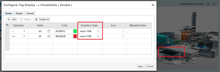
Figure 34
Add rules to tags for an area in an image
The Display tab is used to alter the display settings of the tags. You can modify the name of the tag, alter the maximum decimal places to display, add a unit for the tags, and change the size of the text. You can also choose whether or not to display the tag name, value, or unit. All the fields in the Display tab are disabled if the graphic type is the area on an image. Therefore, the tags are highly customizable. If you want to customize further, then you can use the Events tab to write JavaScript functions for your tags.
You can experiment by adding as many tags as you want on the image. SAP MII supports various image formats, such as JPG, PNG, GIF, or BMP. For example, in the dashboard that you were building earlier, I have added six tags to display the header information, changed the color of the area according to the rule, and showed the running status of the turbine and the transformer. Figure 35 shows the placement of tags in design view and its output when previewed.
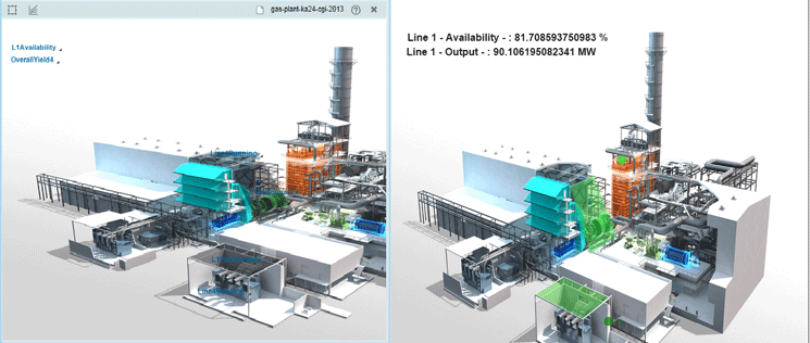
Figure 35
Dynamic PIC tags
After you add the tags, your final dashboard now looks like the image shown in Figure 36.

Figure 36
A complete dashboard
You can now save the dashboard and launch it in a new window by clicking the launch icon  . In the URL of the window, you can change the refresh interval of the SAP Plant Connectivity tags by changing the value of tagRefreshInterval property. By default, the value is 20 seconds. You have sucessfully built a dashboard using the SSCE without writing a single piece of code. Figure 37 shows an example of a completed dashboard.
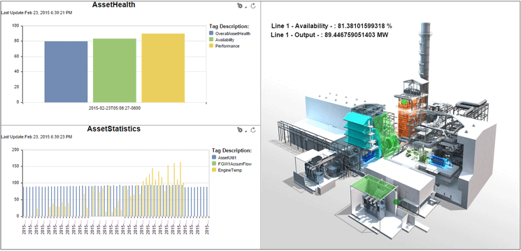
Figure 37
Final dashboard on launch
However, if you want to do some customization to make the dashboard look better, you can do this by using the Source Code tab under DESIGN DASHBOARD. The next section requires basic knowledge of HTML, JavaScript, and jQuery.
Customizing the Dashboard Using the Source Code Tab
If you look at the finished dashboard in Figure 37, you notice that it is plain and lacks character. However, the dashboard can be further customized. All you need to do is add a little bit of code in the Source Code tab (Figure 38). You can add a custom header to the page, change the background color, and add a company logo to your page using the editable area in the Source Code tab. It is not mandatory to use the Source Code tab. If you are satisfied with the way the dashboard looks before any customization is done to it, then you do not need to write any code at all.

Figure 38
The Source Code tab
You can click the Edit button to start writing your custom code. Don’t worry; your custom code does not corrupt the existing code. If you make a mistake somewhere and want to clear all the custom code you have written, you can just click the Reset button. Clicking the Edit button splits the source code area into two. The left part has the source code, and the right side has code that can be edited. Here, you can add your own code.
After you add the code, click the Apply button to add the code to the existing source code. You can also add your own JavaScript and CSS files. To do this, click the Add Include(s) button in the editable part of the code. You can also use the Script Assistant to help you write the code in case you now want to manipulate the charts and query templates in the dashboard.
Start modifying your dashboard by adding a header on the page. Use a combination of jQuery and JavaScript here to change the dashboard. To add the header, insert <H1> tags in the body of the HTML by adding the code shown in Figure 39.
$("body").prepend( "<div id="pageTitle"><H1 style="float: left; color:red">Corbett Fossil
Plant - Daily Report</H1></div>" );
Figure 39
Code to add a header to a dashboard
The code in Figure 39 searches for the <body> tag in the HTML and prepends my custom <div> tag to its content. Similarly, you can change the background color of the page by using the code shown in Figure 40.
document.body.style.background = 'lightblue';
Figure 40
Code to change the background color of a dashboard
You can wrap the code shown in Figure 40 inside a function and then call this function when your HTML document is ready. The complete code to add the title and the color is shown in Figure 41.
$(document).ready(function() {
        alterPage();
    });

function alterPage(){

    $("body").prepend( "<div id="pageTitle"><H1 style="float:left;color:red">Corbett Fossil
 Plant - Daily Report</H1></div>" );
    document.body.style.background = 'lightblue';
}
Figure 41
Code to add a title and color to a dashboard
You can copy and paste this code in your source code tab’s editable area (Figure 38). Click the Apply button and then click the save icon to save the dashboard. Launch the dashboard in a new window or a new tab. See if the changes suit you. If not, you can go back and re-edit the code you have written. Although it is possible to preview your code modifications using the Preview tab, I suggest using the Launch options as it becomes easier to debug your code or CSS using your browser’s developer tools.
You can link one chart in the dashboard to another and create a drill down. You can also navigate to another page when you click a chart or a custom-made button. The customizations are limitless. After you have designed your initial dashboard, you can modify or customize it in any way you want to satisfy your business needs.
Note
SAP released SAP MII 15.0 Support Package 03 in January 2015. This service pack contains many more features in the SSCE and in SAP MII. If you are planning to install SAP MII, make sure you use the latest service pack to take full advantage of SSCE’s features.
Tufale Ashai
Tufale Ashai is a senior IT consultant at Fujitsu Consulting India with approximately six years’ experience in the IT industry. He is currently working on providing SAP MII-based solutions.
Tufale was a member of the SAP MII Product Development Team at SAP Labs Bangalore and has worked on releases 12.x, 14.0, and 15.0 of SAP MII as a senior developer.
You may contact the author at tufyle@gmail.com.
If you have comments about this article or publication, or would like to submit an article idea, please contact the editor.