Learn how to create informative desktop and mobile-device dashboards with SAP BusinessObjects Dashboards by enhancing the way data is presented in charts. Learn the difference between desktop and mobile-device dashboards, and how this affects their design. Gain some tips and techniques to overcome any unsupported components when developing a mobile dashboard.
Key Concept
Dashboard design is an art that requires designers to provide end users with information in such a way that they get the maximum value from it in the way it’s presented. The design of dashboards should take into consideration the needs of the target audience and determine, from the outset, the best way to present the data, either on a desktop or a mobile device. A simple and naturalistic design enhances the overall user experience and leads to a better understanding of the displayed information.
Creating dashboards is an art. It is not just displaying some charts together after linking them with data. The main idea of the dashboard is to help the targeted users get as much information as they can from the presented figures. A clear, easy to understand dashboard design is key. I cover the best practices for creating informative desktop and mobile-device dashboards using SAP BusinessObjects Dashboards (formerly known as Xcelsius). First, however, I provide you with an overview of the salient differences between the two types of dashboards: desktop and mobile-device dashboards.
The Difference Between Desktop and Mobile-Device Dashboards
You can use SAP BusinessObjects Dashboards to create desktop or mobile-device dashboards. You need to determine at the outset of the dashboard design process which device is to be targeted—mobile or desktop. This is very important because the differences between desktop and smart devices are stark. Desktop devices are powerful and capable of displaying rich dashboard content with stunning visual presentation, while, on the other hand, smart devices have a limited memory and resources. For this reason, you need to be aware of these differences when designing a mobile dashboard for smart devices. You need to make sure that the information for the mobile device is displayed in a simple and clear way, and that it can be accessed as well.
In addition, the targeted users for desktop and mobile dashboards are different. You can use a desktop dashboard to display many key performance indicators (KPIs), charts, and metrics, but when information is displayed on a mobile device, it may need to be limited and focus only on the most important and critical ones due to space (screen) constraints. However, some users need to be able track and monitor the critical KPIs on the go using smart devices, so the decision about which information to gather and how it’s displayed is a critical one to make at the outset.
You also need be cognizant of dashboard size. For example, you don’t want to make it so large that it cannot be loaded on a mobile device because it requires too much memory or takes too long to load. A common problem with designers is that they use large images, icons, logos, and backgrounds, all of which increase the size of the dashboard. Response time is another key factor to consider when designing mobile dashboards. You need to track the query’s performance and the size of the data transferred across the network to make sure that you are not overloading it, which results in slow response time and performance issues.
SAP BusinessObjects Dashboards use Flash technology to display desktop dashboards, but it uses HTML5 to display mobile dashboards. Therefore, not all dashboard components are supported to be displayed on mobile dashboards. To make sure that both of these requirements are met, you need to check the Mobile Compatibility section and use it to track supported and unsupported mobile components. This section also helps you keep track of supported connections and to see warnings about any unsupported features. (I discuss this feature in more detail later in the article.) To access this panel from the SAP BusinessObjects Dashboards tool, follow menu path General > Component > Unsupported Components and then review any unsupported elements that are listed.
Best Practices for Creating Informative Dashboards Using SAP BusinessObjects Dashboards
In this section I discuss the many aspects and best practices for creating rich and informative desktop and mobile dashboards. Dashboard components can display the data in many ways. I show you how to focus on and select the best way to present your information, and how to use the dashboard features of SAP BusinessObjects to get the maximum value from your information. I focus on the information itself rather than its visual representation. A simple dashboard with natural colors can deliver more insight than a dashboard full of colored indicators and unnecessary and unclear styling.
Adding Value to Dashboards
In this section I cover how to create a better dashboard. There are some easy ways to create better-looking, clear dashboards, which I discuss in the following sections, including these design specifics:
- Adding data labels to charts
- Adding tables to charts
- Adding legends to charts(to highlight important information)
- Adding values and series names
- Making bar and column charts more informative
The main purpose of a good dashboard design is to help users get as much information as possible from the display of data. This is achieved by presenting charts and indicators in a clear and understandable manner. Indicators are a good way to highlight good or bad performance, behavior, and patterns. The most famous indicator uses traffic light colors (red, yellow, and green). Using colors indicators works perfectly on both a mobile-device or desktop screen.
According to author Stephen Few, dashboard users may be lost while using a dashboard full of indicators, unnecessary styles, and misleading visuals. Simplicity is the key feature that you need to consider when designing your dashboard to maximize user experience. You need to rethink how the human eye translates colors and figures. In this section I explain how you can add more information to your dashboards and direct the user’s eye to the most important and critical information. A good tip for testing your dashboard design is to convert your dashboard to grayscale and check it and see if you can still see and understand the information behind it. Later in this article, I show how to do just this.
Adding Data Labels to Charts
In this example, I show how to display sales by region in a pie chart. Figure 1 shows two examples, one in color and the other in black and white. I show how to create the original colored version as well as the grayscale one, and how to display data labels to make this chart more informative, even when it’s in black and white. Remember, if you can get the desired value from your dashboard even if it is in grayscale, then only a little effort and focus are required to translate the dashboard. This also means the design is simple and natural.

Figure 1
An example of color and grayscale pie charts showing sales by region
To enable data labels, you need to open SAP BusinessObjects Dashboards and create a simple pie chart based on dummy data (Figure 2). Select the pie chart (1) to display the chart properties in the properties panel on the right (2). Click Appearance and then the Text tab (3). Under the Text tab select the Chart Title, Sub Title, Legend, Mouse-Over Values, and Data Labels check boxes (4). After you select the Data Labels check box, the Label Contains section opens at the bottom of the screen (5). Select the Category Label, Value, and Percentage check boxes and then click the Preview button (not shown) to preview the dashboard.
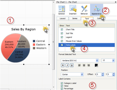
Figure 2
The Appearance tab in pie chart properties
The chart looks like the image in Figure 3 when it’s converted to grayscale. You can use any photo-editing tool to snip the graph to convert it to grayscale.
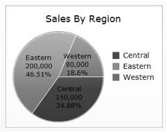
Figure 3
A grayscale image of a pie chart with labels
To further enhance the display of the chart you can take these two additional steps (shown in Figure 4):
- Change the color of the Data Labels from black to white (1).
- Under Position, set the X field to 12 for the offset (2).

Figure 4
Steps to enhance the pie chart
Click the Preview button to preview your dashboard again and convert it to grayscale (as you did previously) to see the pie chart as displayed in Figure 5. In Figure 5, you can easily check to see if the information, now in grayscale, is still as easy to read and decipher as when it’s displayed in color.
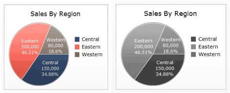
Figure 5
Comparison of sales-by-region pie chart in grayscale and in color
Adding Tables to Charts
Another easy way to enhance the display of your data is to use charts with tables. You can
Use any one of the following dashboard components to display tabular data, but each comes with its own plusses and minuses:
- List view: This is one of the selector dashboard components that you can use to display tabular data. The main disadvantage of this component is that you cannot use alerts to highlight good and bad records. This component can be used to display tabular data in mobile dashboards as well because it is one of the supported mobile components.
- Scorecard: A scorecard is a list view with powerful alerting capabilities. You can alert records with color, with icons, or with both. One of the main advantages of the scorecard that it is also supported on mobile dashboards. I go into more detail about this option later in the article.
- Hierarchical table: A hierarchical table is a type of list view, but you can show hierarchical data (like regions) in a tree view. You also can expand and collapse nodes, but you cannot use the alert feature with this component. This component is also not compatible with mobile dashboards.
- Spreadsheet table: This component is the same as the scorecard, but its functionality is more limited. You still can use it as a selector and you can use the alert feature, but you can’t sort records. You also have limited control of display features such as which grid line to display. This component also is not compatible with mobile dashboards.
- Grid: This component is used to display tabular data. You can use the alert feature with it and you can control the display of the data. You cannot, however, use it as a selector and it is not compatible with mobile dashboards. You can find this component under the Others category in the Components panel.
Figure 6 shows an example of how to display a line chart along with a table.

Figure 6
A line chart showing sales by region with a table listing actual and targeted sales and achievement percentages
Tips for Highlighting Important Information in Dashboards
There are many ways to emphasize important or quick-changing information in dashboards. In this section I discuss some ways to highlight certain information using color, icons, regions, and labels.
Use Color
A good first tip is to use color (which translates into shades in grayscale) to highlight more important information in an image. In the scorecard in Figure 7, you can see that the eye-catching colors that highlight the important sales data (that requires immediate action) on the left is lost when it’s converted to grayscale on the right.
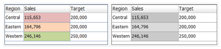
Figure 7
Scorecards in color and black and white
To fix this issue you can use icons to add interest and reinforce the grayscale indicators. These icons can be used to support all the color indicators or (as recommended by Stephen Few), you can highlight only those critical items that need action. Follow these steps to add icons to a scorecard.
Select the scorecard to which you want to add icons, and display its properties. Then open the Alerts section, shown as step (1) in Figure 8. Select the All Columns and the Sales check boxes (2), as the Sales column is the one you want to highlight. In the Alert Values section select the As Percent of Target radio button (3) and enter the appropriate percentages to configure the alert values and target in the two fields to the right. In the Alert Thresholds section, disable the Enable Auto Colors check box (4). In the Enter a value section, select the icon you want to display beside each threshold and select the corresponding check box under the Add button (5). When you’ve made all your selections, click the Add button to save your changes to the dashboard display.
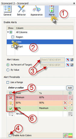
Figure 8
Add icons to the scorecard
After you make the changes outlined above, your new scorecards with the icons added appear in both the color and black and white versions as shown in Figure 9.
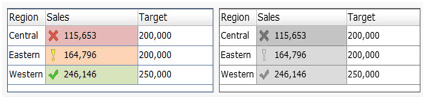
Figure 9
The new scorecards with icons added
Tip!
Make sure to select the icon images that enable you to get the level of
indication required. If you use colored circles, for example, you lose
the reinforcement and highlighting of the more important data that you
get by choosing a more indicative or prominent icon (
Figure 10).

Figure 10
Choose prominent or symbolic icons
Emphasize Critical Information
Now, let’s change the scorecard to highlight the regions with sales behind the target as these are the regions on which action needs to be taken. To do so, follow these steps. Once again, select the scorecard you want customize and open its properties (this is the same screen shown in Figure 8). In this step you enable alerts for the Sales column as this is the column you want highlighted. As shown in step (3) of Figure 8, enter the appropriate percentages to configure the alert values and target in the two fields to the right of the screen. Then under Alert Thresholds disable the Enable Auto Colors check box.
In the section of the screen shown in Figure 11, select the required check boxes next to the desired icons in the From and To columns. Then select the icon only for the red threshold value and disable the remaining icons by clicking each threshold icon button and then selecting no icons (which are indicated by the grayed X in the check box on the left and the red X on the right).
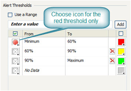
Figure 11
Configure the scorecard indications
After you make the changes outlined above, your new scorecards with the red and grayscale circle icons added appear as shown in Figure 12.
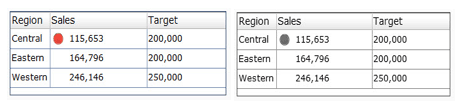
Figure 12
Colored scorecard with red icon and black-and-white scorecard with gray icon
Add Legends
As a best practice and to make the scorecard more informative, you may need to add some more information, such as:
- Achievement percentage
- A legend to show the threshold values (60 percent and 90 percent in this case)
In this example, I show how to add a legend to a table based on the data stored in an Excel data model. First, open a new dashboard file and enter some dummy data or use the scorecard that you used in the Emphasize Critical Information section. You also need to enter the data for the legend.
Create a new scorecard by dragging a Scorecard component from the Components panel to the canvas. Then, in the General section (Figure 13), map the component to the Legend Excel table by clicking the red arrow (Excel) icon to the right of the Display Data field. This opens a dialog box in which you can select the legend table range (1). Next, in the Behavior section under the Common tab (3), disable the Enable Case-insensitive Sorting and Rows are Selectable check boxes. In the Appearance section, under the Layout tab, select the Show Vertical Gridlines check box and disable the Show Horizontal Gridlines check box (4). Then, in the Text tab (5) disable the Title and Header check boxes (but keep the Labels and Column 1 check boxes selected). Finally, in the Alerts section, add an alert and use the same icons used in the main scorecard table (6).

Figure 13
Steps for adding an alert to a dashboard
Click the Preview button (not shown) to view the final dashboard output (Figure 14).
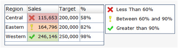
Figure 14
Review the output of the enhanced dashboard
Making Bar and Column Charts More Informative
In this section I show you how to use the features of SAP BusinessObjects Dashboard to enhance bar charts and make them more informative. Most of the steps and features that I describe can also be used with other chart dashboard components, and you can use the same techniques and tips to enhance and empower other dashboard chart components.
First, look at the data in Figure 15. In this chart, mobile phone sales are listed by manufacturer for the year 2013 (as per Wikipedia). This is a boring display of dry data and nothing stands out to make it easier to understand or see what’s important in the columns. Figure 16 is a display of the same data in a simple column chart dashboard component, without any enhancements.
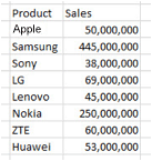
Figure 15
Mobile phone sales data by manufacturer for the year 2013

Figure 16
Mobile phone sales by manufacturer chart
Here is a summary of some of the issues seen in this simple chart:
- There are no X-axis or Y-axis labels in the chart—this makes the chart confusing to read and understand.
- Some of sales values displayed (by the bars) are very close in number; for example, you can’t tell from the graph if ZTE or Huawei’s sales are better.
- There is a huge variance between Samsung’s, Nokia’s sales, and the remaining manufacturers’ sales.
Add Labels to Column Charts
Now I explain how to overcome this chart’s shortcomings and add some enhancements to make it more informative. First, create a new dashboard file and display the mobile phone sales on a bar chart, and then I show you how to add some labels to the chart.
Select the Column Chart dashboard component and navigate to the General section (Figure 17). In the Titles section, enter Cell Phone Sales in the Chart field, 2013 in the Subtitle field, Manufacturers in the Category (X) Axis field (3), and Sales in the Value (Y) Axis field.
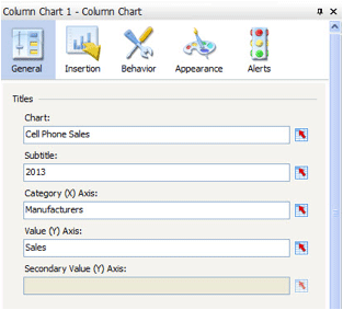
Figure 17
Column Chart properties panel
When displayed, the chart looks like the image in Figure 18.
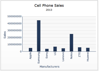
Figure 18
New cell phone sales chart with labels
Now, sort the column bars and adjust the Sales scale. First, Select the column chart and navigate to Behavior > Common tab (1). Select the Enable Sorting check box (2), select the By Data radio button, and select Descending from the Order field drop-down option (3). Click the Scale tab (4) and select the Fixed Label Size (Optimized Performance) check box (5). All these steps are outlined in Figure 19.
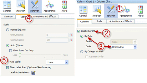
Figure 19
Behavior tab in column chart properties
Click the Preview button (not shown) to see the final graph after the data is sorted and with the chart scale adjusted (Figure 20).

Figure 20
Column chart after sorting data and adjusting the scale
Tip!
There are two types of scales that you can use in charts components.
Select the scale type based on the variations of the data that you want
to present. The scale types are linear and logarithmic scales. A linear
scale display numbers in linear format so that the scale increases with a
linear amount (for example, by increments of 100). In this case the
scale is 100, 200, 300, and so on. This is what is used in most charts,
and it is perfect if the variation between data is not huge. The
logarithmic scale should be used only if there is large variance between
the values to be presented on the chart. The logarithmic scale
increases exponentially like 1, 10, 100, 1000, and so on. This way you
are able to compare small numbers against each other in logarithmic
scale, but you cannot see them in the linear scale format.
Let’s add some more information to this chart. In the Text tab under Appearance (1) select the Data Labels and Sales check boxes (2) under the Show column. Then, in the Format Selected Text section (3), you can make adjustments to the text (e.g., font, size, appearance, and color) and number (Value) format. The rest of the options are filled in by default. These steps are outlined in Figure 21.
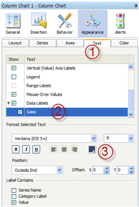
Figure 21
Select the Appearance options
Click the Preview button (not shown) to see the final graph with the new labels (Figure 22).
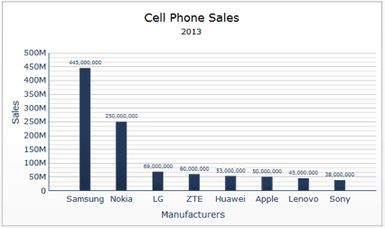
Figure 22
View of the final graph with the labels added
Tips!
Here are some tips to keep in mind when creating charts:
- Avoid using stack charts as they are hard to read and interpret.
- Use a combination chart if you want to display the relationship
between two metrics; for example, the average customer waiting time in a
branch compared with the number of complaints for that branch to see if
there’s a correlation between wait time and complaints about a branch.
Best Practices for Creating Informative Mobile-Device Dashboards Using SAP BusinessObjects Dashboards
In this section I discuss best practices for how to use SAP BusinessObjects Dashboards to create more informative dashboards for mobile devices, along with tips for how to overcome the issue of unsupported mobile components.
Keep the following in mind when designing a mobile-device dashboard:
- You need to include the critical and most important KPIs that will help your target audience track and monitor their business on the fly.
- The design should be simple, uncluttered, and contain only pertinent information—mobile devices have increasingly smaller screens.
- Performance is a key factor. Make sure that the response time of the mobile dashboard is very fast.
In this section I cover some tips, techniques, and best practices that need to be considered when designing a mobile dashboard. For example, I answer these questions:
- What is the best canvas size for a mobile device?
- How can you use the mobile compatibility panel to track unsupported mobile components?
- What other Dashboard components can be used in place of unsupported components?
- How can you limit query running time?
Determining the Best Canvas Size for Mobile-Device Displays
The recommended canvas size for an SAP BusinessObjects mobile dashboard is 1024 x 768 pixels. You can change the canvas size by following these steps. Open the document properties (File > Document Properties…). In the screen that opens (Figure 23), under the Canvas size in pixels section, select the Preset Size radio button and select 1024 * 768 from the drop-down list of options. Click the OK button (not shown).
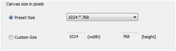
Figure 23
Change the size of the canvas for displaying on a mobile device
Tip!
You need to decide at the beginning of the design process if the
dashboard is for a desktop or a mobile device in order to determine the
right canvas size. Changing the canvas size later on may affect the
layout and it is time-consuming to adjust the layout for the presented
dashboard after it’s been created.
How to Use the Mobile Compatibility Panel
The mobile compatibility panel is your close friend when you are working on creating dashboards for mobile devices. If there are any unsupported dashboard components or connections used in the dashboard, the system will warn you. It also highlights and displays a warning about any features that are lost when displaying the dashboard on a mobile device because they are not supported. Unsupported features and components can’t be displayed on mobile devices such as an iPad, for example, due to the different technology used in the desktop (Flash) and in the mobile device (HTML5).
For example, the Enable Data Animation and Show Lines features are lost when presenting the dashboard on mobile devices because they depend on Adobe Flash technology. It is very important to keep an eye on this panel when designing your mobile-device dashboards, as it helps you immediately identify any unsupported components or functions. I show you how to replace and substitute unsupported components with supported ones in order to achieve almost the same functionality. The screen in Figure 24 shows an example of the warning shown when there are unsupported components.
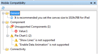
Figure 24
The Mobile Compatibility screen with warnings about unsupported components
Note
To view the Mobile Compatibility screen if you can’t already see it,
select View from the ribbon of the main Dashboard design page, and then
Mobile Compatibility from the drop-down menu options.
In the next section I explain how to replace unsupported components in mobile-device dashboards with supported ones to get the same functionality.
Adding Value and Spinner Components
Value and spinner are single-value dashboard components that can be used to display a single metric. You can use them as inputs as well. They help you build what-if scenarios by using them as input components and by changing their values.
The main advantage of these components is that you can use the Alert feature to give an indication of the displayed metric’s performance. As these two dashboard components are not supported by mobile-device dashboards, I explain how their functionality can be replaced with a text box. I also describe how you can simulate the main value and spinner features, such as alerting.
First, look at the value (on the left) and the value with spinners (Growth, on the right) in Figure 25.

Figure 25
The value and spinner components
Note
The main difference between a value and a spinner is that you can use
the mouse to scroll for an input to the value component to increase or
decrease the displayed value, whereas with the spinner component, you
need to use spinners (e.g., the up and down arrows to the right of the
Growth field in Figure 25) to change the displayed value.
Now, try to simulate the same functionality you get with value and spinner components, but using the label and color-binding features.
First, in the Text tab (Figure 26) add a label to your canvas. Click the Label button (1) and then General. In the Text section select the Link to Cell radio button and select the same three-percent metric as before (e.g., Sheet1!$H$3) from the field drop-down options. Then, under Behavior in the Common tab, select the Treat All Input as Text check box (3). Under Appearance, in the Layout tab (4), select the Show Border check box and make your changes to the borders (color, size, thickness, and so on). In this scenario, change the border thickness to 1 and the border color to light gray. Then select the Show Fill check box (5) and bind the color to the following equation: (=IF(H3/0.05<0.3,"red",IF(H3/0.05>0.9,"green","yellow"))) where H3 contains 3 percent. Then, in the Text tab (6), change the alignment of the text; in this case, center the text.
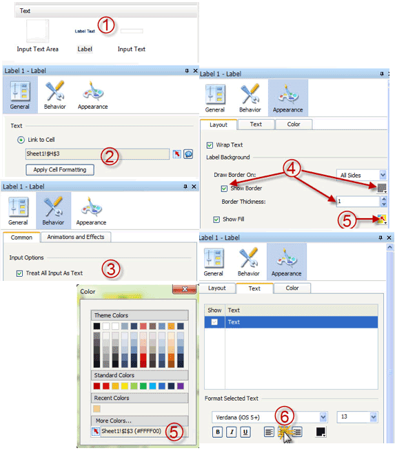
Figure 26
The Appearance tab for the label component property
The final output, with these changes, is shown in Figure 27.
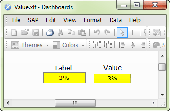
Figure 27
The dashboard display with the changes
Adding Spreadsheet Tables, Hierarchical Tables, and Grids Components
As previously discussed, it is a best practice to support your chart with table data. Spreadsheet table, hierarchical table, and grid dashboard components are very useful for displaying data in a tabular format. However, for components that are not supported by mobile-device dashboards, you can replace them with one of the following supported components:
With these components you can still use almost all the features (like alerting) and can control the layout and display of scorecard and list tables. The only thing that you cannot do is to display hierarchical information as you can in a hierarchical table.
Adding Sliding Picture and Fisheye Selector Components
Fisheye and sliding-picture selector components are very useful and pleasing to the eye. The sliding picture menu displays a set of images with labels that represent a set of values to select from. The fisheye one is almost exactly the same, but the selected label (image) pops up and is larger than the unselected one. They are strong selectors that can help end users select values based on the displayed image and text. Both are Flash-based components with eye-catching visuals. As a result, they are not supported in mobile-device dashboards because there is nothing like this functionality offered with HTML5. The screenprint in Figure 28 shows sample fisheye (on top) and sliding picture (on the bottom) components.
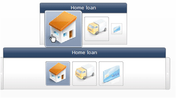
Figure 28
Fisheye and sliding picture dashboard display examples
To simulate this functionality on a mobile-device dashboard, you can use the push-button and image components. Under General go to the Image Component section (Figure 29). On the left side of the screen, select the image you want to add to your canvas (1). In this example, the home image for home loan. Under the JPEG or SWF Options section, select the Resize Image to Component and Embed File check boxes and click the Import button. This action opens the import dialog (3) where you can link the image components with first icon Home Loan.
The next steps are to add a Push button to the canvas, make it transparent, and put it above the image. This simulates the button functionality and makes the image work like a button. To do this, you need to select both dashboard components, the image and the Push button, make their sizes exactly the same, and align them to be on top of each other. Here are the steps for achieving this (as shown in Figure 29). Select the insert icon (4) to insert the Push button onto the canvas. Then you can resize the Push button to be the same size as the image components by selecting the Make Same Size icon on the formatting tool bar (3 and 4). Then align the components to be placed on top of one another (with the Push-button component on top). Select both components and click the align top and align left icons from the formatting tool bar (5).
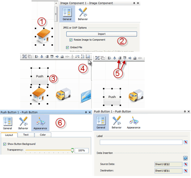
Figure 29
Change an image to a push button for a mobile-device dashboard
The final step is to hide the Push button. Select the button and navigate to the Layout sub-tab and set the Transparency scale to 100% (6). Then configure the button to insert Home Loan in the destination cell by navigating to Properties > General (6). Here you make your selections for the Source Data and Destination fields to pull the required Excel destination cell data. You can use this destination cell to trigger an action based on the inserted value in this cell.
Using Panel Containers
A final word about panel containers. Panel containers can be used when you want pop-up windows to display addition information. The pop-up window acts like a container, and you can control whether it’s visible (or not) by using the dynamic visibility feature. In general, however, the panel container is not recommended for use because it increases the size of the dashboard file and this affects the overall response time (performance) adversely and the stability of the dashboard. You should replace the panel container component with either a canvas or tab-set component. As panel containers are not supported on mobile-device dashboards, I recommend that you use the canvas and tab set components when designing dashboards for mobile devices. To read more about panel containers follow this link: 3 Xcelsius 2008 Components to Avoid.
Taha M. Mahmoud
Taha M. Mahmoud is a PMP, TOGAF, ITIL, and CSM, and a senior BI consultant, BI project manager, and solution architect. He has more than seven years of experience consulting and deploying successful BusinessObjects projects in the banking and telecom industries. Taha is the author of the book, Creating Universes with SAP BusinessObjects.
You may contact the author at tabouelfootooh@ejada.com.
If you have comments about this article or publication, or would like to submit an article idea, please contact the editor.