Learn how to use the Query Builder component in SAP Dashboards 4.1. See how to create a Universe Query that can be inserted into the embedded spreadsheet within SAP Dashboards or bound directly to components of SAP Dashboards, and gain an understanding about the process of querying a BusinessObjects Universe and integrating the data into a dashboard.
Key Concept
A BusinessObjects Universe is an intermediary layer between a database or data source and dependent reports, Queries, or dashboards. The Query Builder feature enables the integration of data that is stored within a database into a dashboard component through the use of a Universe. With SAP Dashboards 4.1, data can be retrieved from a database by using the new Query Builder.
SAP Dashboards 4.1 (formerly known as Xcelsius) is a major tool of the BusinessObjects 4.1 application suite that has numerous features for making user-friendly, dynamic dashboards. Originally SAP Dashboards only allowed for visualization of data that was embedded in Microsoft Excel. However, an enhancement in the 4.1 release of SAP Dashboards, Query Builder, allows developers to pull data directly from a BusinessObjects Universe. Fundamentally, the Query Builder enables the integration of data stored within a database into a dashboard component through the use of a Universe. Now data can be retrieved from a database and the functionality of the embedded Excel spreadsheet within SAP Dashboards4.1 can be greatly extended.
I describe how to use the Query Builder component in SAP Dashboards 4.1. I explain how to create a Universe Query that can be inserted into the embedded spreadsheet within SAP Dashboards or bound directly to components of SAP Dashboards. In a nutshell, this tutorial demonstrates the process of querying a BusinessObjects Universe and integrating the data into a dashboard.
In order to use the features described in this article, users must have the following:
- The SAP Dashboards 4.1 designer product installed on their workstation.
- Log-on credentials to an installation of either BusinessObjects 4.0 or BusinessObjects 4.1.
- Permissions to create Queries from a BusinessObjects UNX format Universe.
Note
The Query Builder in SAP Dashboards 4.1 only works with UNX format
Universes. Legacy UNV format Universes cannot be accessed using this
tool.
Querying Data in SAP Dashboards Using the Query Browser
The first step is to access the Query Builder in SAP Dashboards 4.1. Click View from the ribbon and select the Query Browser option from the drop-down menu options. This opens the Query browser window shown in Figure 1. Users can select either the Add Query button or the add query icon  to create a new Universe Query. This opens a dialog window that allows you to connect to an existing BusinessObjects system.
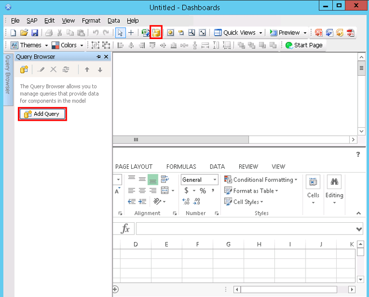
Figure 1
Add a new Universe Query
To access the BusinessObjects system, you must input a set of log-on credentials and then click the OK button (Figure 2). Once you’re logged onto the BusinessObjects system, that is the only system you are able to access for the duration of the Dashboards session (i.e., in order to access another system the application must be closed).
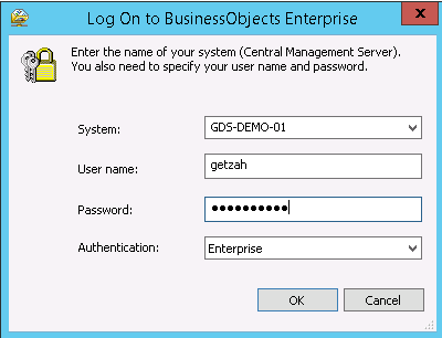
Figure 2
Log on to the BusinessObjects Enterprise system
The next screen that opens (Figure 3) is the Add Query window. Select the first option—Select a Data Source. Then select Select a Universe as a data source to create a Query based on a BusinessObjects Universe.
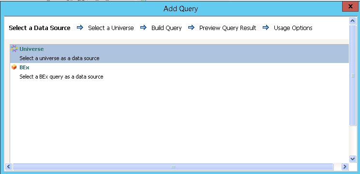
Figure 3
Select a data source
In the next screen that opens (Figure 4), the Select a Universe window, expand the Universes folder to see the available list of Universes. Click the name of the Universe that you want to Query and click the Next button.
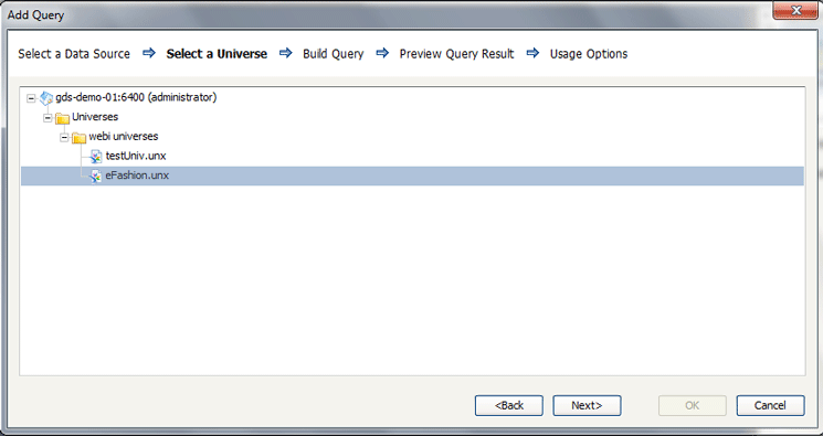
Figure 4
Select a Universe
This opens the Build Query window (Figure 5). This window is essentially a copy of the Query Panel in Web Intelligence as both windows have exactly the same functionality. Expand the folders on the left side by clicking the plus sign (+) next to each respective folder. This opens up each folder in turn and shows the objects and filters within each. You can then drag-and-drop objects and filters from the left screen to the Results Objects and Filters panes on the right side. In this case, the Lines and Sales Revenue Results Objects have been chosen as well the This year filter.
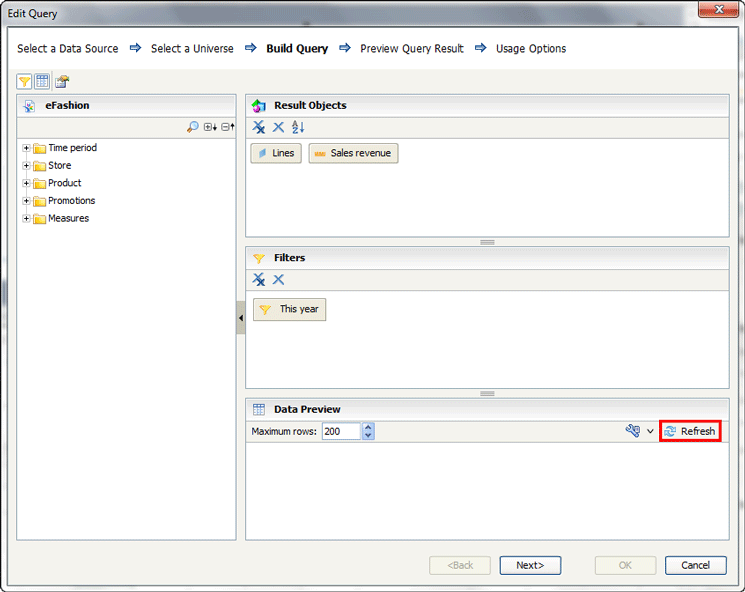
Figure 5
Add objects and filters to the Query
Select the Refresh button in the Data Preview pane (located on the lower right-side of Figure 5). Once the Refresh button is clicked, a result set of data appears in the Result Set pane as shown in Figure 6. Once the Query has been built in the Build a Query window, click the Next button to continue. In the screen that opens (Figure 7), you see a preview of the data from the objects and filters that have been selected.
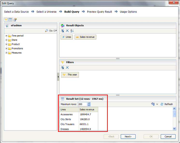
Figure 6
Preview the Result Set
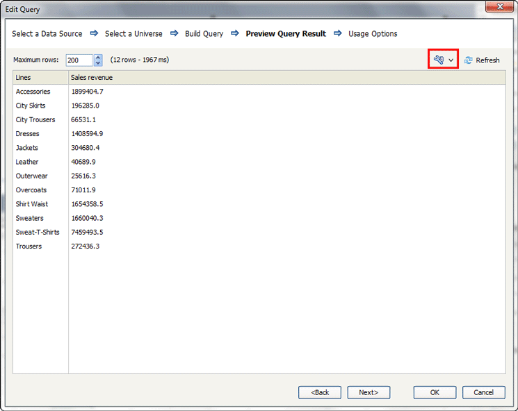
Figure 7
Preview the Query results
By default, 200 records appear in the result set. However, you can change the number of records that will appear by entering another value within the Maximum rows field, up to 99,999 records (but 200 is usually more than adequate for reviewing data). When you’ve determined the number of rows you want to appear, click Refresh in the top right. You also have the option of seeing either raw values or formatted values within the Query results. Simply click the result set display mode button (the wrench icon, highlighted in Figure 7) and select either the Display raw value or Display formatted value option. Once you’ve made your selections, click the Refresh button again and check your last set of changes. Once you’ve confirmed that the Query looks the way you want it to, click the Next button to continue to the Query builder process.
The next screen that opens is the Usage Options window (Figure 8). Here you enable the user to define how often the Query is to be refreshed and how the records are loaded into the dashboard file.

Figure 8
Open the Usage Options window
As a best practice, it is recommended that you select the Refresh Before Components Are Loaded check box and also select the When Value Changes radio button (under Refresh on Trigger in Figure 8) so that the data within the component is updated every time the value in the trigger cell changes or when the value in the trigger cell reaches a specific value. Click the red-arrow icon  to the right of the Trigger Cell field and chose a value. Once this option is selected, the fields below are enabled. Once you click the icon, a screen like the one in Figure 9 opens, where you can select a cell to trigger the Query to refresh within the Excel spreadsheet. Click the OK button.
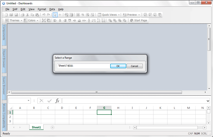
Figure 9
Select a cell to trigger from Excel
This takes you back to the Usage Options screen where you can see that the selected cell is now updated in the Target Cell field (Figure 10).

Figure 10
The trigger cell is added to the Query
Click the OK button to save the Universe Query. This re-opens the Query Browser pane on the left side of Figure 11, where you see that the new Universe Query has been added. This Universe Query includes the result objects, filters, and prompts that were selected earlier.
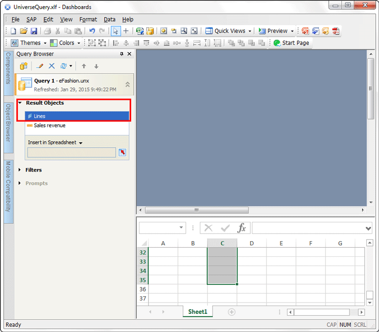
Figure 11
The Query Browser with the new Universe Query included
Using the Query Browser Data within Dashboards
The Dashboards developer has two options for how to use the data obtained by the Query Browser:
- Bind a Query to the embedded spreadsheet
- Bind a Query directly to a component
The first option is useful when you need to make further transformations to the data, as more transformations can be processed within the embedded spreadsheet. The second option simplifies the component setup and reduces the load on the spreadsheet engine. I discuss each in more detail in the following sections.
Bind the Query to the Embedded Spreadsheet
Binding a Query to the embedded spreadsheet involves inserting each of the result objects within the selected Query into the cells in the embedded spreadsheet. The number of rows selected in the spreadsheet should match or exceed the number of records included the Query. In this example, the result Query has 12 records included within it; therefore, at least 12 rows should be selected within the embedded spreadsheet. In the Query Browser tab select Lines in the Result Objects pane (highlighted in Figure 11). Then select the red-arrow icon to the right of the Insert in Spreadsheet textbox, which opens the Select a Range dialog window (Figure 12).
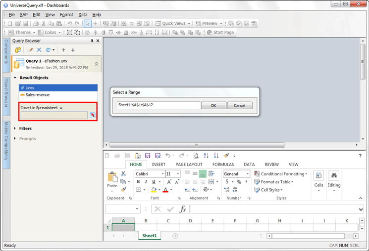
Figure 12
Select the range
There are two ways to update the range of cells within the Select a Range dialog. In this case, enter cells Sheet1!$A$1:$A$12, as the embedded spreadsheet needs to accommodate at least 12 rows of data. You can either:
- Manually type in the range of cells in the field
- Or select the range of cells within the spreadsheet. Select the first cell (A1), scroll down to the last cell in the range (A12), and press Shift to select the last cell (e.g., the range of cells).
After selecting the range of cells, click the OK button. The selected range of cells then appears in the Insert in Spreadsheet textbox (Figure 13).

Figure 13
Insert the range of cells
Repeat these same steps (shown in Figures 11 to 13) for each of the entries included within the Results Objects panel in the Query Builder. However, select a different column in the embedded spreadsheet for each entry, as shown in Table 1.
| Result object |
Range within an embedded spreadsheet |
Lines
|
Sheet1!$A$1:$A$12
|
Sales revenue
|
Sheet1!$B$1:$B$12
|
Table 1
Ranges with embedded spreadsheets
Bind a Component to a Range of Cells
The next option for binding data from a Query is to bind a component that is included in the spreadsheet canvas to the range of cells selected above. In this example, a line-chart component is being used. Double-click the line chart to open the properties as shown in Figure 14. Or you can open the properties of the component (e.g., the line chart) by right-clicking the line chart and then selecting Properties from the context menu as shown in Figure 15.

Figure 14
Open the component properties by double-clicking
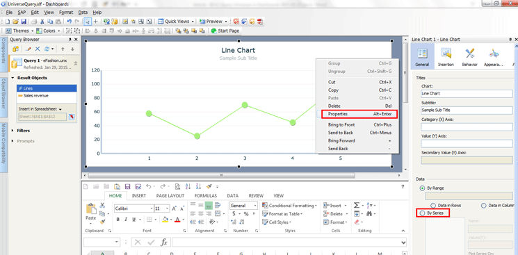
Figure 15
Open the component properties via the context menu
In either case, on the right side under Data select the By Series radio-button option (Figure 14 or 15). (It may be necessary to scroll down in the panel to see this option.) In the Series textbox that expands underneath, select the plus-sign icon  (Figure 16).

Figure 16
Add a new series
The Name field is automatically populated and a new entry appears in the textbox underneath By Series (Figure 16). In this case, Series1 appears in the Name field and the By Series textbox. You now have the option of changing the series (however, this is not required). Note that changing the series name makes it easier to identify the types of values included in the series.
Highlight the existing name in the Name field and overwrite it with a new name as shown in Figure 17. In this case the name is changed from Series1 to Lines. If there is only one series of data for a chart (as in this example), then the Primary Axis radio button should be selected. A secondary axis is useful if there is a second series of data included in the chart. The secondary axis allows the data to be displayed apart from the series on the primary axis in a different format, rather than right next to the data on the primary axis.
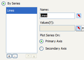
Figure 17
Change the series name
Next, select the values for the chart from the embedded spreadsheet. Click the red-arrow icon to the right of the Values field and the dialog window in Figure 18 opens. Here you select the range of cells in the embedded spreadsheet that correspond to the range of cells in Excel that include the numerals to be displayed in the line chart. In this case, select the Sales Revenue range of cells (e.g., the cells in the range Sheet1!$B$1:$B$12, as shown in Figure 13).
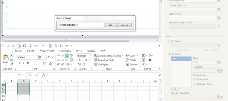
Figure 18
Select the range for the Y values
Click the OK button once the cells have been selected, and the screen in Figure 19 opens where you see that the Values(Y) field is now populated with the new range of cells values.
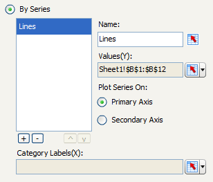
Figure 19
The range of cells for the Y values are added
The next step is to select the labels for the chart from the embedded spreadsheet. Click the red-arrow icon to the right of the Category Labels(X) field (Figure 19). This opens the Select a Range dialog window again. Select the range of cells you want to add for the X axis of the line chart (Sheet1!$B$1:$B$12 in this case), and click the OK button. The properties screen opens, with the Category Labels(X) field populated like the screen shown in Figure 20.
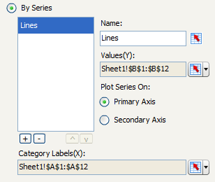
Figure 20
The new range of cells for the X axis of the line chart have been added
Previously, the embedded spreadsheet was set up to have 12 rows for the results objects. Since the results of the Query could be less than 12 records, it is a best practice to set up the chart to ignore blank cells in both values and labels. Click Behavior and then the Common tab. In the screen that opens (Figure 21), select the In Series and In Values check boxes under the Ignore Blank Cells section.
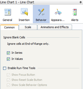
Figure 21
Set up the Query to ignore blank cells in series and values
At this point you can view the line chart with actual data. Simply click the Preview button in the ribbon and the screen opens at the bottom of Figure 22 with the line chart displaying the actual results of the Universe Query. All the data in this line chart has been sourced from data embedded within the included spreadsheet.
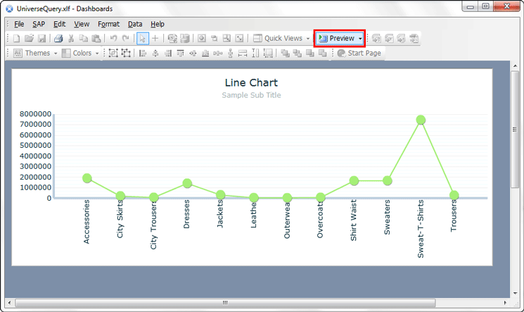
Figure 22
Line chart displaying data directly sourced from the embedded spreadsheet
Bind a Query Directly to a Component
Binding a Query directly to a component binds the result objects for a Universe Query directly to a dashboard component. Components include charts, graphs, gauges, dials, list boxes, sliders, and combo boxes, to name just some of the options.
In this example, a column chart component is being bound to a query. Double-click the column chart to open its properties. (As with the line chart in the last example, you can also open the column chart properties via the context menu option.) The process of binding a Query directly to a component is pretty much the same as for binding a Query to an embedded spreadsheet, up to a point. Follow the same steps as above, up to Figure 16. Once you reach that step, follow these steps instead.
Once you’ve opened the components properties, click the By Series radio button (Figure 15). This opens the screen shown in Figure 23 where you can select the values for the chart directly from the result objects Query. Click the red-arrow icon next to the Values(Y) field to open the drop-down menu and select Query Data from the options.
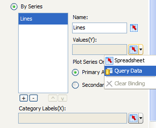
Figure 23
Select Query Data for Values(Y)
This opens the Select from Query dialog window (Figure 24), but in this example only one Query appears in the left-side pane as only one Query has been built thus far in the Query browser. However, if more Queries existed, you would have more options. Select the Q from the left pane and then, in the right pane, select a measure result object to display in the values within the dashboard component. In this example, select Query 1 – eFashion.unx from the left, select Sales revenue from the right, and click the OK button. (The measure is a numeric-based value.)
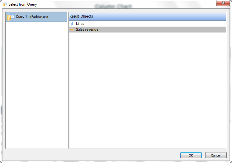
Figure 24
Select the Query and the Sales revenue measure
The screen in Figure 25 opens, and it now shows that the Values(Y) field is populated with the Query and the measure (e.g., Query1 and Sales revenue). Select the Primary Axis radio button.

Figure 25
The Y-axis values are Query 1 and Sales revenue
The next step is to select the labels for the chart directly from the result objects Query. Click the red-arrow icon next to the Category Labels(X) field and select again select Query Data from the drop-down options as executed earlier.
This opens the Select from Query dialog (not shown) where you can select a dimension from the Query to display in the labels within the component (follow the same steps as in the previous section). In this example, Lines is the dimension that has been selected.
Once you’ve selected the Lines Results Object and saved it, the screen in Figure 26 opens and the Category Labels(X) is populated with the name of the Query (Query 1) and the dimension (Lines).

Figure 26
The X-axis Query name and dimension are added
To preview the column chart with actual data, click the Preview button in the ribbon (Figure 27).
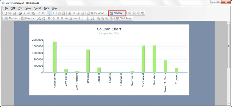
Figure 27
Preview the new column chart with data directly sourced from the Universe Query
The new column chart is displayed with the actual results of the Universe Query with data that has been sourced directly from a Universe Query.
Adam Getz
Adam Getz currently serves as a Manager, Business Intelligence for CGI Federal. In this position, he is leading a large business intelligence and data warehousing implementation for a federal client. He is a thought leader in the field of information technology and an expert in the deployment of leading business intelligence, database management, and data integration products. He has presented at a variety of local, national, and international events, including the 2006 BusinessObjects International Conference, 2007 Oracle BIWA Summit, 2008 Oracle Open World, and 2010 and 2011 ASUG SAP BusinessObjects User Conferences. In addition, Adam is the creator and main author of bi-insider.com, a website, portfolio, and blog that provides rich technical and functional content to business intelligence and data warehousing professionals. He has also published numerous technology white papers that have focused on various topics within business intelligence and data warehousing. Adam currently serves as the chairperson of the Washington DC Business Objects User Group.
You may contact the author at adagetz@yahoo.com.
If you have comments about this article or publication, or would like to submit an article idea, please contact the editor.