Walk through common scenarios for adding sections and breaks to a Web Intelligence report, and learn how to edit section and break properties. These steps make information easier to use and improve navigation for users.
Key Concept
Section master cells are generated for every distinct value in an object when it has been “set as a section.” These cells function as group or subgroup headings, can be collapsed or expanded with the fold-unfold toolbar, and can be accessed directly by using the Navigation Map tab.
Adding sections and breaks to SAP BusinessObjects Web Intelligence reports allows data to be displayed in formats ideal for maximum readability and usability. Working together with the fold-unfold toolbar introduced in BusinessObjects Enterprise XI 3.1 Service Pack 2, sections and breaks now have the potential of becoming active partitions in a report by providing the capability of dynamically expandable and collapsible report parts. This functionality lets users rapidly navigate to specific sections in a report and begin analyzing information more quickly and easily than before.
Report developers and business users performing ad hoc data analysis can add sections and breaks. Once they’ve been added to reports, report viewers will find increased value when examining company data in this grouped format.
With sections, data tables and charts break out into individual report element groups for each value in a “sectioned” dimension. For example, if a Year object has been set as a section, the remaining data in the table is broken out and displayed with the associated year. Each section also includes the Year value in a section master cell that’s generated when the section is created.
Breaks provide the capability of adding subtotals to a data table with just a single click. Similar to sections, breaks group data visually but in a slightly different way. Whereas sections generally are used to group data into categories, breaks commonly are used to calculate subsets within a data block. Users can apply breaks within one or more sections or applied alone to individual data tables without sections. It’s normal for hierarchical report data to include more than three sections and one or more breaks. It’s also common to present data in a table using one or more breaks without using sections at all. The choice of using sections, breaks, or a combination of both depends largely on the business requirements and the overall goals of the report.
The application of both sections and breaks in a report gives analysts the capability of viewing data grouped hierarchically, sorted, and ranked within each section.
Adding Sections to Data
To add sections to a report, first add a table element (i.e., horizontal table, vertical table, crosstab, or form) to the report canvas in a Web Intelligence (also known as WebI) report, and then populate it with at least one dimension or detail object. In Figure 1, four dimension objects and a single measure object are displayed in a vertical table, which I use as an example.
I retrieved this data by querying the eFashion Universe that ships with BusinessObjects. The dimension objects are Year, Lines, Category, and, SKU desc. The single measure object is the Sales revenue field.
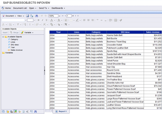
Figure 1
Objects displayed in a vertical table
Figure 1 also shows a Web Intelligence report being viewed within the BusinessObjects Enterprise XI 3.1 InfoView portal – the primary delivery platform for Web Intelligence.
You can add sections and breaks to a report in both edit and view modes. I focus on adding them in view mode and discuss additional properties available in edit mode.
Note
In order to add sections and breaks, or apply any additional formatting to a report element while in view mode, the Default view format setting in the local Web Intelligence preferences must be set to Interactive. This is accomplished by clicking Preferences in InfoView, expanding the Web Intelligence preferences, then selecting the Interactive option under the Default View Format property setting.
The result of the query that produced the data in Figure 1 returned hundreds of rows. This information is difficult, if not impossible, to analyze without organizing and grouping the data set. Below are the steps for adding a section to the data block:
- Right-click on the dimension that you want to convert to a section
- Select Set as section from the list of available choices (Figure 2)
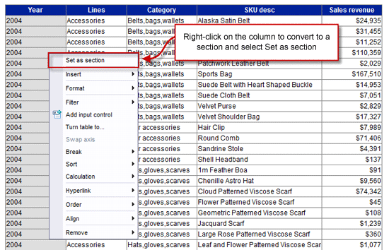
Figure 2
Adding a section to data
You find the following changes to your report after you add a section to a data table:
- The object converted to a section is removed from the table
- The object converted to a section appears in the upper left of the data table, and each distinct value is listed individually in a section master cell
- The remaining data in the table is grouped into individual tables and listed under the associated section value
Although creating a section gives the appearance that multiple instances of a data block are generated for each section value, this is not the case. The existing data block remains a single object split out into visual groups or sections. Figure 3 shows the result of setting the Year object as a section (e.g., 2004 shows up as a section header).
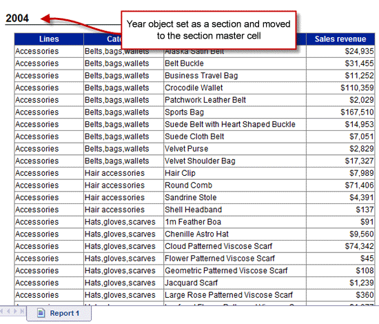
Figure 3
Year object set as a section
You can easily add additional sections to a data table in the same way you added the initial section. So far in my example, the data is still somewhat difficult to analyze even though it is separated into yearly groups.
Next, I’ll convert the Lines object to a section (e.g., Accessories shows up as a section header). Any subsequent sections added from this table result in subsections of the existing Year section; format the subsections differently to avoid any potential confusion from a user’s perspective. Common formatting adjustments include indenting and changing the color, font, or font size.
Modifying and Formatting Sections in View Mode
Figure 4 shows the data table with sections added for both the Year and Lines dimensions (designated by the sections 2004 and Accessories).
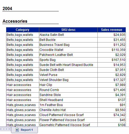
Figure 4
Year and Lines objects set as a section
By default, section master cells are generated with font point size 12, Arial font style, bolded, added with a bottom border, and listed directly under each other. Since the Lines section object in the example is subordinate to the Year section, it’s a good idea to modify the appearance and provide each section master cell with its own distinguishable visual characteristics.
Common modifications include indenting subordinate section master cells and reducing the font size by one or two points. Figure 5 shows the Lines section master cell indented and modified by using shortcut icons in the formatting toolbar. Begin this process by selecting the section master cell to be modified. This is done by using a standard left-click drag. Start the process by moving your cursor over the border to be moved or indented. The shortcut icons on the formatting toolbar are enabled when any cell on the report canvas is selected. This allows for single-click formatting changes to be made to section master cell or other data values.
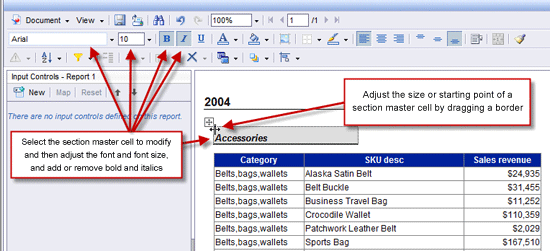
Figure 5
Adjusting the appearance of a section master cell
The bold, italics, and underlined options are toggled on and off, and the icons appear depressed when selected. You can change the font style from Arial to any other available font name by clicking the downward arrow located immediately to the right of the font name.
If there’s too much or too little space between two or more sections, you can resize the top or bottom of a section by dragging it up or down (Figure 6). To further cut down on space between sections, you can move section master cells to the very top of a section. Figure 6 shows the top of the Lines section being resized.
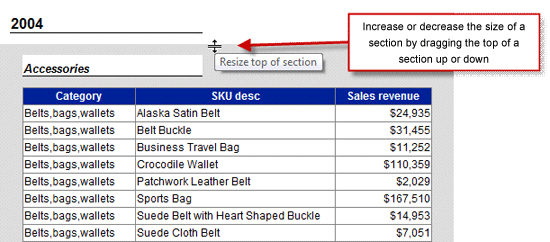
Figure 6
Resizing the top of a section
Here’s another way of modifying a section:
- Right-click anywhere inside a section
- Select Format > Section (Figure 7)
To remove a section:
- Right-click anywhere inside a section
- Select Remove Section from the list of available options (Figure 7)
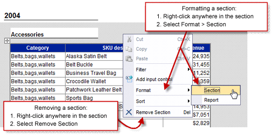
Figure 7
Other ways to modify a section
Formatting a section in view mode provides modification capabilities in three tabs:
- The General tab provides the option to include or exclude the section values from appearing in the navigation map (Figure 8)
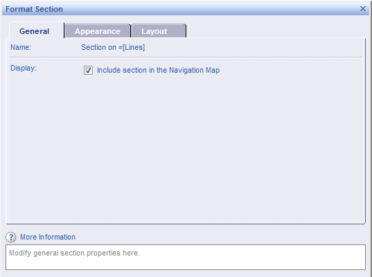
Figure 8
General tab modifications
- The Appearance tab makes changes to the background color or background pattern from prepackaged skin, URLs, or images (Figure 9)
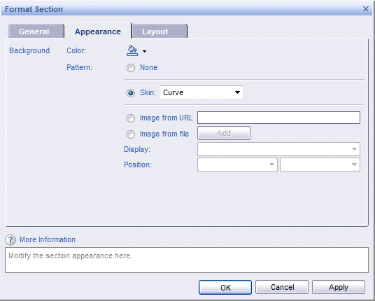
Figure 9
Appearance tab modifications
- The Layout tab allows new page and position options, such as starting on a new page, avoiding page breaks, and setting positioning within a section (Figure 10)
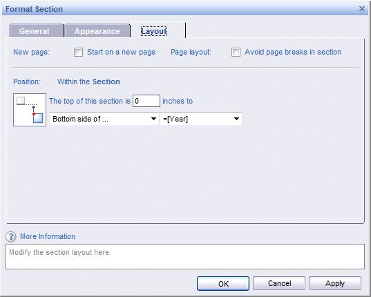
Figure 10
Layout tab modifications
Modifying and Formatting Sections in Edit Mode
Editing sections is most effective in edit mode and while viewing the report structure. If you have permissions to edit Web Intelligence reports, you can edit section formatting in six different categories on the Properties tab:
- General
- Display
- Minimum height
- Option to Show when empty
- Option to Bookmark section
- Appearance
- Background color
- Background image
- Page Layout
- Relative Position (e.g., start on a new page and avoid a page break in a section)
- Sorts
Figure 11 shows the Lines section selected on the report canvas and the Properties tab selected showing all modifiable section properties.
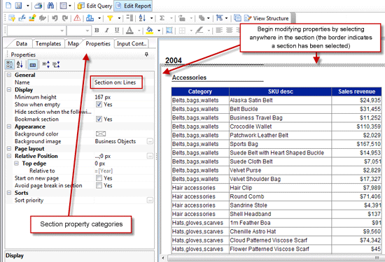
Figure 11
Formatting options to edit a section under the Properties tab
To modify the top and bottom of all sections in a report while in edit mode, click the View Structure button in Figure 11 to adjust the amount of space between the start and end of each section. You can also adjust the location of any report element while viewing the structure, including section master cells, data tables, and charts. Figure 12 shows the structure of a report with two sections and a single data table.
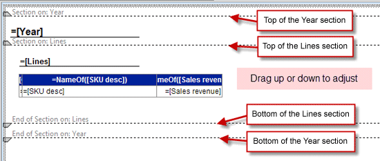
Figure 12
Adjusting report element locations
Summarizing Measures in Sections
You can summarize measures in a report in as few as two clicks. The simplest method for adding a calculation is to select the column with the measure object then clicking the add or remove calculations icon on the report toolbar.
Below are two easy methods for adding a calculation to a data table:
- Click the sigma symbol (add calculations shortcut icon) to add a sum calculation to the innermost section values
- Click the small downward arrow to the right of the sigma symbol to quickly add any of the following aggregate types:
- Sum
- Count
- Average
- Min
- Max
- Percentage
The screen in Figure 13 is where summarized values appear by default when clicking the add calculation icon. These summarized values are applied at the lowest section level.
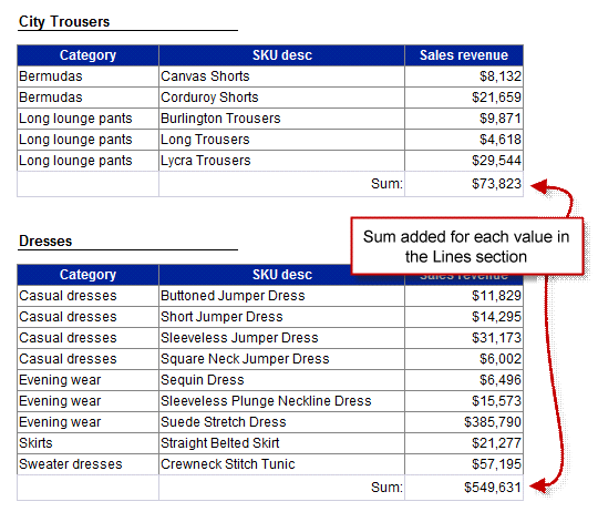
Figure 13
Summarized values
To add a summarized value for a different section, drag and drop the measure anywhere in the section (usually at the top or bottom of the section). Next, modify the calculation by selecting the measure you just added and then editing the formula in the formula toolbar. View the structure of the report before adding a summarized value for pinpoint placement.
Navigating a Report with Sections
You can navigate to a specific section value in a report by using the navigation map. As an example, you can easily toggle between sales revenue for sweaters in 2004 and leather sales revenue in 2006 with this useful tool.
In view mode, click the navigation map icon tab and expand and select any of the values listed to jump to a specific section (Figure 14). Only section values will appear in the navigation map.
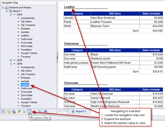
Figure 14
Jumping to a certain section
Breaks
Breaks are another method for grouping like values in a data table, and they provide an ideal way for adding subtotals to a report. Breaks are useful for analyzing data, and you can add them to a report with or without sections.
When adding a break, the values are automatically sorted alphabetically, duplicates are removed, break headers and footers are added, and a new row is automatically inserted at the bottom of each distinct value in the break object for measure summarization.
To add a break, select the column that you want grouped and then click the break shortcut icon on the report toolbar. Figure 15 highlights this process.
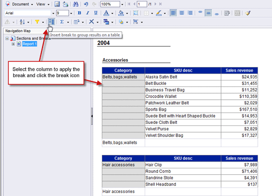
Figure 15
Adding a break to a report
Formatting Breaks
You can modify several break properties to fit your reporting requirements by taking the following steps. To do so, right-click on a break object and then select Break > Properties (Figure 16).

Figure 16
Select Properties to modify break properties
Figure 17 shows the available break properties that you can modify in view mode.
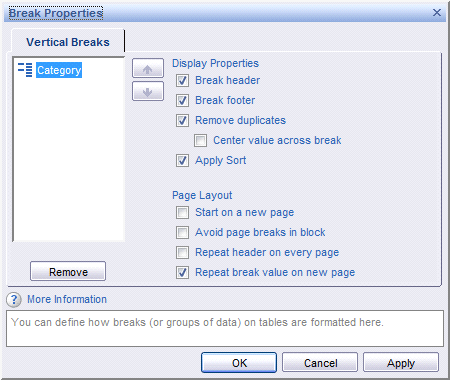
Figure 17
Available break properties
A common problem with adding breaks to a report is the repetitive header displayed for every break group. This header begins to seem redundant after repeating several times. Instead, a single header is ideal. Use the following steps to remove the header from every break group but leave one header for the data table:
- Select the break object and uncheck the Break header property
- Go into edit mode and then select the data table
- Under the Display category in the Properties tab, check the Show table header box
The end result will only show the header once per section in a data table.
Use the Fold-Unfold Toolbar to Navigate Sections and Breaks
The fold-unfold toolbar is in the default reporting toolbar located in the upper right corner of a report (Figure 18). This feature provides report viewers with the capability to quickly collapse sections they are uninterested in and expanding the sections most relevant to their analysis. “Fold-unfold” refers to collapsing and expanding sections. This feature is also available for break objects, but the data table containing the break object must be selected to view the fold-unfold blue arrows for the breaks.
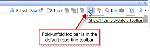
Figure 18
The fold-unfold toolbar icon
Figure 19 shows how the fold-unfold toolbar is used to navigate through section values. At the bottom of the report is a small box used as a shortcut for folding or unfolding the full list of section values in a report.
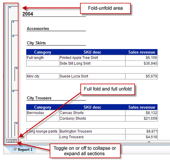
Figure 19
The fold-unfold toolbar enabled with two sections
You can also navigate to specific break objects with the fold-unfold toolbar. Figure 20 shows the same table as in Figure 19, with the only difference being that a break object is selected in Figure 20.
When comparing the two screenshots you can see that Figure 19 does not show the fold-unfold toolbar for the break object but Figure 20 does show it because the Category column was selected in the table.
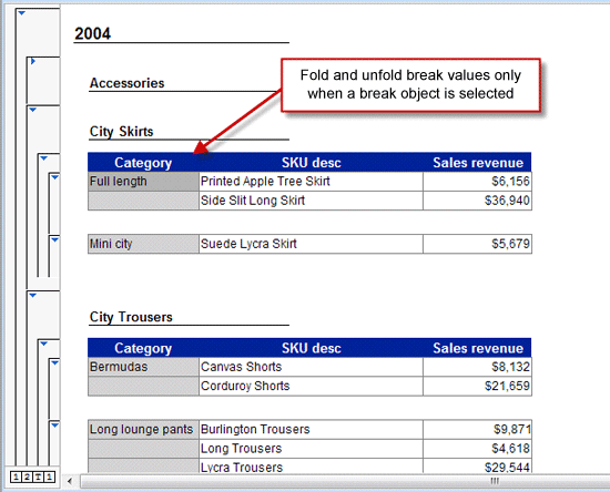
Figure 20
Fold-unfold break values shown for a selected break object