
Creating Dynamic Charts and Tables Using SAP Analytics Cloud
by Dr Marco Sisfontes-Monge, Arellius Enterprises Inc.
SAP Analytics Cloud (SAC) is becoming a groundbreaking technology to support financial teams and sales teams with amazing graphics and integration of multiple platforms both SAP and non-SAP. The great capabilities available in the SAP SAC are not limited to integration but also to flexible data display capabilities and visualizations to bring the story of your business to life. Read a general overview of the solution here. In this article we will review the dynamic capabilities for charts and tables to be adjusted so the contents are adjusted by using a control.
In this article we will review how to:
Explore related questions
- Automatically upload a flat file using drag and drop
- Create a chart and a table
- Add dynamic filters using input controls so both your chart and table change dynamically based on selections
- Configure dynamic text that will change depending on user selections
Uploading a Flat File into SAP SAC
SAP SAC runs on a similar environment to those familiar with web development or MS Excel VBA environment that you can work with tables, charts, widgets, and more. As shown in Figure 1, before we start creating charts and tables, we certainly need data. To achieve this SAP SAC has simplified this process by allowing users to perform drag and drop to create and upload into the cloud your flat file available in the desktop or in any other location.
Figure 1 shows how the *.CSV file is selected and dragged and dropped into the SAP SAC environment and the system will initiate its creation, and validation of the database on-the-fly as shown in Figure 2.
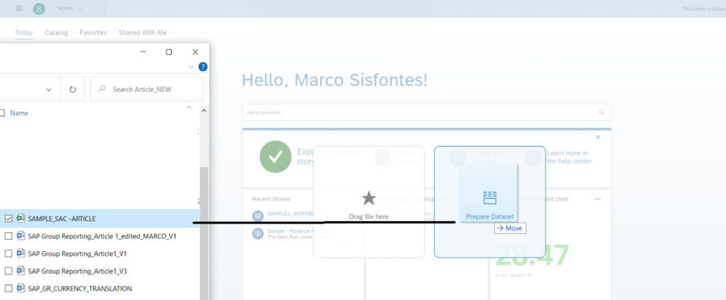
Figure 1—Performing drag and drop of a flat file into the SAC environment
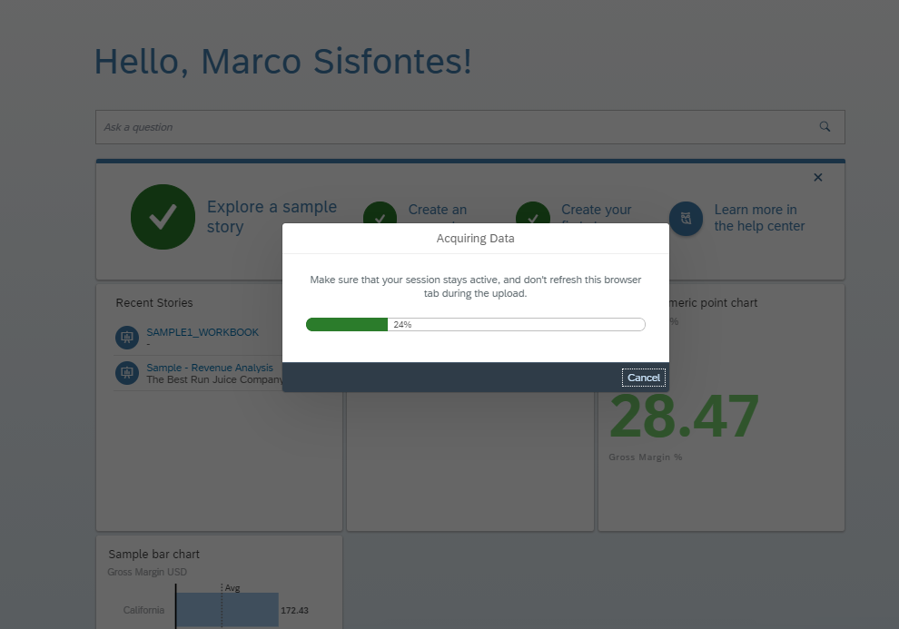
Figure 2—Automatic process performed by SAC to upload the file into the server after drag and drop
Once completed the file will look as shown in Figure 3, and SAC will notify you of any inconsistencies or errors available in your data, and it will display the contents of the flat file uploaded in the grid view.
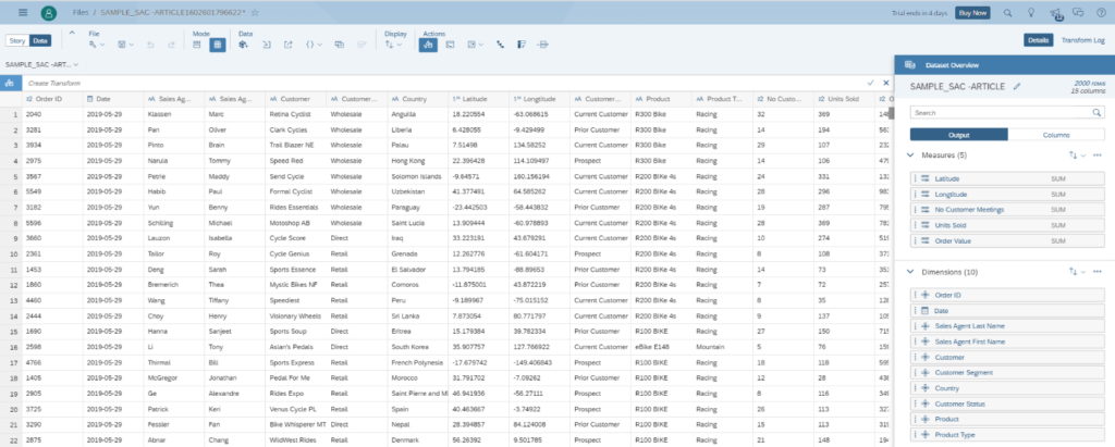
Figure 3—Grid view in SAC displaying the contents of the flat file uploaded
As shown in Figure 3, on the right-hand side, the system has created the dimensions and measures identified in the file automatically, and also assigned the dimension types based on the master data uploaded. The system has automatically identified 3 measures and 9 dimensions.
Creating a Story
A story created in SAC is nothing more than a webpage environment that you can enhance with all kinds of objects based on the data available in the database. For our purpose we need to create a chart, a table, dynamic filters, and your charts/table will change accordingly. In addition, we need to create a dynamic text based on the years selected it will be displayed on top of the chart.
To get started click on the chart icon on the insert menu shown in Figure 4 in the story icon and select the measures and dimensions to be used, and type of chart. As shown in Figure 4, a horizontal bar chart has been selected, “units sold” has been selected for measures, and “products” has been selected for dimensions. The color blue for the bars has been chosen, but it can be changed depending on your needs.
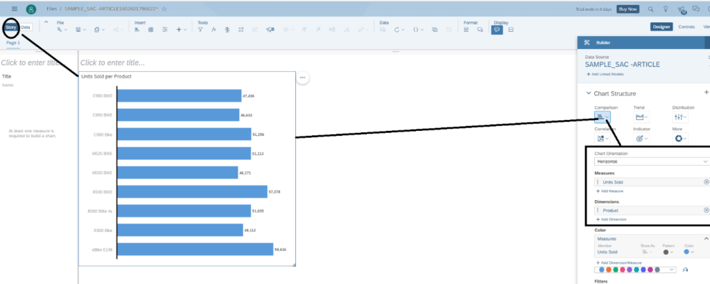
Figure 4—Creating a chart and adding to your story
Now, let us insert a table by clicking on the icon table next to the chart icon in the insert menu and set the product dimension and units sold as measure, as shown in Figure 5. Basically, we are seeing the same information in numbers and using a graph that is being updated based on the information uploaded using the flat file.
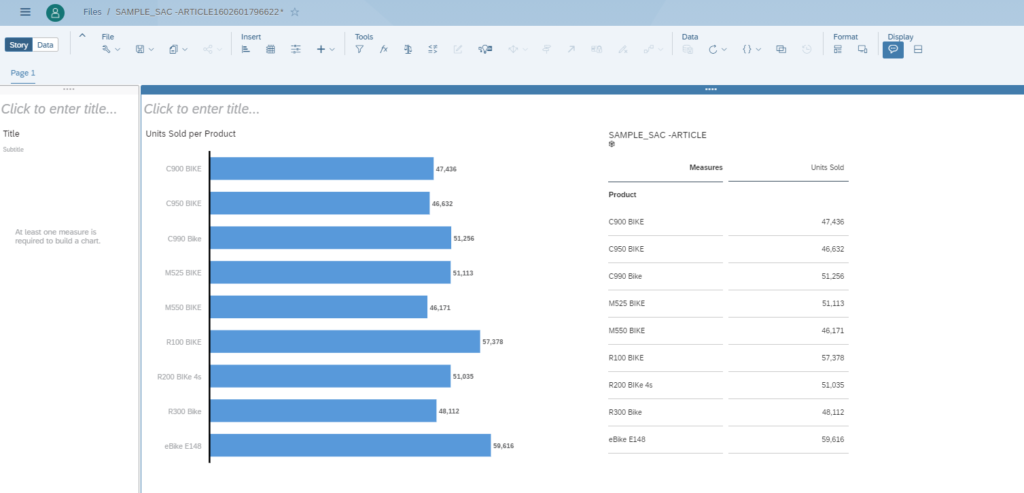
Figure 5—Creating a table in your story
Adding Dynamic Behavior to Your SAP SAC Story
At this point our development is very straight forward and contains a chart and a table that display the units sold per product; however, there are multiple years, and I would like to manage and filter the data displayed. For this, input controls in SAC becomes handy to apply and create interactive dynamic filters, and with the possibility to add styling, colors, ranges, and more. To add an input control, simply click on the icon shown in Figure 6 for page filter. This object will control the filtering of the complete page displayed. There are other limitations that can be done so selective objects are affected by the selections done with this widget object.
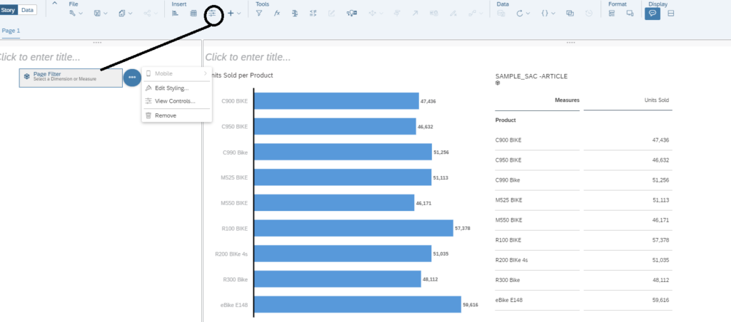
Figure 6—Creating an input control
As shown in Figure 6, the page filter object was added, and there are different options available. Access the options available in the page filter object as shown in Figure 7, select dimensions, and choose the date, and the option filter by member. As shown in Figure 7 on the right hand side, in another screen you will be able to see all the objects for the year dimension, and select the ALL parent so all years, quarters, and months are displayed, and you are able to change them on-the-fly, and click Ok.
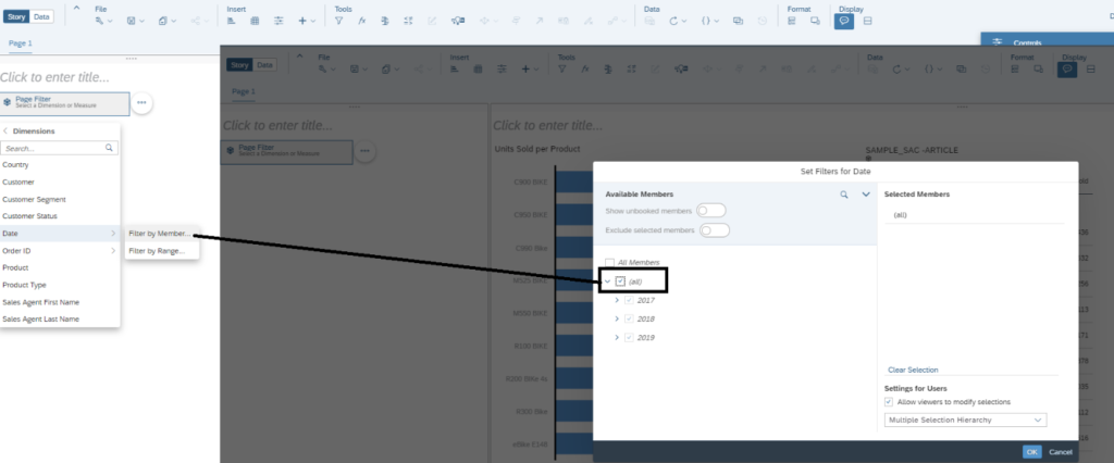
Figure 7—Creating your page filter to allow all, yearly, quarterly, and monthly selections
Once you click on the Ok button shown in Figure 7, you need to select again the page filter object we just created and expand it. As shown in Figure 8, the time dimension with hierarchy will appear for all years available in your data. Now both parents and children are available for selection using a check box. You can click on the view menu to experience the look and feel of your design from a user perspective. Select, and deselect a few years, and see how automatically your data displayed in both the chart and the table are adjusted based on your year selections.
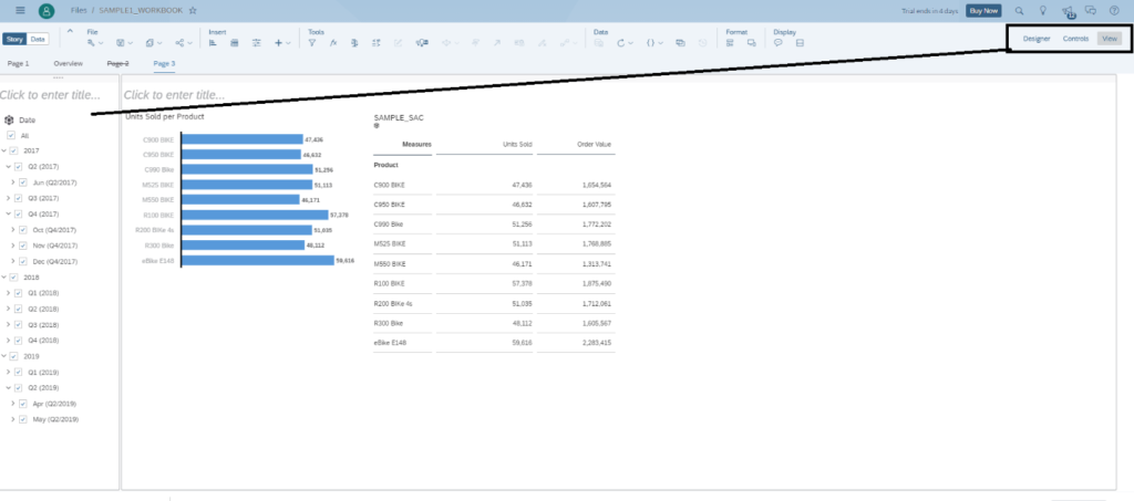
Figure 8—Working with the year dynamic filter
Now let’s add another dynamic filter so we can restrict the minimum values of the order value to be displayed in BOTH the chart and the table using a “greater than” functionality widget. For this insert a new input control, and this time select the order ID, and choose the greater than or equal to option, and set any default value. As shown in Figure 9 we have defined a default value of 10,000, so both chart and table will only display values greater than or equal to the value input by the user in real-time, that we can later adjust in the story on the fly, and the system will update both the chart and the table values. Click OK and let’s see what we have.
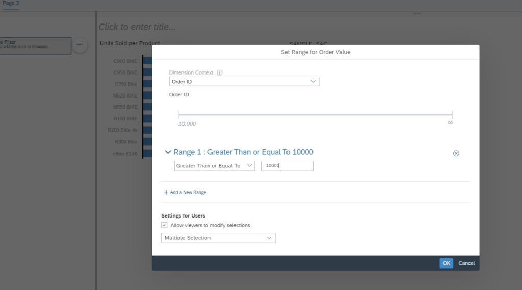
Figure 9—Setting up a new page filter to control values “greater than” or “equal to” for order value
Similarly, to our first page filter, we need to expand it so the display is adjusted as shown in Figure 10. Notice that both page filters are set up, and we can select the periods that we want to see data, and the order value minimum that we desire to see to affect both units sold per product, and order value.
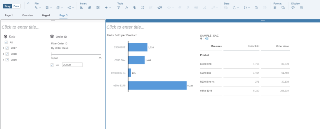
Figure 10—Your story is ready to be tested for dynamic filters
In the case above we are displaying only orders greater than or equal to 20,000 order value, since we changed it manually in the story from the value 10,000 as shown in Figure 9, and the products are displayed along with the units sold and filtered for all years. If you just want the year 2019, perform the appropriate selections as shown in Figure 11, the filters have affected successfully both the chart and the table dynamically based on the end-user selections.
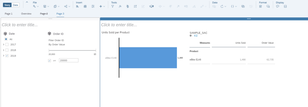
Figure 11—Testing your dynamic filters year 2019 only, and greater than 20,000 order value
Adding Dynamic Text to Your Story
Like dynamic filters, dynamic texts are quite useful for business analysts, so they do not forget the type of data that they are looking at depending on their selections when working with their Stories. To access a dynamic text first you need to insert a text object for that click on the plus sign shown in Figure 12 and choose a location for it. Let us say on top of the bar chart, and type in “Sales Analysis,” and then click on the three dots object, and select the dynamic text option as shown in Figure 12. Choose the input controls since we are selecting the page filter for date we previously created in Figure 6, and click on date, and click on create button.
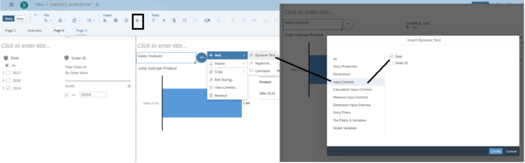
Figure 12—Creating a text object and adding dynamic text
Now we have linked the dynamic text with the master data selected for the YEAR dynamic filter object. Now as shown in Figure 13, every time that there is a selection in the page filter for year the values will be displayed also in the text on top of the bar chart. Figure 13 provides some examples on the results from changing from 2017 and 2018, to just 2019 and seeing the effects on both the chart and the table. Congratulations, now you know how to improve the visualization and make your stories more user friendly to your customers!
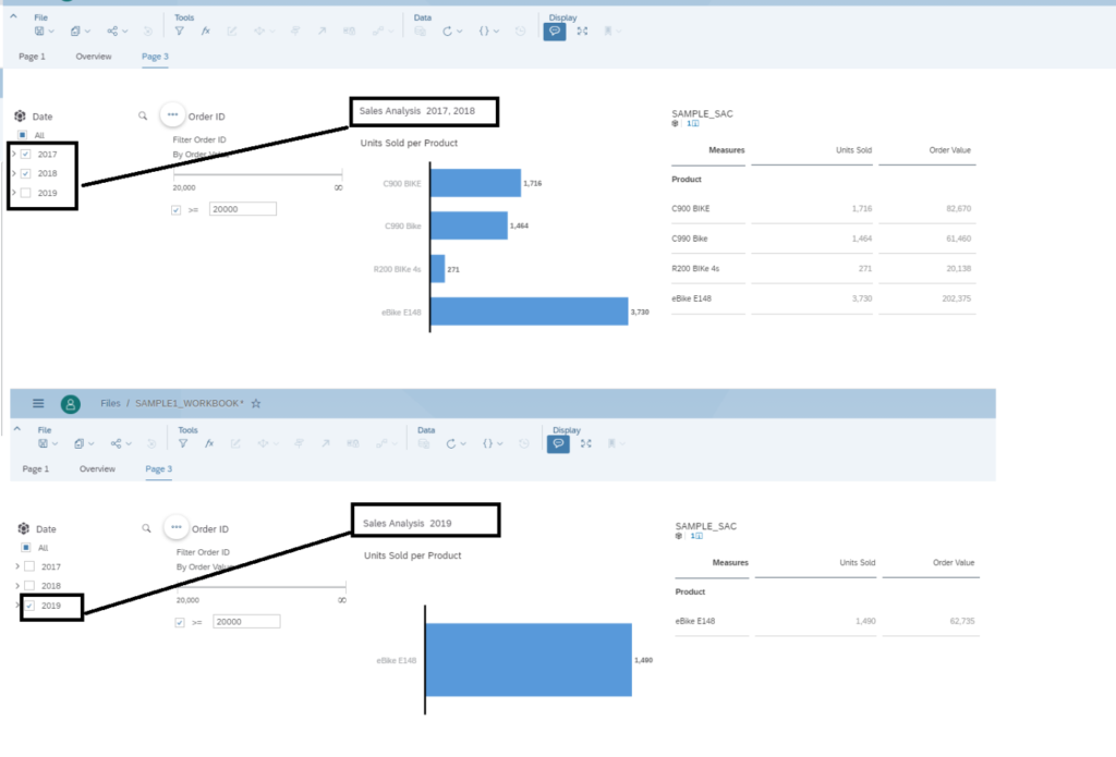
Figure 13—Testing the dynamic filters with the dynamic text object
Conclusion
We have reviewed how the functionality in SAC can support and improve your business analytics requirements, and your customer experience. This article put a lot of emphasis on the front end to help you create a more user-friendly environment that can help your end-users to get the most out of the data. Dynamic filters without question are key for customer satisfaction that business analysts require in any deployment to reduce the dependency from the technical teams. SAC offers many more capabilities such as GeoMaps, BPC planning integration, formatting and styling capabilities that you can explore now that you are more familiar with the solution, or explore some of the other articles available in SAPinsider to help you improve your SAP career.