
Creating and Modifying a SAPUI5 Custom Control
By Cord Jastram, Software Developer at DXC.
SAPUI5 offers a large set of controls ranging from simple ones like the Label to complex controls like the PlanningCalendar control. The available set of SAPUI5 controls covers most use cases for SAPUI5, but sometimes the requirements for a developer go beyond the scope of the existing controls. One example of these advanced use cases is when you want to edit and annotate PDF files using a SAPUI5 application. There is a control available from SAP for viewing PDF files, but it is a viewing only control. But SAPUI5 has a feature that comes to the rescue: SAPUI5 Custom controls.
The custom control approach allows a developer to create a bespoke SAPUI5 control in such a way that it plays nicely with the SAPUI5 framework. There are two different approaches to create custom controls. The first approach builds a control from scratch, whereas the second approach wraps an already existing non-UI5 control. In my article, I show an example for the second approach, where I wrap a commercial JavaScript-based control for editing PDF files.
Explore related questions
I wrap a control named WebViewer, which is developed by PDFTron, a company from Canada. WebViewer is a JavaScript library for viewing, annotating, and editing PDF documents. Wrapped as a SAPUI5 custom control, it allows the utilization of two interactive elements of PDF files, namely annotations and form-fields, in a SAPUI5 application. But the real value emerges when the data of a PDF file can also be processed in an SAP system, and therefore, I also implement an OData interface for PDF files and their annotations and form data.
I will not cover every detail of my SAPUI5 application in this article as it covers a lot of SAPUI5 development tasks, but the source code of the client and the source code of the OData services are available at GitHub. This allows a developer to set up the solution for testing purposes and to have a closer look at details of the implementation.
This is a series of articles consisting of three major parts. In this first part, I show a sample application that demonstrates the use of the new custom control. In the second part, I will show how the WebViewer control is wrapped as a SAPUI5 custom control. In the third and last part, I will develop a set of OData services that allows to read and update PDF files on the server from my SAPUI5 application. You can read the other part by clicking the following links:
- Demo of SAPUI5 application with custom control
- Creating and modifying the SAPUI5 Custom Control
- Connecting the custom control to OData services
Part 2: Creating and modifying the SAPUI5 Custom Control
Creating the SAPUI5 Custom Control
As a first step, I download the PDFTron demo version from and unzip the file. The demo version covers the full functionality of the commercial version but adds a PDFTron watermark to each file. Then I create a folder named pdftron in my SAPUI5 project and copy the PDFTron lib folder into it. This results in a folder structure shown in Figure 7.
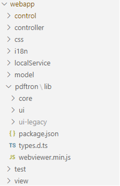
Figure 7: Project structure in VS Code after copying the PDFTRON library into the folder structure
It is difficult to find an exact definition for a SAPUI5 custom control, but the following statements give a good overview of a custom control as they also lead to an implementation guide for a custom control:
- a custom control extends the SAPUI5 class ui.core.Control
- there are three functions that connect the control to the SAPUI5 rendering mechanism:
- the function renderer() creates the HTML of the control
- actions before the rendering are implemented in the function onBeforeRendering()
- actions after the rendering are implemented in the function onAfterRendering()
- in the metadata section of the control, you can define properties that can be used for data binding and which allow you to customize your control via XML in a view definition
- when you want to add additional objects to your control via XML, then use an aggregation in your metadata
- in the metadata you also define the events that your control can fire
With my description of a custom control in mind, I had a look at the PDFTron documentation. I found a simple example of an HTML file that shows the basic steps to integrate the WebViewer control into an HTML file. Looking at the HTML file shown in Listing 1, you see that there are four major steps for integrating the control in an HTML file.
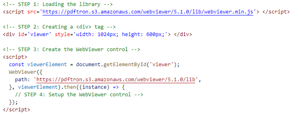
Listing 1: A simple HTML file that uses the WebViewer control
STEP 1 is loading the library, STEP 2 is adding a DIV tag to the HTML, and STEP 3 creates the WebViewer control using the DIV tag from the previous step. After the creation of the WebViewer, STEP 4 performs the initial setup.
These four steps can be mapped to a SAPUI5 custom control. STEP 1 is done in the definition of the custom control via the sap.ui.define statement. STEP 2 is performed in the renderer() function, and STEP 3 is performed in the onAfterRendering() function, followed by STEP 4 after the creation of the WebViewer control. The function onBeforeRendering is not used. I also define the properties width and height in the metadata. This results in the first version of my custom control shown in Listing 2.
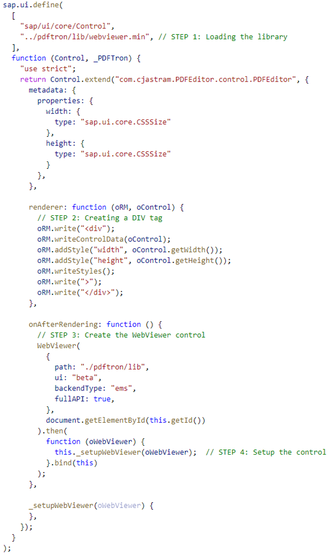
Listing 2: First version of the SAPUI5 custom control
Using this first version of the control, I define a simple XML view which only shows my custom control.

Listing 3: The XML view with a custom control
Running the SAPUI5 application, you see the WebViewer custom control as shown by Fig. 8. Now a WebViewer control is available inside a SAPUI5 application, and from the fact that the control only covers 75 percent of the width of the screen, you see that configuring the width of the control via XML works out of the box. However, the width property is only used to create the HTML for the control.

Figure 8: The custom PDFEditor control in a SAPUI5 application
In the next step, I enhance the custom control in such a way that it can be used to configure a property directly related to the WebViewer via XML from my view. Figure 9 shows an example, where a property named theme allows to configure the theme of the WebViewer to “dark” or “light”.
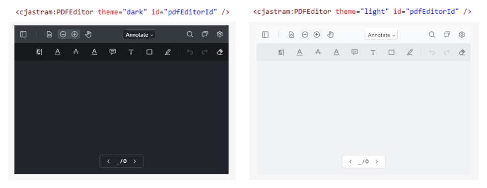
Figure 9: Configuring the WebViewer via XML
For implementing this feature, you must have in mind that the WebViewer control is created AFTER the properties of the custom control are set. Figure 10 shows the sequence of events. You see that you must store the properties which are set before the WebViewer control is created in order to synchronize these properties with the WebViewer after it has been created. But once the WebViewer control has been created, changes of properties for the custom control have to be synched immediately with the WebViewer.
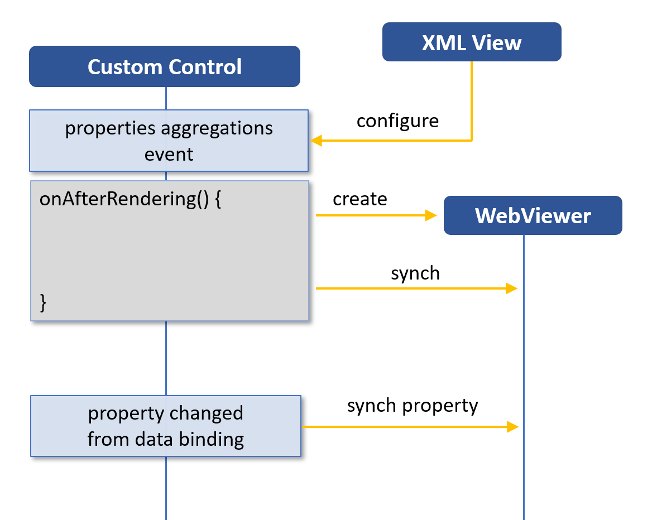
Figure 10: Synching the custom control and the WebViewer control
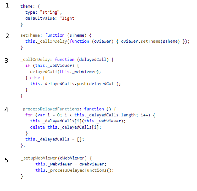
As an example of an automatically synching property, I define a property theme in the metadata of my custom control as shown by code snippet 1 in Listing 4. The default implementation of the setTheme function provided by the SAPUI5 framework would not synchronize the property with my WebViewer control. Therefore, in snippet 2, I redefine the setTheme function. There I create a JavaScript function object that is executed by the function shown in snippet 3. This function checks if the WebViewer has already been created. When the WebViewer has already been created, this function executes the function given as an argument immediately. Otherwise, it stores the function in an array. Snippet 4 shows the function which processes all function objects stored for a delayed execution. As this function is called after the WebViewer control has been created, as shown in snippet 5, the delayed execution will automatically be performed.
Listing 4: Code snippets for synching properties
This approach looks a little bit overcomplicated at first, but it simplifies adding new properties to my custom control as it ensures that the properties are always synchronized with the WebViewer control after the creation of the WebViewer.
In its current version, the custom control implements six properties, which are shown in Table 1. These properties can be used in an XML view to insert a Custom Control into the view.

Table 1: Properties of the PDFEditor control
When you look at the data type of the data property in Table 1, you might be surprised that the type is string as PDF files are binary files. However, in my scenario, the files are provided by an OData service, and therefore I use a base64 encoded representation for file data. The encoding increases the size of the actual data by approximately 33% in comparison to the binary data, but the encoding simplifies the implementation of my OData services.
As the WebViewer control uses binary data, I have implemented a base64 to binary conversion and perform the conversion in the setData function of my custom control, as shown in Listing 5.
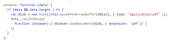
Listing 5: Loading a PDF file in the WebViewer control
Modifying the user interface
Now I extend the custom control in such a way that buttons can be added to the WebViewer via the XML view. Also, events from these buttons can be processed in the controller of the view in which the custom control is included. Listing 6 shows the XML definition for the custom control with additional definitions for a divider and two buttons. This XML definition results in the additional buttons shown in Figure 2.

Listing 6: Adding buttons to the WebViewer
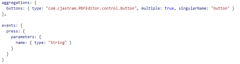
Adding additional items to a SAPUI5 custom control is done by defining an aggregation in the metadata of the control and by defining a JavaScript class that defines the properties of the items of the aggregation. After defining the class Button, as shown in Listing 7, I add the aggregation section and the press event in the metadata, as shown in Listing 8.

Listing 7: Defining a Button class to be used in the custom control
Listing 8: Defining an aggregation of Buttons and an event for the custom control
By deriving my Button class from the ManagedObject class of the UI5 framework, I get the mapping from the XML file to the properties of the Button for free.
Now I create additional buttons, as shown in Listing 9. At first (1), I get the buttons that have been defined in the XML, and then I call the setHeaderItems function of the WebViewer. For each button, I get the name and the type of control (2). Depending on the type of the button, I add a divider or a button (3). By firing a press event when a button is clicked (4) the events from the WebViewer button can be processed in the controller of the view in which the custom control is embedded. The function from Listing 9 is called after the WebViewer control has been created (STEP 4 in Listing 2).
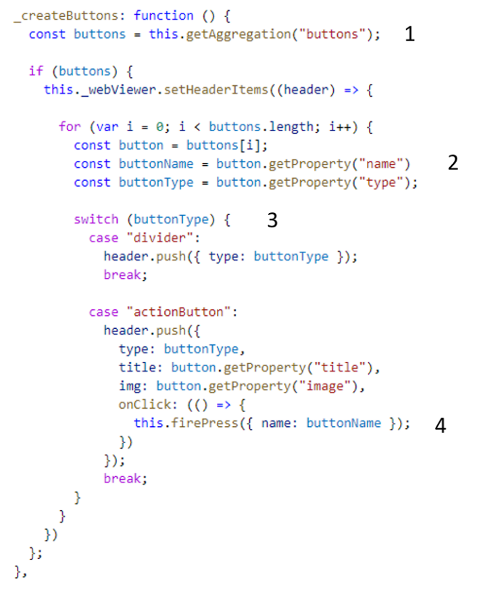
Listing 9: Using the XML configuration to add buttons to the WebViewer control
In the XML shown in Listing 6, the press event from the buttons has been wired up with the onPdfEditorButtonPress function of the controller. This function is shown in Listing 10. The name of the button which has created the event is used to dispatch to different functions of the controller, and the custom control can be accessed from the source of the event.

Listing 10: Handling events from the custom control in the controller
Now, as the integration of the user interface part of the custom control is done, I connect the custom control with OData services in order to save modified PDF files to my SAP system.
More Resources
See All Related Content-

-

-

 Premium
SAPUI5 Nested Components
-