A Simple Workaround for Charts in SAP Analytics Cloud Story
Key Takeaways
⇨ Showing totals is a much-needed requirement in bar/column chart widgets in SAC. However, this feature is not available out of the box.
⇨ This article provides a step-by-step workaround solution to achieve this in SAP Analytics Cloud considering a business scenario.
⇨ Steps are simple and take only few minutes to enable and setup in an SAC story!
There is a key business need to analyze employee data across the organization. This will help influence strategic decisions for the Human Resources division with respect to employees. One of the widgets that is required in this story is to use some bar/column charts to show data comparison between employee types and show the total employee count.
A bar chart would enable you to analyze
- Employee Count split between Contingent & Regular
- Total (Employee count)
Step 1
Let us create a story in SAP Analytics Cloud with a sample dataset containing Employee data.
Explore related questions
We can start by Logging in to SAP Analytics Cloud tenant using our login credentials and importing the available dataset using the “Flat File” option.
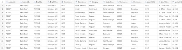
Fig. 1: Sample flat file with Employee Details
Step 2
After exiting Data Preparation step, let us now insert a bar/column chart from the available widgets and select “Count” and “Category” from the list of available Measures and Dimensions, respectively.
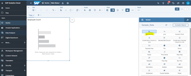
Fig. 2: Insert bar/column chart from the available widgets in the story builder.
A new bar chart is generated in SAP Analytics Cloud showing comparison between “Regular” and “Contingent” employees.
However, there is no option available in the selected widget to show the total count of employees in the same bar chart.
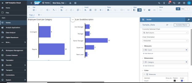
Fig. 3: Bar chart in SAC shows comparison between Regular and Contingent employees. However, no option available in this chart type to include “Totals” in the same bar chart.
To achieve this requirement of adding “Totals” in the bar/column chart, let us explore at a workaround wherein we will use the table and in-cell chart features of tables in SAP Analytics Cloud.
Step 3
Let us insert a “Table” from the toolbar and select the “Category” and “Count” as Rows and Columns respectively.
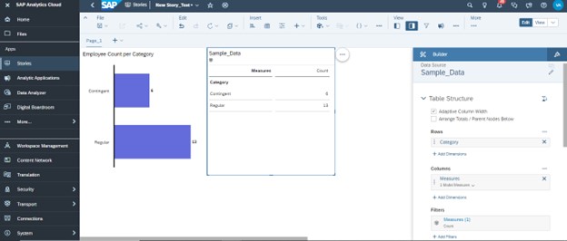
Fig. 4: A new table has been inserted in the sample story with “Category” and “Count” as Dimensions and Measures.
Step 4
We will now Add “Totals” to the table by right-clicking on “Category” and selecting the option Show/Hide -> Totals.
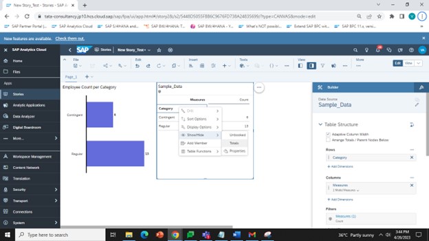
Fig. 5: Add “Totals” to the dataset using the option selected above.
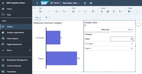
Fig. 6: Table shows Employee category wise split and count of Total employees in the organization.
Step 5
Let us enable the in-cell chart option by right -clicking on “Count” and selecting “In-cell Chart” option from the available list of options.
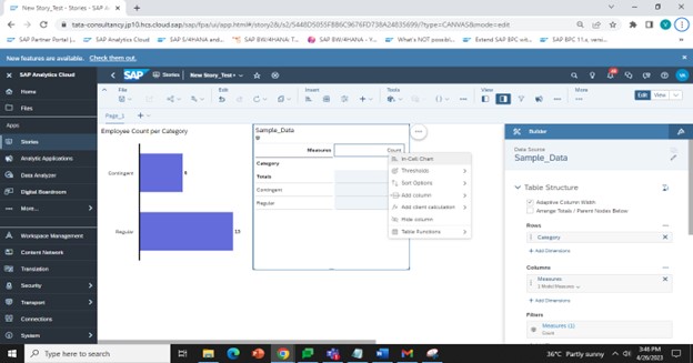
Fig. 7: Enable “In-cell chart” option for the table added in the story
As shown in the image below, this will convert the table into a bar chart representation. We need to carry out some simple cosmetic changes to the in-cell chart shown in the table on the right, to make it similar to the bar/column chart widget on the left.
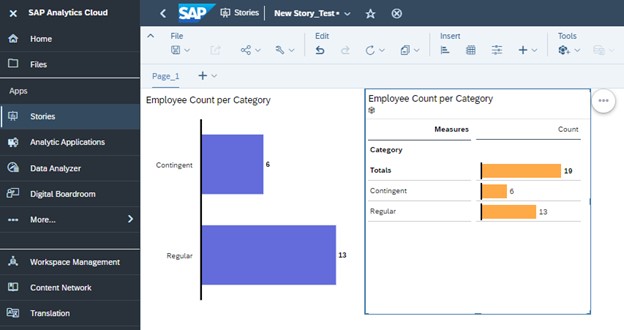
Fig. 8: “In-cell Chart” is now enabled for the table with Employee Data.
Step 6
The widget is now showing both “Totals” and comparison between “Contingent” and “Regular” employee data.
Let us go ahead and do some simple “Show/Hide” steps on this widget to remove unwanted headers and text to make this table with “In-cell Chart” like a bar/column widget.
We can start by removing all the selected items except the table header in the image below.
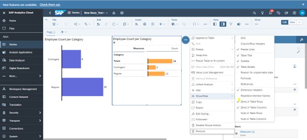
Fig. 9: Remove all options except “Table Title” from the list of options
Step 7
With most of unwanted items hidden, we will remove the grid lines in the widget by selecting the “Count” column -> Go to “Styling”-> Select “Lines” -> Option “None.” We need to carry out the same step for the “Category” column.
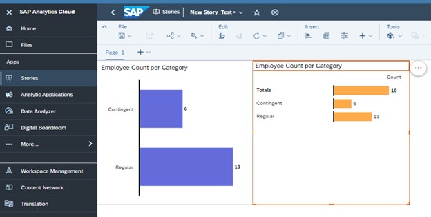
Fig. 10: Remove all the grid lines for the In-cell chart in the table shown above
Final Step
With all the previous steps complete, we need to finally do the following: Change the color of column header title “Count” to white and remove the black color from the “Y” axis. This can be done easily by going to Styling -> Font -> Select color as white. For removing the black color on the bars, we need to go to “In-cell chart properties” and change “Axis line color” to “no-color” or desired background color.
In case we have a background color other than white then the same color needs to be selected while carrying out the color changes mentioned above.
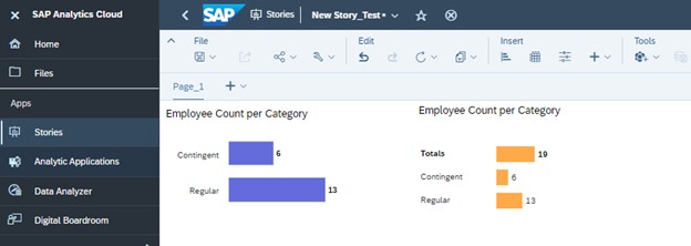
Fig. 11: Changing the column header and Axis line color to same as background, the table widget used looks similar to a bar chart. In addition to the comparison data displayed for Employee category, “Totals are also visible in the same widget.
We have the desired bar chart which shows the “Totals” along with the category wise split of employee count by regular and contingent.
Although the steps may appear to be lengthy at first glance, they should take few minutes to enable and setup for a widget added to a SAC story!
Conclusion
By leveraging this powerful “In-Cell Chart” feature available in table widgets provided by SAP Analytics Cloud, and following the workaround steps mentioned above, we have now successfully explored how to add “Totals” to a bar/column chart displaying comparison of datasets to a sample SAC story.