Learn from Sandesh Darne how to quickly and efficiently create new SAP UI5 controls or enhance existing controls to improve users’ web or mobile experience.
Key Concept
The SAP UI5 technology framework comes with a set of visual and non-visual user interface (UI) controls to develop web or mobile enterprise applications. It offers an enhancement framework to generate additional UI controls with new enhanced functionalities. With a conceptual design understanding of the basic SAP UI5 control framework and following well-proven enhancement guidelines, a developer can rapidly map the majority of the functionalities of existing controls to the required new controls. Further, integration flexibility of third-party libraries and effective JavaScript and JQuery language ease development efforts to quickly achieve the final desired control functionalities.
- Could not figure out how an existing control could provide the exact or nearby functionalities for new control
- Could identify nearby existing control, but failed to extend it due to the complexity of the original control design and was not sure how and which functions to re-write or drop
- Existing control fails to meet the demand of further intuitive navigation functionalities
- Could not provide dynamic user interface (UI) behavior
- UI demands more animation or transitions with respect to user interactions
- Alignment of control theme to company corporate theme
- Existing control interaction with mobile device features
I address some of these common challenges with suggested design approaches and guidelines. I further share a five-step decision-making process to help you select the most optimal and effective development strategy. For better understanding, I walk you through a sample web application development process for a key performance indicator (KPI) dashboard. It provides guidelines you can refer to for any web or mobile application development using the SAP UI5 framework.
Note
I assume the reader has a preliminary understanding of SAP UI5
application programming knowledge. Basic JavaScript programming design
knowledge is an added advantage.
Getting Started
Consider a sample KPI dashboard web application design in which a business KPI can be analyzed or evaluated by business users. The expected features and functions of the dashboard application are as follows:
- Display business KPI brief information such as name, value, and current status with up (green)/down (red) visual indicators supported by budgeted and actual values.
- Enable business users to evaluate KPIs by enforcing various time dimensions such as year-to-date, current month, and rolling forecast
- Allow business users to select a KPI and see more detailed information in a column chart
- Show all KPIs or top seven KPIs
- User interaction with application should be responsive with required animation or transition effect such as in shape or color wherever required
- Able to execute on web browser or any mobile device
Figures 1 and 2 show a wireframe that helps you to understand how a KPI dashboard application can be used. As shown in Figure 1, the screen displays all KPI objects at the center of the screen in a grid layout. The left side of screen provides buttons to see the KPI status at various times. For evaluation a user can click any time button and see an immediate reflection of the values and status on every KPI object.
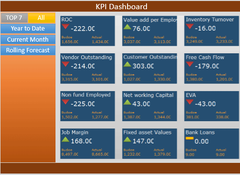
Figure 1
Landing screen on application start
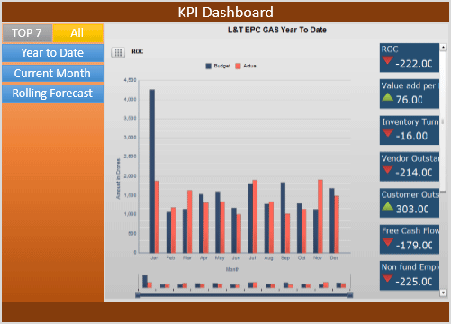
Figure 2
After selection of a KPI title, the screen changes UI positions with charts
To view a specific business KPI in more detail, a user can click the desired KPI object displayed on the screen. With that action all KPI objects move from a grid arrangement and re-arrange in the right column. The column chart appears in the center of the screen showing more details of the selected business KPI (Figure 2).
Although the application looks simple, underlying challenges surface when a developer starts the application design process. A typical flow of the design and development process is done in these five steps:
- Leverage existing SAP UI5 controls
- Identify gaps where the standard does not meet final required design
- Evaluate the standard SAP UI5 controls’ design to find possibilities for enhancements
- Define an enhancement path for the desired controls design
- Develop the application with the desired controls
Next I provide guidelines and details that help you to make quick decisions while the design process progresses. Each guideline includes a description and a concept further explained with KPI dashboard application design process steps.
Step 1. Leverage Existing SAP UI5 Controls
Guideline: Identify the required UIs for the application and map them with out-of-the box SAP UI5 library controls.
Description: One of the important design processes of the application architecture is to look for what is readily available. Identify existing SAP UI5 library controls that can exactly map to the look and feel and expected behavior needed by the application design.
Dashboard application example: As per the wireframe design of the sample KPI dashboard application, all the UIs except for the KPI object UI can be developed using standard SAP UI5 library controls without any functional or behavioral modifications of the original control design. Those controls could be a split application, button, label, or chart. However, you can take care of the UI control’s visual aspect such as look and feel and color theme by defining style classes in a standalone Cascade Style Sheet (CSS) file or in part of the application index.html file. That CSS file can be useful for standard or custom UI controls.
Now let’s understand how to address the rest of the UIs. Here is a guideline to make the process easier.
Guideline: Identify standard SAP UI5 controls that could partly map the required UI functionalities or behavior of the application under development.
Description: Application UIs that do not map to the standard SAP UI5 controls can be further evaluated based on required execution behavior and visual aspects. Some of the aspects may exist in standard controls and could be ideal candidates for further enhancements to design or build for the final control.
Dashboard application example: The KPI object UI is not fully mapped with any standard SAP UI5 library controls. This conclusion is derived by defining detailed visual or behavior aspects of the KPI tile object, and finding those in exact or near to standard SAP UI5 controls. In this process you may find more than one standard control with gaps or missing aspects as per the design of the final UI.
Step 2. Identify Gaps Where Standard Does Not Meet the Final Required Design
Table 1
|
Visual/behavior aspect
|
Description |
Standard SAP UI5 controls
|
1
|
Dynamic content display and flexible alignment of content |
The KPI tile object should display in a rectangular shape big enough to accommodate content such as the name of the KPI, a dynamic visual indicator showing up or down status based on the current KPI value, the KPI value, and the budget and actual values. Figure 3 shows the content alignment and formatting details.
|
Partly map with standard Tile control
Gap: Provision of display content. Its sequence and alignment of StandardTile control do not satisfy the need of the KPI object content and its design. StandardTile control content display and format are shown in Figure 4.
|
2
|
Dynamic shape of KPI tile object |
The KPI tile object should appear in a rectangular shape with two sizes based on its location on the screen.
- When all KPI tile objects are displayed in matrix layout at the center of screen, every KPI object should able to display content such as KPI name, value, indicator, budget, and actual labels with values. The rectangular size of the KPI object must be big enough to accommodate all details (Figure 5).
- When all KPI tile objects are displayed in column layout, every KPI object should display content limited to KPI name, value, and indicator only. Few content displays need a rectangular size of the KPI object much smaller than the size requirement defined in point 1. Figure 6 is an example.
These two sizes should dynamically change based on KPI object location in the screen
|
Partly map with Tile control and TileContainer control
Gap:
- StandardTile control provides fixed height and width and hence fails to provide a dynamic size or shape display.
- Standard TileContainer control cannot provide column layout.
|
3
|
Transition or animation |
Three transition effects are required for KPI objects:
- When the application loads on a web or mobile device, all KPI objects appear from the top-left corner of the screen toward the center of the screen and form a matrix layout (Figure 7).
- In response to a click event raised on any KPI, the tile object moves all KPI tile objects from the center of the screen towards the right of screen and forms a column layout (Figure 8).
- In response to a click event raised on any time dimension, buttons or a chart move all KPI tile objects towards the center of the screen in the matrix layout as shown in Figure 9.
|
Partly map with TileContainer control
Gap: Not able to produce dynamic layout of KPI objects
|
4
|
Events |
The KPI tile object should able to list events such as a click or tap
|
Fully address using standard Tile control
|
Table 1
Behavior aspect of controls under design
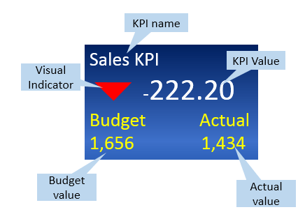
Figure 3
Alignment and formatting details

Figure 4
Standard tile content display and format
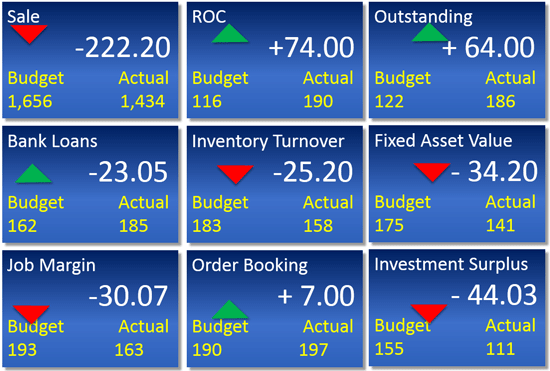
Figure 5
Example of rectangle size
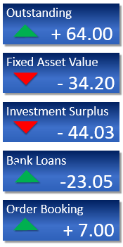
Figure 6
Example of smaller rectangle
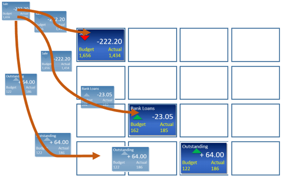
Figure 7
Matrix layout
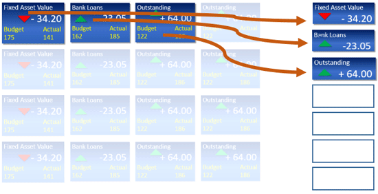
Figure 8
Column layout

Figure 9
Tile objects move to the center of the screen
Guideline: As described in Table 1, I consider the Tile, StandardTile, and TileContainer standard controls as the best fit for current design needs. These standard controls are listed against each design aspect showing what can be leveraged and where they are short of fulfilling the need.
Finding relevant or nearby standard controls is the initial step of the process. However, consideration of those partially mapped standard controls for further enhancement can be done after studying the technical design and implementation of individual selected controls.
Study the relevant design of technical implementation of identified standard controls that partly map to the required aspects of the final UI. Evaluate development possibilities or enhancements to accommodate new functionalities identified earlier as gaps. If the gap cannot be bridged due to any valid reason, then disqualify that standard control to be used as a base for the final desired UI.
Description: Visual and behavioral aspects exhibited by standard controls are based on the technical design of those controls. SAP UI5 library controls are mostly extended designs of either base UI element classes or standard UI controls. The control design code is JavaScript variables or functions that are mainly called properties and methods of control.
Identify and study relevant properties and methods that are responsible for producing the desired aspects that are partly mapped to the final UI aspects. Determine the limitations of the current design of standard controls. Provide development opportunities to enhance the original control to bridge the gaps. In very rare circumstances the original control may not be flexible enough to offer more enhancements due to valid reasons, such as the need to change the data type of the original control parameters or to change the code of the control methods. In those situations you should create a new control.
Each of the SAP UI5 library visual and non-visual controls are represented by two JavaScript code files. One defines the control properties and methods. The name of the file could be <Control Name>.js. The other takes care of the rendering of the control using render class implementation. The control renderer file name could be <Control Name>Renderer.js. For example, if the control name is myButton then the file names could be myButton.js and myButtonRenderer.js.
Step 3. Evaluate the Standard SAP UI5 Controls’ Design to Find Possibilities for Enhancements
Table 2
| Control name |
Code file |
| Tile |
Tile.js
TileRenderer.js
|
| StandardTile |
StandardTile.js
StandardTileRenderer.js
|
| TileContainer |
TileContainer.js
TileContainerRenderer.js
|
Table 2
List of standard control and related JavaScript files considered for evaluation
Method A: Go through the control design files to understand program code lines. If you downloaded and installed SAP UI5 libraries on a PC then you can find all the controls files located in the respective directory path of the control package. For example, the tile control is packaged in sap.m and hence Tile.js and TileRenderer.js files exist in <SDK root>resourcessapm. Since these are JavaScript files they can be read using any simple PC editors such as Notepad.exe or Notepad++.exe/Eclipse Editor. If you are interested in seeing a readable file (e.g., code in printer style) then you can read Control JavaScript file with the suffix dbg. For example, the readable file for tile control would be Tile-dbg.js.
Method B: Understand execution of the example application of the control. For better understanding of the execution behavior of a standard control, I executed an example at the <SDK root>/test-resource/sap/m directory. I prefer to execute those applications in a Safari or Google Chrome browser to leverage open source web developer tools of those browsers. They are mainly known as Web Inspector for the Safari browser and Developer Tool for the Chrome browser. These tools are intuitive enough to quickly give you detailed information about related displays and relevant HTML code lines along with respective JavaScript and CSS classes. Tool features such as breakpoint settings in code lines allow you to manipulate CSS file style properties and variable values at runtime, which is helpful for a quick understanding of application programming code and its execution time impacts.
Using these two methods you can answer the questions such as which controls’ methods or properties are most relevant for the current design need and the enhancement opportunities that can bridge gaps for the final UI design.
I applied both methods on selected standard controls. Table 3 shows those controls along with gaps identified in the earlier section.
StandardTile control
|
|
Code files
|
StandardTile.js and StandardTileRenderer.js
|
|
Gap identified
(refer to record 1 of Table 1)
|
Provision of display content; its sequence and alignment of StandardTile control does not satisfy the need of KPI object content and its design. |
| Reference example application from SDK |
StandardTile.html |
Table 3
StandardTile control details with identified gaps
I first verified control metadata in StandardTile.js to understand the defined properties of the control. Apart from the icon property, the control properties may not be appropriate for KPI object content.
Scope for enhancement: Enhance the standard control to accommodate additional properties (i.e., kpiName, Budget, and Actual) in the metadata definition of the standard control.
Going further through code lines, I found control methods _getIcon and _getImage defined to set the icon property for a given icon image from the icon library pool. These methods are not suitable for a KPI tile object status indicator design in which a display of an up icon and a down icon needs to be based on a performance indicator of positive value or negative value.
Scope for enhancement: Enhance the standard controls method definition by adding a new method to address the need for a behavior status indicator.
I got a quick understanding of display content alignment after going through StandardTileRenderer.js program code lines and observing the example application execution as described in method B. Standard display content alignment is not suitable as per the design requirement of the KPI object display content.
Scope for enhancement: Override the standard control renderer method to achieve the desired the content display.
Tile Control
Now I discuss tile controls analysis and enhancements. Table 4 shows tile controls-related gaps identified in the earlier section.
| Tile control |
|
Code files
|
Tile.js and TileRenderer.js
|
|
Gap identified
(refer to record 1 of Table 1)
|
Tile control provides fixed height and width and hence fails to provide dynamic size or shape display
|
Reference example application from SDK
|
Tile.html
|
Table 4
Tile control details with identified gaps
Scope for enhancement: Override or redefine the CSS class either in the application or in the UI control enhancement.
TileContainer
Now let’s analyze the TileContainer standard control. Table 5 shows the TileContainer control-related gaps identified in the earlier section.
| TileContainer control |
|
| Code files |
TileContainer.js and TileContainerRenderer.js |
Gap identified
(refer to record 1 of Table 1) |
Not able to produce dynamic layout of KPI objects |
| Reference example application from SDK |
TileContainer.html |
Table 5
TileContainer control details with identified gaps
SAP UI5 library control API code files are well documented along the code lines and follow naming standards that are supported so a developer can quickly understand the purpose of the defined metadata and methods. In many cases you will find that control property or method name are self-explanatory. Due to disciplined structured programming, complex coding can be easy to understand. Leveraging those documentations and naming standards, I was able to gather methods in TileContainer.js, which is responsible for producing content layout. They are as follows:
- _updateTilePositions
- _updatePager
- _calculatePositions
- _getTilesFromPosition
- _applyTranslate
By setting breakpoints for each of those identified methods, I verified execution of the example application at runtime as described in method B. This verification process not only confirmed the relevant responsible methods for content layout, but helped me to understand the execution sequence of methods as well.
I found update _TilePositions and _calculatePositions are the methods that determine the positions of all the tile objects inside the tile container object to form a matrix layout.
These methods further maintain the tile objects matrix layout in events such as browser re-size, mobile device landscape or portrait orientation, or click or tap events.
Therefore, the current design of the TileContainer control is not suitable for the requirement of transition and animation.
Step 4. Define an Enhancement Path for the Desired Controls Design
Understanding the relevant design of standard controls and listing possible solutions to overcome identified gaps help determine further actions in your enhancement strategy. Use these design directions as guidelines. First collect all required enhancements of a standard control and decide either to extend the control or create a new control. The decision can be made based on the following criteria:
- Addition or deletion of metadata
- Addition of new methods or override of existing methods
- Override of the renderer method
- Re-definition or modification of CSS styles
- Degree of modifications or enhancement to program code
Here is the control collection of enhancements and the thought process I used to decide the final control enhancement or development strategy.
StandardTile controls enhancements requirements:
- Enhance the standard control to accommodate additional properties (i.e., budget and actual) in the metadata definition of the standard control.
- Enhance the standard control method definition by adding a new method to address the need of status indicator behavior.
- Override the standard control renderer method to achieve the desired content display
The above three enhancements discussed for the StandardTile control would be additional code to modify almost all original functionalities in StandardTile.js and StandardTileRenderer.js. In such situations the guideline is: enhancements need to be carried out by extending almost all design parts of a standard control. Then it is appropriate to create a new control.
You can write a new UI control code either in the application root file (generally index.html) or in a separate file with a JavaScript file extension which further is referred to in the application root file after the bootstrap code. Rather than writing all UI control development code for metadata definition, related JavaScript functions, and to render methods from scratch, I prefer to copy standard UI control files and rename them with a new UI control name. New UI control file names must adhere to SAP UI5 file naming standards. If a new UI control name is StandardTileKPI then related file names must be StandardTileKPI.js and StandardTileKPIRenderer.js. These files are included in the application root file after bootstrap code lines.
Tile control enhancements requirements require you to override or re-define a CSS class either in the application or in the UI control enhancement.
For this enhancement you do not need to extend the standard tile control. Standard SAP UI5 style classes can be re-defined at the application root file. In most cases it is Index.html if not specified with another name. The most ideal place to redefine a standard CSS style class is after bootstrap code lines in the application root file. I prefer to write all such classes in a separate CSS file and refer to that file after bootstrap code lines in application root file.
Note
Re-definition of CSS style classes is applicable to all instances of related standard SAP UI5 controls used in an application.
As discussed earlier, you can extend the standard TileContainer further for re-defining the _updateTilePosition and calculatePositions methods and enhancing the render function. For better understanding, I prefer the extended control name as TileContainerExt. Enhance the control further by following this guideline: the extension of standard UI control JavaScript programming code lines can be part of the application root file. However, for better application programming code modularization, UI control-wise it is advisable to have a dedicated JavaScript file with a collection of all the required enhancements (typically metadata, JavaScript methods, and renderer functions).You then refer to that file into the application root file after bootstrap code lines (using <SCRIPT>). Such file names must follow SAP UI5 naming standards; therefore the file name for TileContainerExt control is TileContainerExt.js.
Step 5. Develop the Application with the Desired Control
I quickly take you through UI control enhancement programming code as defined in earlier sections along with their use in the final application. Figure 10 shows code snippets for the standard TileKPI.js file. They are the essential declarations for a new control.
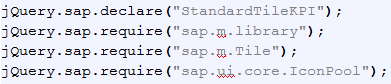
Figure 10
Standard TileKPI.js file
Figure 11 shows the constructor of the new StandardTileKPI control with the new parameters discussed earlier.
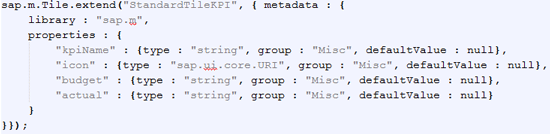
Figure 11
New parameters added
I introduced a new method (Figure 12) to the correctly allocate icon based on positive or negative differences between the budget and actual parameters (Figure 12).
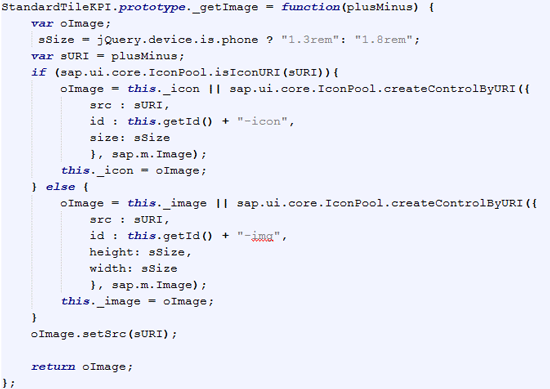
Figure 12
Icon adapted to show the difference between budget and actual
Code snippets for the StandardTileKPIRenderer.js file show the essential declarations for the new control renderer method (Figure 13).
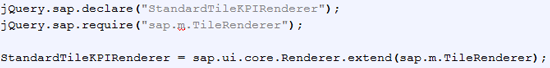
Figure 13
New renderer method declaration
For better understanding let’s quickly look at the required new layout of StandardTile Control UI shown in Figure 14.
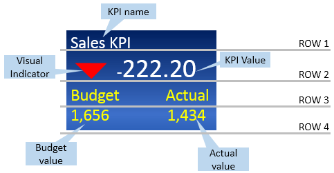
Figure 14
KPI tile object content layout
As shown in Figure 14 the contents are organized in four rows. The code snippets are respective to each row display. Figure 15 shows the development code for row 1.
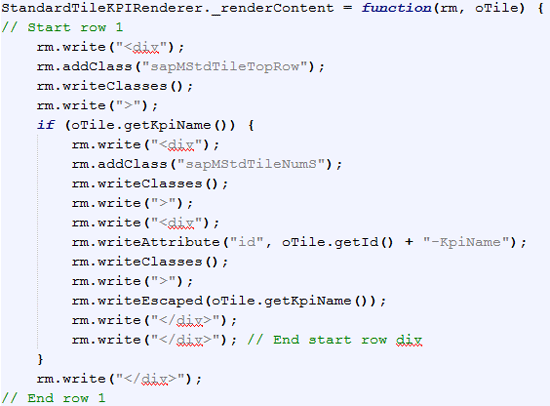
Figure 15
Row 1 code snippets
Row 2 shows the display icon symbol either with a green up arrow or a down red arrow with the color depending on the variance between budget and actual values. Figure 16 shows the development code for row 2.
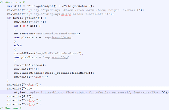
Figure 16
Row 2 code
Figure 17 shows the code lines for row 3, which displays labels.
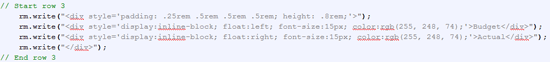
Figure 17
Code for labels
Figure 18 shows the code for row 4 which displays Budget and Actual values.
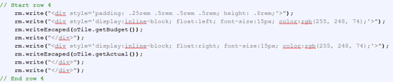
Figure 18
Code for budget and actual values
Figure 19 shows the code for tile control re-definition of a CSS style class. These are code snippets for the KPI.css file.
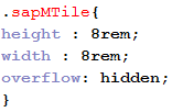
Figure 19
Redefine the CSS style class
Code snippets for TileContainerExt.j file: Control Function _updateTilePositions define each tiles? UI control positions depending on events and the environment. To get the desired layout (column layout) the left and top coordinates of the tile object need to be re-defined (Figure 20).
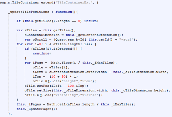
Figure 20
Redefine the column layout and top coordinate
A related control function _calculatePositions also modifies for offset co-ordinates of Tile objects inside the container as shown in Figure 21.
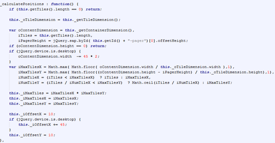
Figure 21
Redefine _calculatePositions method
Since you do not have to modify the render functions of the control you simply use the code line in Figure 22.
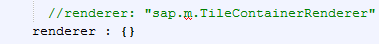
Figure 22
Redefine renderer function
Before seeing the use of these enhanced standard controls in a final application, let’s glance at sample KPI dashboard web application development components. Refer to Table 6, which lists the files required to design the complete application.
Application launch file
|
index.html |
| Application view files |
App.view.js
App.controller.js |
| Input master view files |
InputMaster.view.js
InputMaster.controller.js |
KPI detail view files
|
KPIDetail.view.js
KPIDetail.controller.js
|
CSS class collection file
|
KPI.css
|
New UI control files to address enhancements for StandardTile UI control
|
StandardTileKPI.js
StandardTileKPIRenderer.js
|
| Collection of enhancements for standard TileContainer UI control |
TileContainerExt.js |
| KPI data |
DataKPI.json |
| Other files |
Set of files used from SAP UI5 API resource bundle. API libraries are sap.m, sap.me, sap.ui.commons, and sap.viz.
Theme API library is sap_bluecrystal. |
Table 6
Files required to design the complete application
Figure 23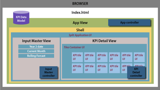
Figure 23
Technical components of the application design
I would like to take you through the code lines that are related to enhanced controls discussed in this article. The following code snippets show where and how I used the enhanced controls.
Index.html
Since index.html is a root file and responsible for launching the application I have declared an enhanced control for related files after the bootstrap as shown in Figure 24.
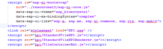
Figure 24
Declaration of enhancement control-related files
KPIDetail.view.js
The code lines in Figure 25 create an instance of enhanced StandardTileKPI.
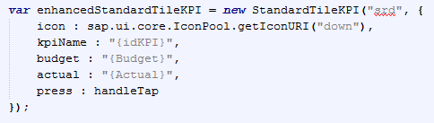
Figure 25
Declare an instance of StandardTileKPI
The code lines in Figure 26 create an instance of enhanced TileContainerExt.
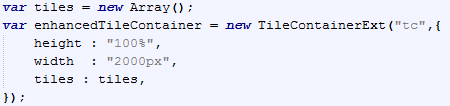
Figure 26
Declare an instance of TileContainerExt
Figure 27 shows the the binding of data to the instance enhancedTileContainer.
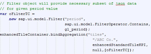
Figure 27
Declare an instance of enhanced TileContainer and binding
Further Scope
The techniques discussed here are not only the ones available to address these challenges. Developers are free to use any tools or techniques to simplify analysis and design challenges. However, following this five-step process is the simplest way to address design challenges of UI controls.
Sandesh Darne
Sandesh Darne is a senior lead for the Consulting ERP Practice at L&T Infotech, India. He leads a group of senior consultants whose primarily focus is on SAP upgrades and SAP usability consulting services. He also directs the SAP NetWeaver Portal and the SAP Center of Excellence, which focuses on excellent practices in organizations. He is certified in SAP NetWeaver Business Warehouse 3.5. He has also worked in the product development department of L&T Infotech where products such as ZoomUP, eALPS, and CodeReview were built and used as accelerators for SAP upgrade projects.
You may contact the author at sandesh.darne@lntinfotech.com.
If you have comments about this article or publication, or would like to submit an article idea, please contact the editor.


 Premium